import pandas as pd
from lets_plot import *

LetsPlot.setup_html()Layers
Introduction
In the previous chapters, you’ve learned much more than just how to make scatterplots, bar charts, and boxplots. You learned a foundation that you can use to make any type of plot with lets-plot.
In this chapter, you’ll expand on that foundation as you learn about the layered grammar of graphics. We’ll start with a deeper dive into aesthetic mappings, geometric objects, and facets. Then, you will learn about statistical transformations lets-plot makes under the hood when creating a plot. These transformations are used to calculate new values to plot, such as the heights of bars in a bar plot or medians in a box plot. You will also learn about position adjustments, which modify how geoms are displayed in your plots. Finally, we’ll briefly introduce coordinate systems.
We will not cover every single function and option for each of these layers, but we will walk you through the most important and commonly used functionality provided by lets-plot.
Prerequisites
You will need to install the letsplot package for this chapter, as well as pandas.
In your Python session, import the libraries we’ll be using:
Aesthetic mappings
“The greatest value of a picture is when it forces us to notice what we never expected to see.” — John Tukey
We’re going to use the mpg dataset for this section, so let’s download it.
mpg = pd.read_csv(
    "https://vincentarelbundock.github.io/Rdatasets/csv/ggplot2/mpg.csv", index_col=0
)

mpg = mpg.astype(
    {
        "manufacturer": "category",
        "model": "category",
        "displ": "double",
        "year": "int64",
        "cyl": "int64",
        "trans": "category",
        "drv": "category",
        "cty": "double",
        "hwy": "double",
        "fl": "category",
        "class": "category",
    }
)
mpg.head()| manufacturer | model | displ | year | cyl | trans | drv | cty | hwy | fl | class | |
|---|---|---|---|---|---|---|---|---|---|---|---|
| rownames | |||||||||||
| 1 | audi | a4 | 1.8 | 1999 | 4 | auto(l5) | f | 18.0 | 29.0 | p | compact |
| 2 | audi | a4 | 1.8 | 1999 | 4 | manual(m5) | f | 21.0 | 29.0 | p | compact |
| 3 | audi | a4 | 2.0 | 2008 | 4 | manual(m6) | f | 20.0 | 31.0 | p | compact |
| 4 | audi | a4 | 2.0 | 2008 | 4 | auto(av) | f | 21.0 | 30.0 | p | compact |
| 5 | audi | a4 | 2.8 | 1999 | 6 | auto(l5) | f | 16.0 | 26.0 | p | compact |
Among the variables in mpg are:
displ: A car’s engine size, in liters. A numerical variable.hwy: A car’s fuel efficiency on the highway, in miles per gallon (mpg). A car with a low fuel efficiency consumes more fuel than a car with a high fuel efficiency when they travel the same distance. A numerical variable.class: Type of car. A categorical variable.
Let’s start by visualising the relationship between displ and hwy for various classes of cars. We can do this with a scatterplot where the numerical variables are mapped to the x and y aesthetics and the categorical variable is mapped to an aesthetic like color or shape.
(ggplot(mpg, aes(x="displ", y="hwy", color="class")) + geom_point())(ggplot(mpg, aes(x="displ", y="hwy", shape="class")) + geom_point())Similarly, we can map class to size or alpha aesthetics as well, which control the shape and the transparency of the points, respectively.
(ggplot(mpg, aes(x="displ", y="hwy", size="class")) + geom_point())(ggplot(mpg, aes(x="displ", y="hwy", alpha="class")) + geom_point())While we are able to do it, mapping an unordered discrete (categorical) variable (class) to an ordered aesthetic variable (size or alpha) is generally not a good idea because it implies a ranking that does not in fact exist.
Once you map an aesthetic, lets-plot takes care of the rest. It selects a reasonable scale to use with the aesthetic, and it constructs a legend that explains the mapping between levels and values. For x and y aesthetics, lets-plot does not create a legend, but it creates an axis line with tick marks and a label. The axis line provides the same information as a legend; it explains the mapping between locations and values.
You can also set the visual properties of your geom manually as an argument of your geom function (outside of aes()) instead of relying on a variable mapping to determine the appearance. For example, we can make all of the points in our plot blue:
(ggplot(mpg, aes(x="displ", y="hwy")) + geom_point(color="blue"))Here, the colour doesn’t convey information about a variable, but only changes the appearance of the plot. You’ll need to pick a value that makes sense for that aesthetic:
- The name of a color as a character string, e.g.,
color = "blue" - The size of a point in mm, e.g.,
size = 1 - The shape of a point as a number, e.g,
shape = 1.
Try changing the above plot but, instead of specifying colour, try specifying the shape aesthetic. What do you get with shape set to 1, 2, or 3?
So far we have discussed aesthetics that we can map or set in a scatterplot, when using a point geom.
The specific aesthetics you can use for a plot depend on the geom you use to represent the data. In the next section we dive deeper into geoms.
Create a scatterplot of
hwyvs.displwhere the points are pink filled in triangles.Why does the following code not result in a plot with blue points?
(
    ggplot(mpg) +
  geom_point(aes(x = "displ", y = "hwy", color = "blue"))
)
What does the
strokeaesthetic do? What shapes does it work with? (Hint: usestrokein the global aesthetic andshapeingeom_point())Try changing the last plot from above but, instead of specifying colour, try specifying the shape aesthetic. What do you get with shape set to 1, 2, or 3?
Geometric objects
How are these two plots similar?
(ggplot(mpg, aes(x="displ", y="hwy")) + geom_point(size=4))(ggplot(mpg, aes(x="displ", y="hwy")) + geom_smooth(method="loess", size=2))Both plots contain the same x variable, the same y variable, and both describe the same data. But the plots are not identical. Each plot uses a different geometric object, geom, to represent the data. The plot on the left uses the point geom, and the plot on the right uses the smooth geom, a smooth line fitted to the data.
To change the geom in your plot, change the geom function that you add to ggplot().
Every geom function in lets-plot takes a mapping argument, either defined locally in the geom layer or globally in the ggplot() layer. However, not every aesthetic works with every geom. You could set the shape of a point, but you couldn’t set the “shape” of a line. If you try, lets-plot will silently ignore that aesthetic mapping. On the other hand, you could set the linetype of a line. geom_smooth() will draw a different line, with a different linetype, for each unique value of the variable that you map to linetype.
Let’s take a look:
(ggplot(mpg, aes(x="displ", y="hwy", line="drv")) + geom_smooth(method="loess"))(ggplot(mpg, aes(x="displ", y="hwy", linetype="drv")) + geom_smooth(method="loess"))Here, geom_smooth() separates the cars into three lines based on their drv value, which describes a car’s drive train. One line describes all of the points that have a 4 value, one line describes all of the points that have an f value, and one line describes all of the points that have an r value. Here, 4 stands for four-wheel drive, f for front-wheel drive, and r for rear-wheel drive.
If this is too confusing, we can make it clearer by overlaying the lines on top of the raw data and then coloring everything according to drv.
(
    ggplot(mpg, aes(x="displ", y="hwy", color="drv"))
    + geom_point()
    + geom_smooth(aes(linetype="drv"), method="loess")
)
Notice that this plot contains two geoms in the same graph.
Many geoms, like geom_smooth(), use a single geometric object to display multiple rows of data. For these geoms, you can set the group aesthetic to a categorical variable to draw multiple objects. lets-plot will draw a separate object for each unique value of the grouping variable. In practice, lets-plot will automatically group the data for these geoms whenever you map an aesthetic to a discrete variable. It is convenient to rely on this feature because the group aesthetic by itself does not add a legend or distinguishing features to the geoms.
Note that if you place mappings in a geom function, lets-plot will treat them as local mappings for the layer. It will use these mappings to extend or overwrite the global mappings for that layer only. This makes it possible to display different aesthetics in different layers.
(ggplot(mpg, aes(x="displ", y="hwy")) + geom_point(aes(color="class")) + geom_smooth())You can use the same idea to specify different data for each layer. Here, we use red points as well as open circles to highlight two-seater cars. The local data argument in geom_point() overrides the global data argument in ggplot() for that layer only.
(
    ggplot(mpg, aes(x="displ", y="hwy"))
    + geom_point()
    + geom_point(data=mpg.loc[mpg["class"] == "2seater", :], color="red", size=2)
    + geom_point(
        data=mpg.loc[mpg["class"] == "2seater", :], shape=1, size=3, color="red"
    )
)
Geoms are the fundamental building blocks of lets-plot. You can completely transform the look of your plot by changing its geom, and different geoms can reveal different features of your data.
lets-plot provides over 40 geoms but these don’t cover all possible plots one could make. You can find an overview at the relevant part of the lets-plot documentation.
If you need a geom that is not included, you have three main options: 1. Look for packages that extend lets-plot and that do what you need 2. Raise an issue on the lets-plot Github page requesting it as a new feature—but bear in mind that it might not be a priority for the maintainers, and there’s no guarantee that they’ll add it, depending on how useful it is for others and how easy it is to implemet. 3. Turn to an imperative plotting package that gives you fine-grained control so you can build your own chart from the ground up—matplotlib is absolutely excellent for this.
Exercises
What geom would you use to draw a line chart? A boxplot? A histogram? An area chart?
What effect would running the previous example:
(
ggplot(mpg, aes(x = "displ", y = "hwy", alpha = "class")) +
  geom_point()
)
with the keyword argument
show_legend=Falsehave on the chart generated by this code?What does the
seargument togeom_smooth()do?Recreate the Python code necessary to generate the following graph.
Facets
In Data Visualisation, you learned about faceting with facet_wrap(), which splits a plot into subplots that each display one subset of the data based on a categorical variable.
(ggplot(mpg, aes(x="displ", y="hwy")) + geom_point() + facet_wrap("cyl"))To facet your plot with the combination of two variables, switch from facet_wrap() to facet_grid().
(ggplot(mpg, aes(x="displ", y="hwy")) + geom_point() + facet_grid("drv", "cyl"))By default each of the facets share the same scale and range for x and y axes. This is useful when you want to compare data across facets, and is the recommended default, but it can be limiting when you want to visualise the relationship within each facet better. Setting the scales argument in a faceting function to "free" will allow for different axis scales across both rows and columns, "free_x" will allow for different scales across rows, and "free_y" will allow for different scales across columns.
(
    ggplot(mpg, aes(x="displ", y="hwy"))
    + geom_point()
    + facet_grid("drv", "cyl", scales="free_y")
)
(ggplot(mpg) + geom_point(aes(x="displ", y="hwy")) + facet_wrap("class", nrow=2))Exercises
What happens if you facet on a continuous variable?
What do the empty cells in plot with
facet_grid("drv", "cyl")mean? Run the following code. How do they relate to the resulting plot?( ggplot(mpg) + geom_point(aes(x = "drv", y = "cyl")) )What plots does the following code make? What does omitting the second variable do?
(
  ggplot(mpg) +
  geom_point(aes(x = "displ", y = "hwy")) +
  facet_grid("drv")
)

(
  ggplot(mpg) +
  geom_point(aes(x = displ, y = "hwy")) +
  facet_grid("cyl")
)
Take the first faceted plot in this section:
(
    ggplot(mpg) +
      geom_point(aes(x = "displ", y = "hwy")) +
      facet_wrap("class", nrow = 2)
)
What are the advantages to using faceting instead of the color aesthetic? What are the disadvantages? How might the balance change if you had a larger dataset?
Read
help(facet_wrap)or hover your mouse overfacet_wrap()in Visual Studio Code. What doesnrowdo? What doesncoldo? What other options control the layout of the individual panels? Why doesn’tfacet_grid()havenrowandncolarguments?Recreate the following plot using
facet_wrap()instead offacet_grid(). How do the positions of the facet labels change?( ggplot(mpg) + geom_point(aes(x = "displ", y = "hwy")) + facet_grid("drv") )
Statistical transformations
Consider a basic bar chart, drawn with geom_bar() or geom_col(). The following chart displays the total number of diamonds in the diamonds dataset, grouped by cut. The diamonds dataset contains information on ~54,000 diamonds, including the price, carat, color, clarity, and cut of each diamond. We’ll load it in a moment. The chart shows that more diamonds are available with high quality cuts than with low quality cuts.
diamonds = pd.read_csv(
    "https://vincentarelbundock.github.io/Rdatasets/csv/ggplot2/diamonds.csv",
    index_col=0,
)
diamonds_cut_order = ["Fair", "Good", "Very Good", "Premium", "Ideal"]
diamonds["cut"] = diamonds["cut"].astype(
    pd.CategoricalDtype(categories=diamonds_cut_order, ordered=True)
)
diamonds.head()| carat | cut | color | clarity | depth | table | price | x | y | z | |
|---|---|---|---|---|---|---|---|---|---|---|
| rownames | ||||||||||
| 1 | 0.23 | Ideal | E | SI2 | 61.5 | 55.0 | 326 | 3.95 | 3.98 | 2.43 |
| 2 | 0.21 | Premium | E | SI1 | 59.8 | 61.0 | 326 | 3.89 | 3.84 | 2.31 |
| 3 | 0.23 | Good | E | VS1 | 56.9 | 65.0 | 327 | 4.05 | 4.07 | 2.31 |
| 4 | 0.29 | Premium | I | VS2 | 62.4 | 58.0 | 334 | 4.20 | 4.23 | 2.63 |
| 5 | 0.31 | Good | J | SI2 | 63.3 | 58.0 | 335 | 4.34 | 4.35 | 2.75 |
(ggplot(diamonds, aes(x="cut")) + geom_bar())On the x-axis, the chart displays cut, a variable from diamonds. On the y-axis, it displays count, but count is not a variable in diamonds! Where does count come from? Many graphs, like scatterplots, plot the raw values of your dataset. Other graphs, like bar charts, calculate new values to plot:
Bar charts, histograms, and frequency polygons bin your data and then plot bin counts, the number of points that fall in each bin.
Smoothers fit a model to your data and then plot predictions from the model.
Boxplots compute the five-number summary of the distribution and then display that summary as a specially formatted box.
The algorithm used to calculate new values for a graph is called a stat, short for statistical transformation. The figure below shows how this process works with geom_bar().
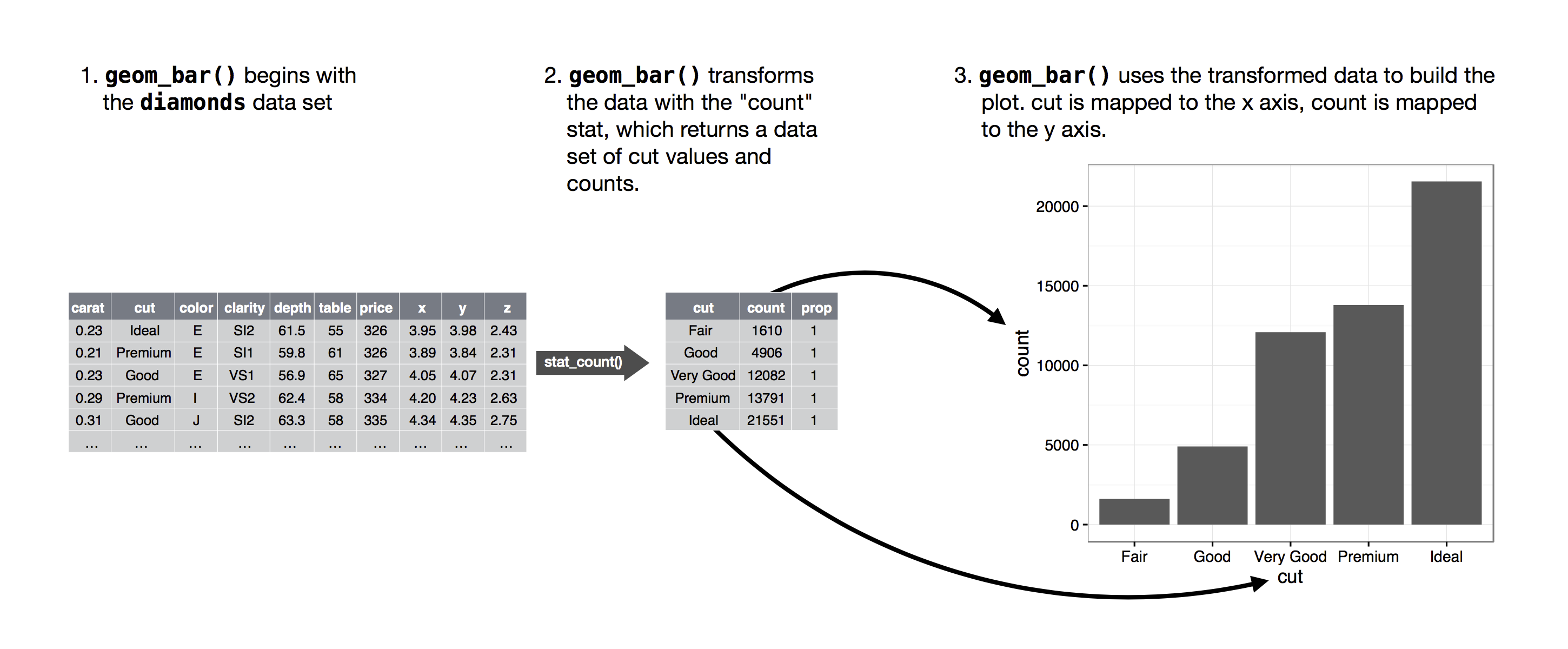
You can learn which stat a geom uses by inspecting the default value for the stat argument. For example, help(geom_bar) (or hovering your mouse over the function written in code) shows that the default value for stat is “count”, which means that geom_bar() uses counts of the number of occurrences.
Every geom has a default stat; and every stat has a default geom. This means that you can typically use geoms without worrying about the underlying statistical transformation. However, there are some reasons why you might need to use a stat explicitly; for example, you might want to override the default stat. In the code below, we change the stat of geom_bar() from count (the default) to identity. This lets us map the height of the bars to the raw values of a y variable.
(
    ggplot(
        diamonds.value_counts("cut").reset_index(name="counts"),
        aes(x="cut", y="counts"),
    )
    + geom_bar(stat="identity")
)
Position adjustments
There’s one more piece of magic associated with bar charts. You can colour a bar chart using either the color aesthetic, or, more usefully, the fill aesthetic:
(ggplot(mpg, aes(x="drv", color="drv")) + geom_bar())(ggplot(mpg, aes(x="drv", fill="drv")) + geom_bar())Note what happens if you map the fill aesthetic to another variable, like class: the bars are automatically stacked. Each colored rectangle represents a combination of drv and class.
(ggplot(mpg, aes(x="drv", fill="class")) + geom_bar())The stacking is performed automatically using the position adjustment specified by the position argument. If you don’t want a stacked bar chart, you can use one of three other options: "identity", "dodge" or "fill".
position = "identity"will place each object exactly where it falls in the context of the graph. This is not very useful for bars, because it overlaps them. To see that overlapping we usually need to make the bars slightly transparent by settingalphato a small value.
(ggplot(mpg, aes(x="drv", fill="class")) + geom_bar(alpha=0.5, position="identity"))The identity position adjustment is more useful for 2d geoms, like points, where it is the default.
position = "fill"works like stacking, but makes each set of stacked bars the same height. This makes it easier to compare proportions across groups.
(ggplot(mpg, aes(x="drv", fill="class")) + geom_bar(position="fill"))position = "dodge"places overlapping objects directly beside one another. This makes it easier to compare individual values.
(ggplot(mpg, aes(x="drv", fill="class")) + geom_bar(position="dodge"))There’s one other type of adjustment that’s not useful for bar charts, but can be very useful for scatterplots. Recall our first scatterplot. Did you notice that the plot displays only some of the points (even though there are 234 observations in the dataset)?
(ggplot(mpg, aes(x="displ", y="hwy")) + geom_point())The underlying values of hwy and displ are rounded so the points appear on a grid and many points overlap each other. This problem is known as overplotting. This arrangement makes it difficult to see the distribution of the data. Are the data points spread equally throughout the graph, or is there one special combination of hwy and displ that contains 109 values?
You can avoid this gridding by setting the position adjustment to “jitter”. position = "jitter" adds a small amount of random noise to each point. This spreads the points out because no two points are likely to receive the same amount of random noise.
(ggplot(mpg, aes(x="displ", y="hwy")) + geom_point(position="jitter"))Adding randomness seems like a strange way to improve your plot, but while it makes your graph less accurate at small scales, it makes your graph more revealing at large scales.
Because this is such a useful operation, letsplot comes with a shorthand for geom_point(position = "jitter"): geom_jitter().
Of course, a more sophisticated way of dealing with overplotting is via a binscatter plot, which is available in the binsreg package.
To learn more about position adjustment, take a look at the documentation.
Exercises
- What is the problem with the following plot? How could you improve it?
(ggplot(mpg, aes(x="cty", y="hwy")) + geom_point())What, if anything, is the difference between the two plots? Why?
(
    ggplot(mpg, aes(x = "displ", y = "hwy")) +
      geom_point()
)
(
    ggplot(mpg, aes(x = "displ", y = "hwy")) +
      geom_point(position = "identity")
)
What parameters to
geom_jitter()control the amount of jittering?What’s the default position adjustment for
geom_boxplot()? Create a visualisation of thempgdataset that demonstrates it.
The layered grammar of graphics
We can expand on the graphing template you learned already by adding position adjustments, stats, coordinate systems, and faceting:
ggplot(data = <DATA>) +
  <GEOM_FUNCTION>(
     mapping = aes(<MAPPINGS>),
     stat = <STAT>,
     position = <POSITION>
  ) +
  <FACET_FUNCTION>
Our new template takes six parameters, the bracketed words that appear in the template. In practice, you rarely need to supply all seven parameters to make a graph because lets-plot will provide useful defaults for everything except the data, the mappings, and the geom function.
The six parameters in the template compose the grammar of graphics, a formal system for building plots. The grammar of graphics is based on the insight that you can uniquely describe any plot as a combination of a dataset, a geom, a set of mappings, a stat, a position adjustment, a coordinate system, a faceting scheme, and a theme.
To see how this works, consider how you could build a basic plot from scratch: you could start with a dataset and then transform it into the information that you want to display (with a stat). Next, you could choose a geometric object to represent each observation in the transformed data. You could then use the aesthetic properties of the geoms to represent variables in the data. You would map the values of each variable to the levels of an aesthetic. These steps are illustrated in the figure below.
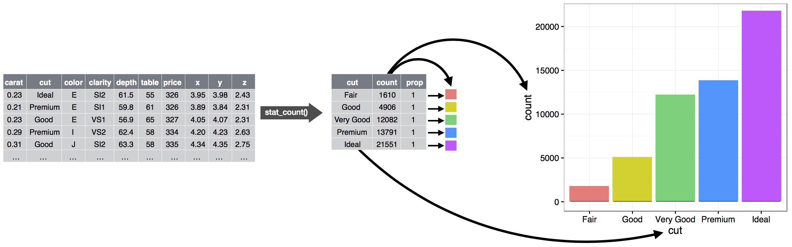
At this point, you would have a complete graph, but you could further adjust the positions of the geoms within the coordinate system (a position adjustment) or split the graph into subplots (faceting). You could also extend the plot by adding one or more additional layers, where each additional layer uses a dataset, a geom, a set of mappings, a stat, and a position adjustment.
You could use this method to create a lot of plots that you can imagine.
Summary
In this chapter you learned about the layered grammar of graphics starting with aesthetics and geometries to build a simple plot, facets for splitting the plot into subsets, statistics for understanding how geoms are calculated, position adjustments for controlling the fine details of position when geoms might otherwise overlap, and coordinate systems which allow you to fundamentally change what x and y mean.
The most useful further resource on lets-plot is the documentation, which you can find here.