
Common Plots#
Introduction#
In this chapter, we’ll look at some of the most common plots that you might want to make—and how to create them using the most popular data visualisations libraries, including matplotlib, lets-plot, seaborn, altair, and plotly. If you need an introduction to these libraries, check out the other data visualisation chapters.
This chapter has benefited from the phenomenal matplotlib documentation, the lets-plot documentation, viztech (a repository that aimed to recreate the entire Financial Times Visual Vocabulary using plotnine), from the seaborn documentation, from the altair documentation, from the plotly documentation, and from examples posted around the web on forums and in blog posts. You may be wondering why plotnine isn’t featured here: its functions have almost exactly the same names as those in lets-plot, and we have opted to include the latter as it is currently the more mature plotting package. However, most of the code below for lets-plot also works in plotnine, and you can read more about plotnine in Data Visualisation using the Grammar of Graphics with Plotnine.
Bear in mind that for many of the matplotlib examples, using the df.plot.* syntax can get the plot you want more quickly! To be more comprehensive, the solution for any kind of data is shown in the examples below.
Throughout, we’ll assume that the data are in a tidy format (one row per observation, one variable per column). Remember that all Altair plots can be made interactive by adding .interactive() at the end.
First, though, let’s import the libraries we’ll need.
import warnings
from itertools import cycle
from pathlib import Path
import altair as alt
import matplotlib.pyplot as plt
import numpy as np
import pandas as pd
import plotly.express as px
import seaborn as sns
import seaborn.objects as so
from lets_plot import *
from lets_plot.mapping import as_discrete
from vega_datasets import data
# Set seed for reproducibility
# Set seed for random numbers
seed_for_prng = 78557
prng = np.random.default_rng(
seed_for_prng
) # prng=probabilistic random number generator
# Turn off warnings
warnings.filterwarnings("ignore")
# Set up lets-plot charts
LetsPlot.setup_html()
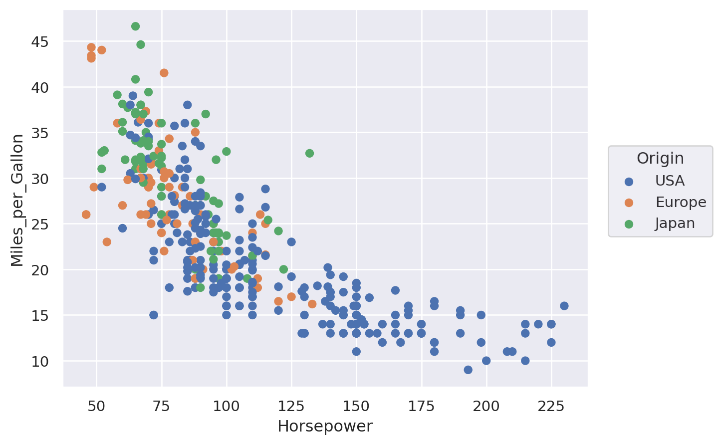
Scatter plot#
In this example, we will see a simple scatter plot with several categories using the “cars” data:
cars = data.cars()
cars.head()
| Name | Miles_per_Gallon | Cylinders | Displacement | Horsepower | Weight_in_lbs | Acceleration | Year | Origin | |
|---|---|---|---|---|---|---|---|---|---|
| 0 | chevrolet chevelle malibu | 18.0 | 8 | 307.0 | 130.0 | 3504 | 12.0 | 1970-01-01 | USA |
| 1 | buick skylark 320 | 15.0 | 8 | 350.0 | 165.0 | 3693 | 11.5 | 1970-01-01 | USA |
| 2 | plymouth satellite | 18.0 | 8 | 318.0 | 150.0 | 3436 | 11.0 | 1970-01-01 | USA |
| 3 | amc rebel sst | 16.0 | 8 | 304.0 | 150.0 | 3433 | 12.0 | 1970-01-01 | USA |
| 4 | ford torino | 17.0 | 8 | 302.0 | 140.0 | 3449 | 10.5 | 1970-01-01 | USA |
Matplotlib#
fig, ax = plt.subplots()
for origin in cars["Origin"].unique():
cars_sub = cars[cars["Origin"] == origin]
ax.scatter(cars_sub["Horsepower"], cars_sub["Miles_per_Gallon"], label=origin)
ax.set_ylabel("Miles per Gallon")
ax.set_xlabel("Horsepower")
ax.legend()
plt.show()

Seaborn#
Note that this uses the seaborn objects API.
(so.Plot(cars, x="Horsepower", y="Miles_per_Gallon", color="Origin").add(so.Dot()))
Lets-Plot#
(
ggplot(cars, aes(x="Horsepower", y="Miles_per_Gallon", color="Origin"))
+ geom_point()
+ ylab("Miles per Gallon")
)
Altair#
For this first example, we’ll also show how to make the altair plot interactive with movable axes and a tooltip that reveals more info when you hover your mouse over points.
alt.Chart(cars).mark_circle(size=60).encode(
x="Horsepower",
y="Miles_per_Gallon",
color="Origin",
tooltip=["Name", "Origin", "Horsepower", "Miles_per_Gallon"],
).interactive()
Plotly#
Plotly is another declarative plotting library, at least sometimes (!), but one that is interactive by default.
fig = px.scatter(
cars,
x="Horsepower",
y="Miles_per_Gallon",
color="Origin",
hover_data=["Name", "Origin", "Horsepower", "Miles_per_Gallon"],
)
fig.show()
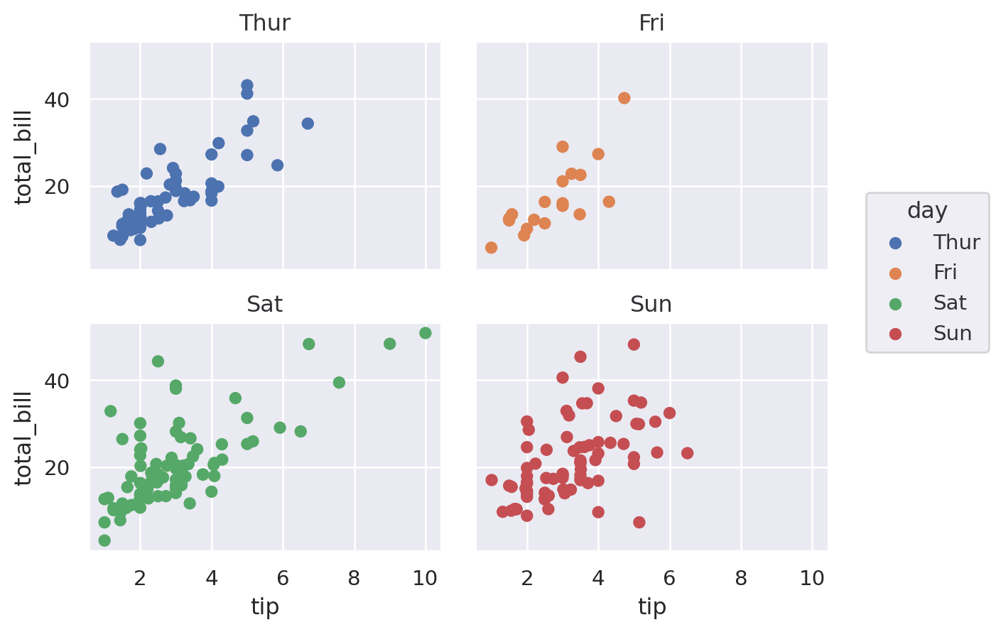
Facets#
This applies to all plots, so in some sense is common! Facets, aka panels or small multiples, are ways of showing the same chart multiple times. Let’s see how to achieve them in a few of the most popular plotting libraries.
We’ll use the “tips” dataset for this.
df = sns.load_dataset("tips")
df.head()
| total_bill | tip | sex | smoker | day | time | size | |
|---|---|---|---|---|---|---|---|
| 0 | 16.99 | 1.01 | Female | No | Sun | Dinner | 2 |
| 1 | 10.34 | 1.66 | Male | No | Sun | Dinner | 3 |
| 2 | 21.01 | 3.50 | Male | No | Sun | Dinner | 3 |
| 3 | 23.68 | 3.31 | Male | No | Sun | Dinner | 2 |
| 4 | 24.59 | 3.61 | Female | No | Sun | Dinner | 4 |
Matplotlib#
There are many ways to create facets using Matplotlib, and you can get facets in any shape or sizes you like.
The easiest way, though, is to specify the number of rows and columns. This is achieved by specifying nrows and ncols when calling plt.subplots(). It returns an array of shape (nrows, ncols) of Axes objects. For most purposes, you’ll want to flatten these to a vector before iterating over them.
fig, axes = plt.subplots(nrows=1, ncols=4, sharex=True, sharey=True)
flat_axes = axes.flatten() # Not needed with 1 row or 1 col, but good to be aware of
facet_grp = list(df["day"].unique())
# This part just to get some colours from the default color cycle
colour_list = plt.rcParams["axes.prop_cycle"].by_key()["color"]
iter_cycle = cycle(colour_list)
for i, ax in enumerate(flat_axes):
sub_df = df.loc[df["day"] == facet_grp[i]]
ax.scatter(
sub_df["tip"],
sub_df["total_bill"],
s=30,
edgecolor="k",
color=next(iter_cycle),
)
ax.set_title(facet_grp[i])
fig.text(0.5, 0.01, "Tip", ha="center")
fig.text(0.0, 0.5, "Total bill", va="center", rotation="vertical")
plt.tight_layout()
plt.show()

Different facet sizes are possible in numerous ways. In practice, it’s often better to have evenly sized facets laid out in a grid–especially each facet is of the same x and y axes. But, just to show it’s possible, here’s an example that gives more space to the weekend than to weekdays using the tips dataset:
# This part just to get some colours
colormap = plt.cm.Dark2
fig = plt.figure(constrained_layout=True)
ax_dict = fig.subplot_mosaic([["Thur", "Fri", "Sat", "Sat", "Sun", "Sun"]])
facet_grp = list(ax_dict.keys())
colorst = [colormap(i) for i in np.linspace(0, 0.9, len(facet_grp))]
for i, grp in enumerate(facet_grp):
sub_df = df.loc[df["day"] == facet_grp[i]]
ax_dict[grp].scatter(
sub_df["tip"],
sub_df["total_bill"],
s=30,
edgecolor="k",
color=colorst[i],
)
ax_dict[grp].set_title(facet_grp[i])
if grp != "Thurs":
ax_dict[grp].set_yticklabels([])
plt.tight_layout()
fig.text(0.5, 0, "Tip", ha="center")
fig.text(0, 0.5, "Total bill", va="center", rotation="vertical")
plt.show()

As well as using lists, you can also specify the layout using an array or using text, eg
axd = plt.figure(constrained_layout=True).subplot_mosaic(
"""
ABD
CCD
CC.
"""
)
kw = dict(ha="center", va="center", fontsize=60, color="darkgrey")
for k, ax in axd.items():
ax.text(0.5, 0.5, k, transform=ax.transAxes, **kw)

Seaborn#
Seaborn makes it easy to quickly create facet plots. Note the use of col_wrap.
(
so.Plot(df, x="tip", y="total_bill", color="day")
.facet(col="day", wrap=2)
.add(so.Dot())
)
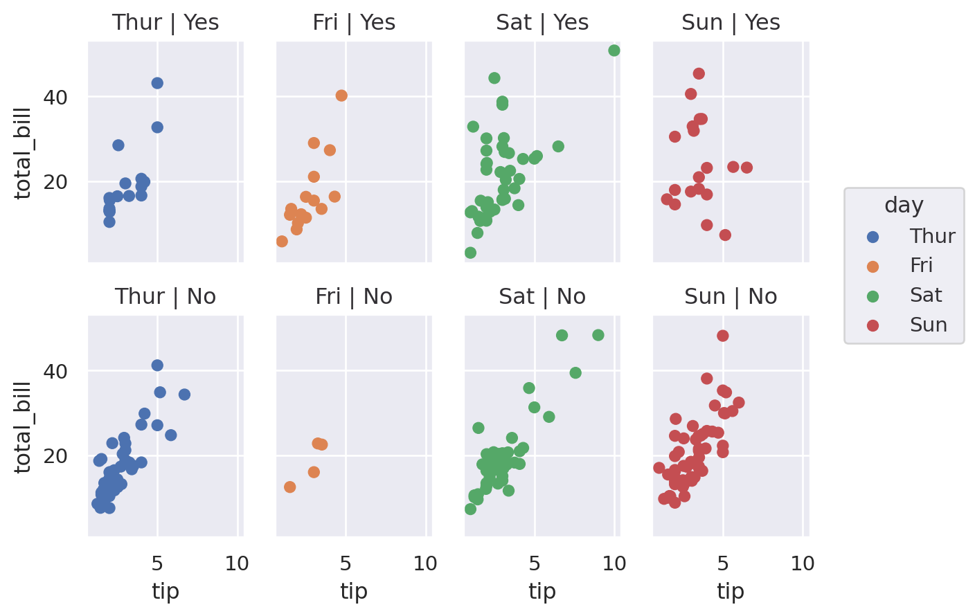
A nice feature of seaborn that is much more fiddly in (base) matplotlib is the ability to specify rows and columns separately: (smoker)
(
so.Plot(df, x="tip", y="total_bill", color="day")
.facet(col="day", row="smoker")
.add(so.Dot())
)
Lets-Plot#
(
ggplot(df, aes(x="tip", y="total_bill", color="smoker"))
+ geom_point(size=3)
+ facet_wrap(["smoker", "day"])
)
Altair#
alt.Chart(df).mark_point().encode(
x="tip:Q",
y="total_bill:Q",
color="smoker:N",
facet=alt.Facet("day:N", columns=2),
).properties(
width=200,
height=100,
)
Plotly#
fig = px.scatter(
df, x="tip", y="total_bill", color="smoker", facet_row="smoker", facet_col="day"
)
fig.show()
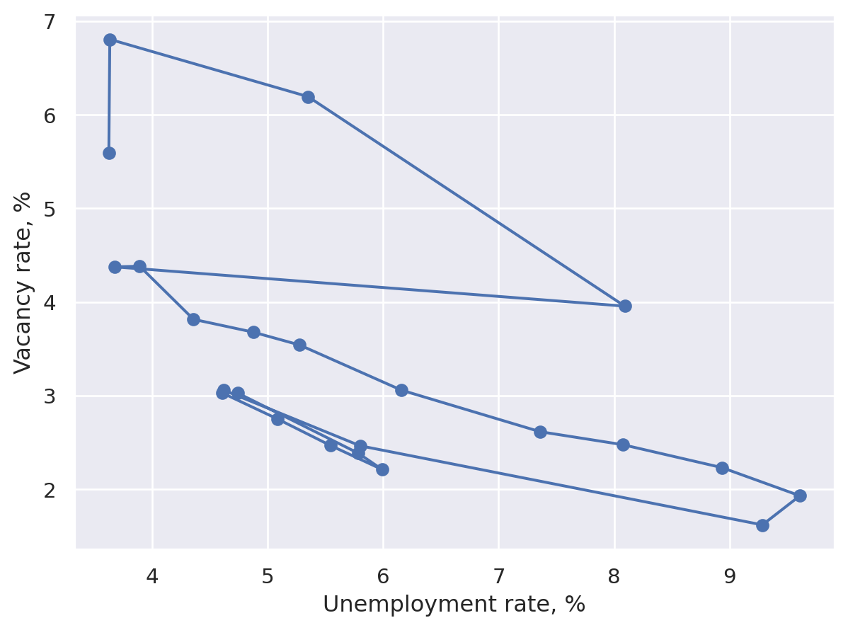
Connected scatter plot#
A simple variation on the scatter plot designed to show an ordering, usually of time. We’ll trace out a Beveridge curve based on US data.
import datetime
import pandas_datareader.data as web
start = datetime.datetime(2000, 1, 1)
end = datetime.datetime(datetime.datetime.now().year, 1, 1)
code_dict = {
"Vacancies": "LMJVTTUVUSA647N",
"Unemployment": "UNRATE",
"LabourForce": "CLF16OV",
}
list_dfs = [
web.DataReader(value, "fred", start, end)
.rename(columns={value: key})
.groupby(pd.Grouper(freq="AS"))
.mean()
for key, value in code_dict.items()
]
df = pd.concat(list_dfs, axis=1)
df = df.assign(Vacancies=100 * df["Vacancies"] / (df["LabourForce"] * 1e3)).dropna()
df["Year"] = df.index.year
df.head()
| Vacancies | Unemployment | LabourForce | Year | |
|---|---|---|---|---|
| DATE | ||||
| 2001-01-01 | 3.028239 | 4.741667 | 143768.916667 | 2001 |
| 2002-01-01 | 2.387254 | 5.783333 | 144856.083333 | 2002 |
| 2003-01-01 | 2.212238 | 5.991667 | 146499.500000 | 2003 |
| 2004-01-01 | 2.470209 | 5.541667 | 147379.583333 | 2004 |
| 2005-01-01 | 2.753326 | 5.083333 | 149289.166667 | 2005 |
Matplotlib#
plt.close("all")
fig, ax = plt.subplots()
quivx = -df["Unemployment"].diff(-1)
quivy = -df["Vacancies"].diff(-1)
# This connects the points
ax.quiver(
df["Unemployment"],
df["Vacancies"],
quivx,
quivy,
scale_units="xy",
angles="xy",
scale=1,
width=0.006,
alpha=0.3,
)
ax.scatter(
df["Unemployment"],
df["Vacancies"],
marker="o",
s=35,
edgecolor="black",
linewidth=0.2,
alpha=0.9,
)
for j in [0, -1]:
ax.annotate(
df["Year"].iloc[j],
xy=(df[["Unemployment", "Vacancies"]].iloc[j].tolist()),
xycoords="data",
xytext=(-20, -40),
textcoords="offset points",
arrowprops=dict(arrowstyle="->", connectionstyle="angle3,angleA=0,angleB=-90"),
)
ax.set_xlabel("Unemployment rate, %")
ax.set_ylabel("Vacancy rate, %")
plt.tight_layout()
plt.show()

Seaborn#
(
so.Plot(df, x="Unemployment", y="Vacancies")
.add(so.Dots())
.add(so.Path(marker="o"))
.label(
x="Unemployment rate, %",
y="Vacancy rate, %",
)
)
Lets-Plot#
You can also use geom_curve() in place of geom_segment() below to get curved lines instead of straight lines.
# This is a convencience and creates a dataframe of the form
# Vacancies_from Unemployment_from LabourForce_from Year_from Vacancies_to Unemployment_to LabourForce_to Year_to
# 0 3.028239 4.741667 143768.916667 2001 2.387254 5.783333 144856.083333 2002
# 1 2.387254 5.783333 144856.083333 2002 2.212237 5.991667 146499.500000 2003
# so that we have both years (from and to) in each row
path_df = (
df.iloc[:-1]
.reset_index(drop=True)
.join(df.iloc[1:].reset_index(drop=True), lsuffix="_from", rsuffix="_to")
)
min_yr = df["Year"].min()
max_yr = df["Year"].max()
(
ggplot(df, aes("Unemployment", "Vacancies"))
+ geom_segment(
aes(
x="Unemployment_from",
y="Vacancies_from",
xend="Unemployment_to",
yend="Vacancies_to",
),
data=path_df,
size=1,
color="gray",
arrow=arrow(type="closed", length=15, angle=15),
spacer=5
+ 1, # Avoids arrowheads being sunk into points (+1 as circles are size 1)
)
+ geom_point(shape=21, color="gray", fill="#c28dc3", size=5)
+ geom_text(
aes(label="Year"),
data=df[df["Year"].isin([min_yr, max_yr])],
position=position_nudge(y=0.3),
)
+ labs(x="Unemployment rate, %", y="Vacancy rate, %")
)
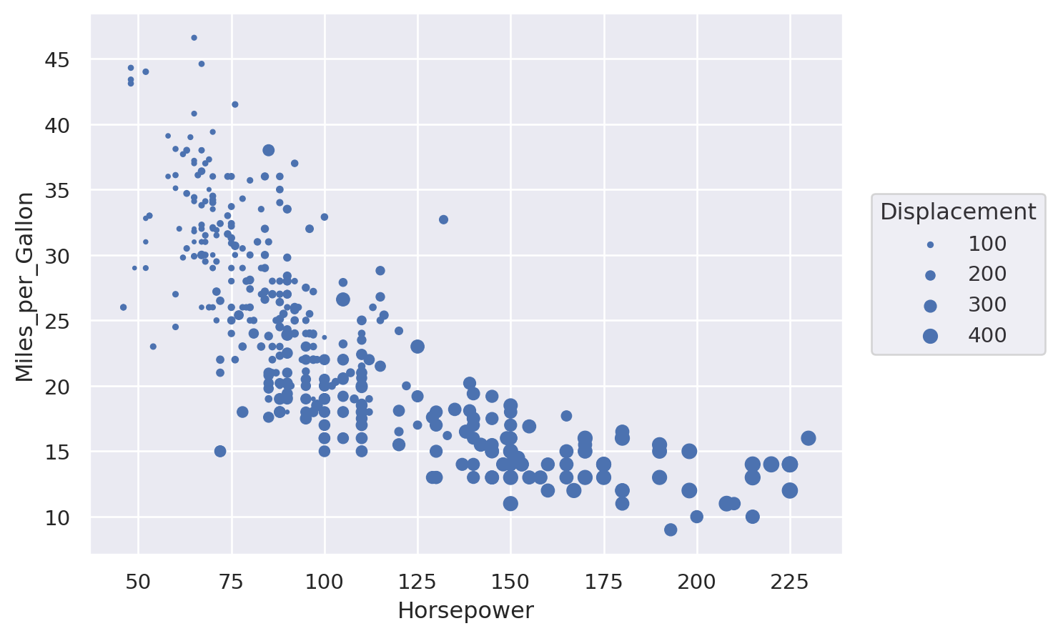
Bubble plot#
This is a scatter plot where the size of the point carries an extra dimension of information.
Matplotlib#
fig, ax = plt.subplots()
scat = ax.scatter(
cars["Horsepower"], cars["Miles_per_Gallon"], s=cars["Displacement"], alpha=0.4
)
ax.set_ylabel("Miles per Gallon")
ax.set_xlabel("Horsepower")
ax.legend(
*scat.legend_elements(prop="sizes", num=4),
loc="upper right",
title="Displacement",
frameon=False,
)
plt.show()

Seaborn#
(
so.Plot(cars, x="Horsepower", y="Miles_per_Gallon", pointsize="Displacement").add(
so.Dot()
)
)
Lets-Plot#
(
ggplot(cars, aes(x="Horsepower", y="Miles_per_Gallon", size="Displacement"))
+ geom_point()
)
Altair#
alt.Chart(cars).mark_circle().encode(
x="Horsepower", y="Miles_per_Gallon", size="Displacement"
)
Plotly#
# Adding a new col is easiest way to get displacement into legend with plotly:
cars["Displacement_Size"] = pd.cut(cars["Displacement"], bins=4)
fig = px.scatter(
cars,
x="Horsepower",
y="Miles_per_Gallon",
size="Displacement",
color="Displacement_Size",
)
fig.show()
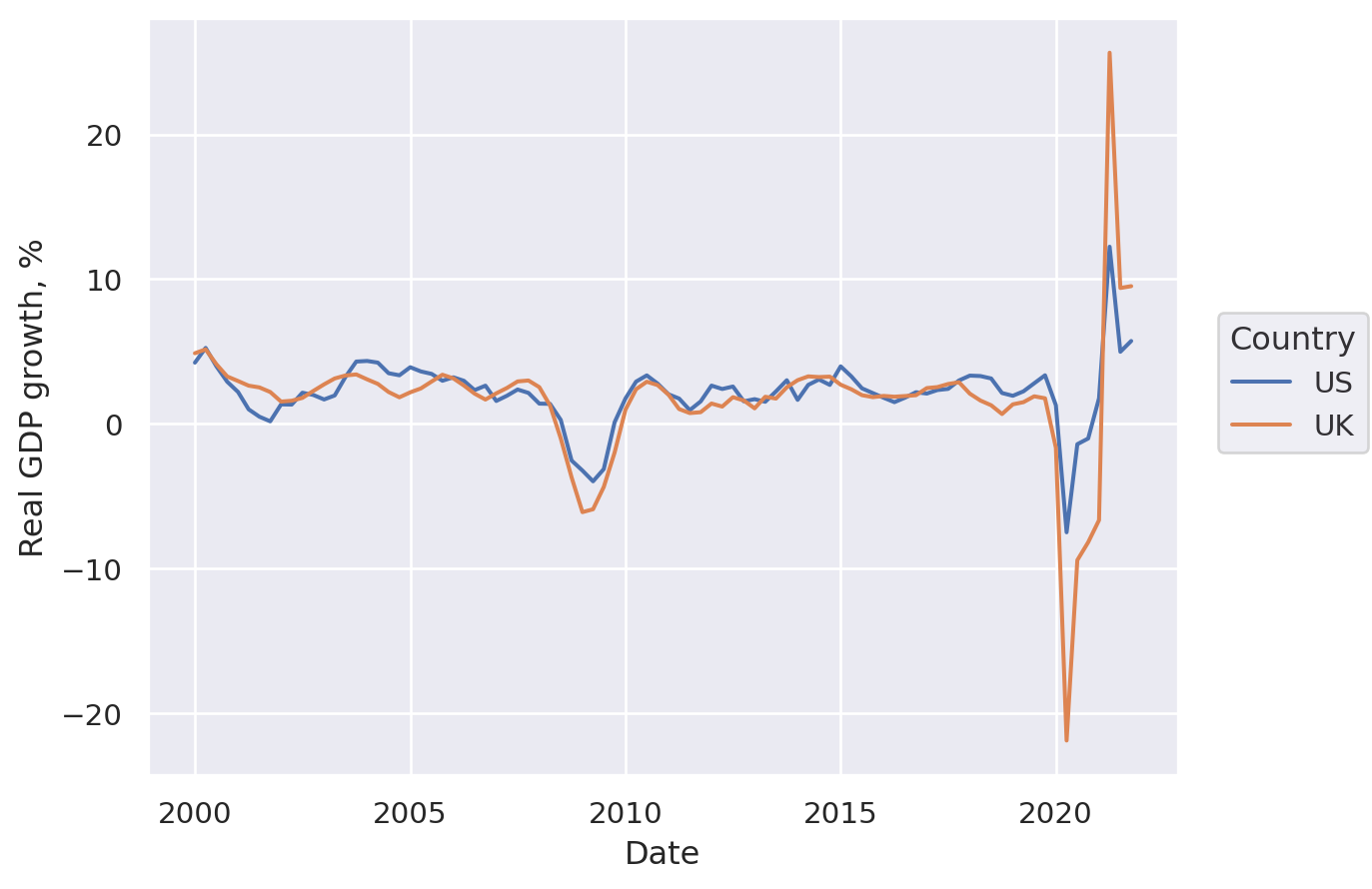
Line plot#
First, let’s get some data on GDP growth:
todays_date = datetime.datetime.now().strftime("%Y-%m-%d")
fred_df = web.DataReader(["GDPC1", "NGDPRSAXDCGBQ"], "fred", "1999-01-01", "2021-12-31")
fred_df.columns = ["US", "UK"]
fred_df.index.name = "Date"
fred_df = 100 * fred_df.pct_change(4)
df = pd.melt(
fred_df.reset_index(),
id_vars=["Date"],
value_vars=fred_df.columns,
value_name="Real GDP growth, %",
var_name="Country",
)
df = df.set_index("Date")
df.head()
| Country | Real GDP growth, % | |
|---|---|---|
| Date | ||
| 1999-01-01 | US | NaN |
| 1999-04-01 | US | NaN |
| 1999-07-01 | US | NaN |
| 1999-10-01 | US | NaN |
| 2000-01-01 | US | 4.224745 |
Matplotlib#
Note that Matplotlib prefers data to be one variable per column, in which case we could have just run
fig, ax = plt.subplots()
df.plot(ax=ax)
ax.set_title('Real GDP growth, %', loc='right')
ax.yaxis.tick_right()
but we are working with tidy data here, so we’ll do the plotting slightly differently.
fig, ax = plt.subplots()
for i, country in enumerate(df["Country"].unique()):
df_sub = df[df["Country"] == country]
ax.plot(df_sub.index, df_sub["Real GDP growth, %"], label=country, lw=2)
ax.set_title("Real GDP growth per capita, %", loc="right")
ax.yaxis.tick_right()
ax.spines["right"].set_visible(True)
ax.spines["left"].set_visible(False)
ax.legend(loc="lower left")
plt.show()

Seaborn#
Note that only some seaborn commands currently support the use of named indexes, so we use df.reset_index() to make the ‘Date’ index into a regular column in the snippet below (although in recent versions of seaborn, lineplot() would actually work fine with data=df):
fig, ax = plt.subplots()
y_var = "Real GDP growth, %"
sns.lineplot(x="Date", y=y_var, hue="Country", data=df.reset_index(), ax=ax)
ax.yaxis.tick_right()
ax.spines["right"].set_visible(True)
ax.spines["left"].set_visible(False)
ax.set_ylabel("")
ax.set_title(y_var)
plt.show()

(
so.Plot(df.reset_index(), x="Date", y="Real GDP growth, %", color="Country").add(
so.Line()
)
)
Lets-Plot#
(
ggplot(df.reset_index(), aes(x="Date", y="Real GDP growth, %", color="Country"))
+ geom_line(size=1)
)
Altair#
alt.Chart(df.reset_index()).mark_line().encode(
x="Date:T",
y="Real GDP growth, %",
color="Country",
strokeDash="Country",
)
Plotly#
fig = px.line(
df.reset_index(),
x="Date",
y="Real GDP growth, %",
color="Country",
line_dash="Country",
)
fig.show()
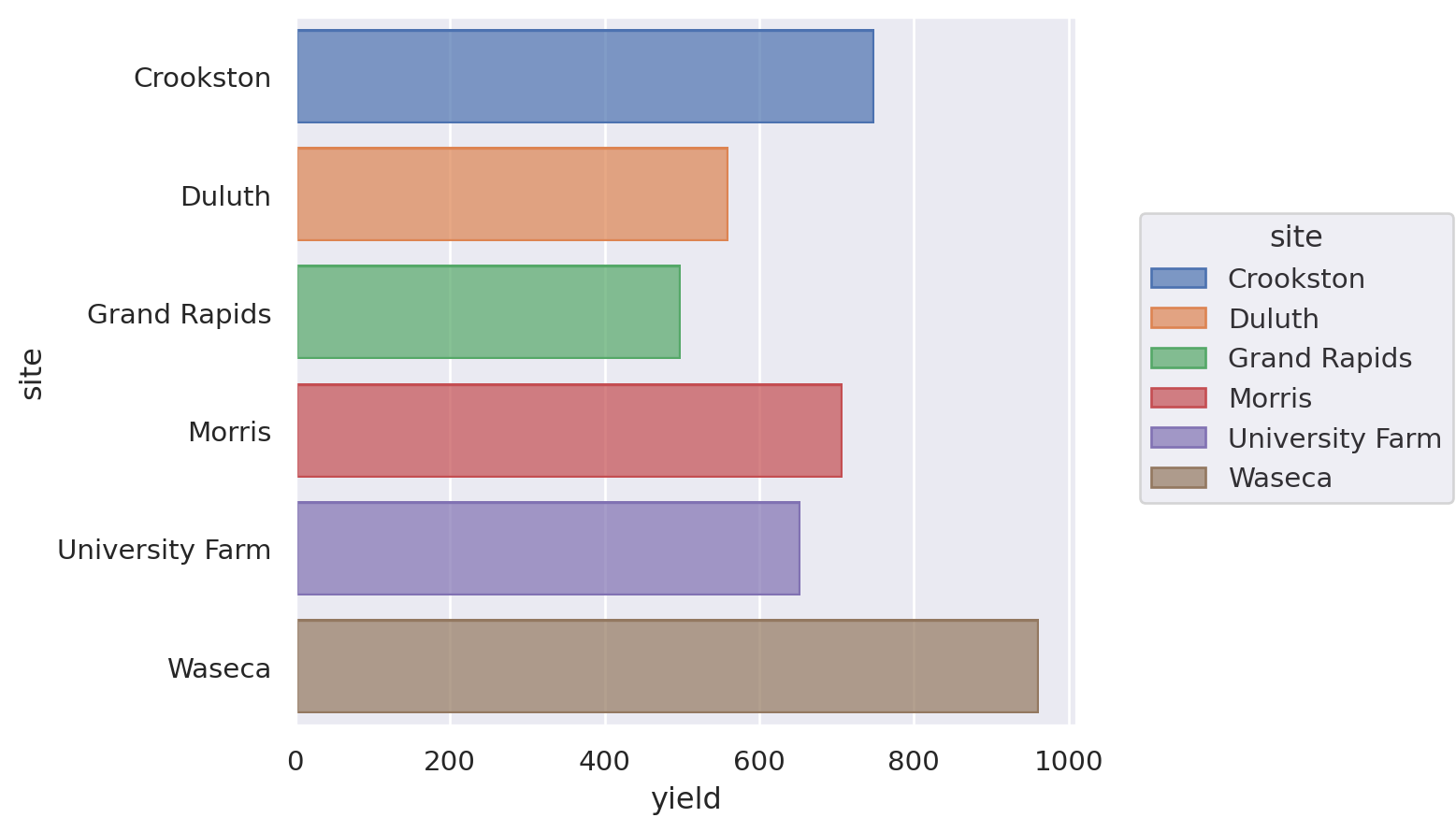
Bar chart#
Let’s see a bar chart, using the ‘barley’ dataset.
barley = data.barley()
barley = pd.DataFrame(barley.groupby(["site"])["yield"].sum())
barley.head()
| yield | |
|---|---|
| site | |
| Crookston | 748.39997 |
| Duluth | 559.93334 |
| Grand Rapids | 498.63334 |
| Morris | 708.00001 |
| University Farm | 653.33335 |
Matplotlib#
Just remove the ‘h’ in ax.barh() to get a vertical plot.
fig, ax = plt.subplots()
ax.barh(barley["yield"].index, barley["yield"], 0.35)
ax.set_xlabel("Yield")
plt.show()

Seaborn#
Just switch x and y variables to get a vertical plot.
(
so.Plot(barley.reset_index(), x="yield", y="site", color="site").add(
so.Bar(), so.Agg()
)
)
Lets-Plot#
Just omit coord_flip() to get a vertical plot.
(
ggplot(barley.reset_index(), aes(x="site", y="yield", fill="site"))
+ geom_bar(stat="identity")
+ coord_flip()
+ theme(legend_position="none")
)
Altair#
Just switch x and y to get a vertical plot.
alt.Chart(barley.reset_index()).mark_bar().encode(
y="site",
x="yield",
).properties(
width=alt.Step(40) # controls width of bar.
)
Plotly#
fig = px.bar(barley.reset_index(), y="site", x="yield")
fig.show()
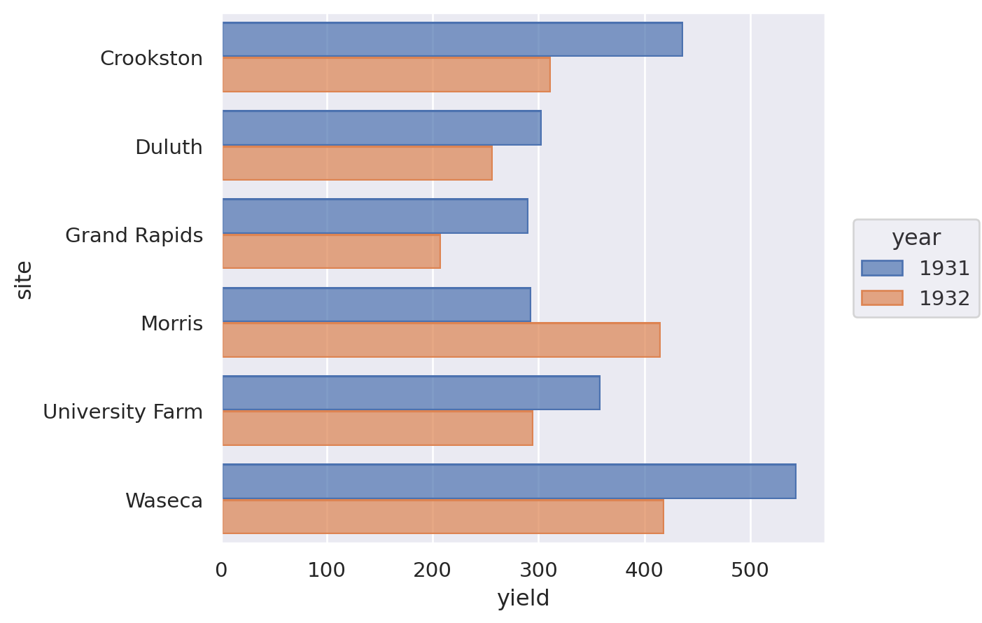
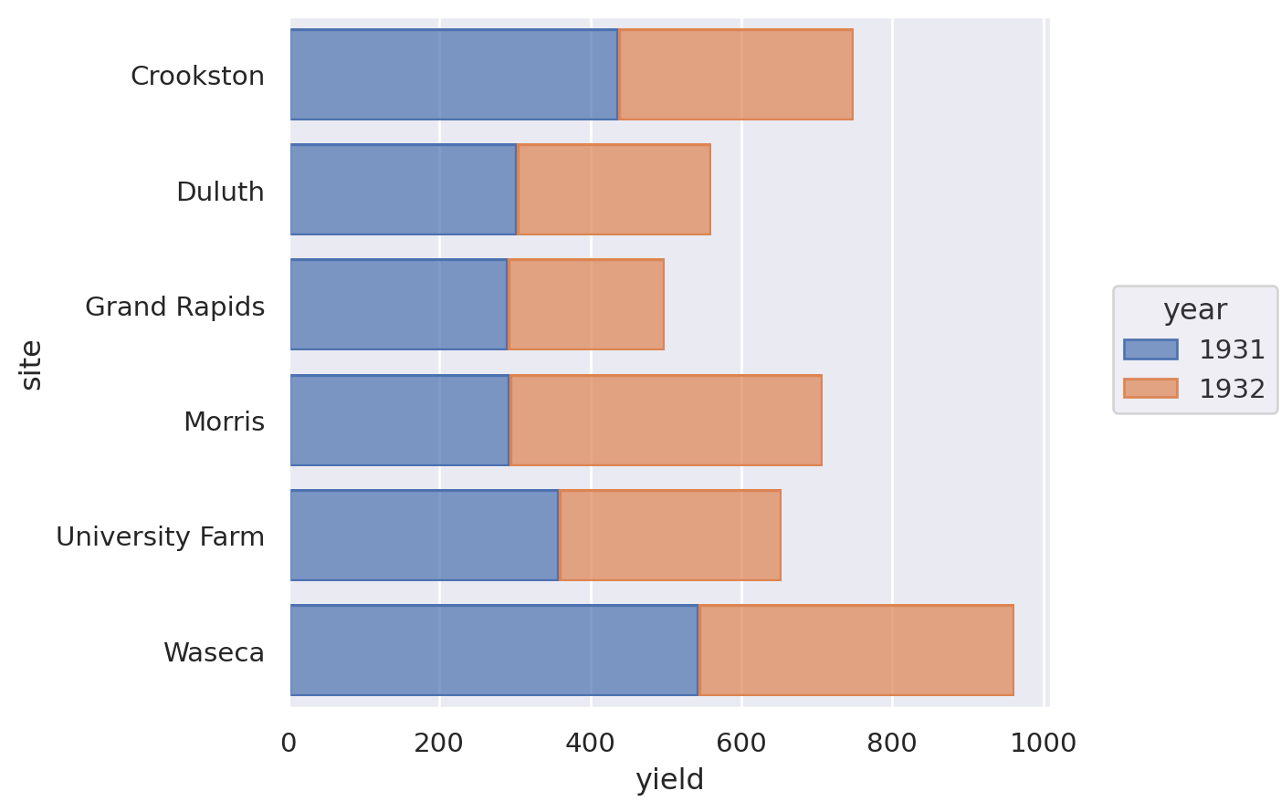
Grouped bar chart#
barley = data.barley()
barley = pd.DataFrame(barley.groupby(["site", "year"])["yield"].sum()).reset_index()
barley.head()
| site | year | yield | |
|---|---|---|---|
| 0 | Crookston | 1931 | 436.59999 |
| 1 | Crookston | 1932 | 311.79998 |
| 2 | Duluth | 1931 | 302.93333 |
| 3 | Duluth | 1932 | 257.00001 |
| 4 | Grand Rapids | 1931 | 290.53335 |
Matplotlib#
labels = barley["site"].unique()
y = np.arange(len(labels)) # the label locations
width = 0.35 # the width of the bars
fig, ax = plt.subplots()
ax.barh(y - width / 2, barley.loc[barley["year"] == 1931, "yield"], width, label="1931")
ax.barh(y + width / 2, barley.loc[barley["year"] == 1932, "yield"], width, label="1932")
# Add some text for labels, title and custom x-axis tick labels, etc.
ax.set_xlabel("Yield")
ax.set_yticks(y)
ax.set_yticklabels(labels)
ax.legend(frameon=False)
plt.show()

Seaborn#
barley["year"] = barley["year"].astype("category") # to force category
(
so.Plot(barley.reset_index(), x="yield", y="site", color="year").add(
so.Bar(), so.Dodge()
)
)
Lets-Plot#
(
ggplot(barley, aes(x="site", y="yield", group="year", fill=as_discrete("year")))
+ geom_bar(position="dodge", stat="identity")
+ coord_flip()
)
Altair#
alt.Chart(barley.reset_index()).mark_bar().encode(
y="year:O", x="yield", color="year:N", row="site:N"
).properties(
width=alt.Step(40) # controls width of bar.
)
Plotly#
px_barley = barley.reset_index()
# This prevents plotly from using a continuous scale for year
px_barley["year"] = px_barley["year"].astype("category")
fig = px.bar(px_barley, y="site", x="yield", barmode="group", color="year")
fig.show()
Stacked bar chart#
Matplotlib#
labels = barley["site"].unique()
y = np.arange(len(labels)) # the label locations
width = 0.35 # the width (or height) of the bars
fig, ax = plt.subplots()
ax.barh(y, barley.loc[barley["year"] == 1931, "yield"], width, label="1931")
ax.barh(
y,
barley.loc[barley["year"] == 1932, "yield"],
width,
label="1932",
left=barley.loc[barley["year"] == 1931, "yield"],
)
# Add some text for labels, title and custom x-axis tick labels, etc.
ax.set_xlabel("Yield")
ax.set_yticks(y)
ax.set_yticklabels(labels)
ax.legend(frameon=False)
plt.show()

Seaborn#
barley["year"] = barley["year"].astype("category") # to force category
(
so.Plot(barley.reset_index(), x="yield", y="site", color="year").add(
so.Bar(), so.Stack()
)
)
Lets-Plot#
(
ggplot(barley, aes(x="site", y="yield", fill=as_discrete("year")))
+ geom_bar(stat="identity")
+ coord_flip()
)
Altair#
alt.Chart(barley.reset_index()).mark_bar().encode(
y="site",
x="yield",
color="year:N",
).properties(
width=alt.Step(40) # controls width of bar.
)
Plotly#
fig = px.bar(px_barley, y="site", x="yield", barmode="relative", color="year")
fig.show()
Diverging stacked bar chart#
First, let’s create some data to use in our examples.
category_names = [
"Strongly disagree",
"Disagree",
"Neither agree nor disagree",
"Agree",
"Strongly agree",
]
results = [
[10, 15, 17, 32, 26],
[26, 22, 29, 10, 13],
[35, 37, 7, 2, 19],
[32, 11, 9, 15, 33],
[21, 29, 5, 5, 40],
[8, 19, 5, 30, 38],
]
likert_df = pd.DataFrame(
results, columns=category_names, index=[f"Question {i}" for i in range(1, 7)]
)
likert_df
| Strongly disagree | Disagree | Neither agree nor disagree | Agree | Strongly agree | |
|---|---|---|---|---|---|
| Question 1 | 10 | 15 | 17 | 32 | 26 |
| Question 2 | 26 | 22 | 29 | 10 | 13 |
| Question 3 | 35 | 37 | 7 | 2 | 19 |
| Question 4 | 32 | 11 | 9 | 15 | 33 |
| Question 5 | 21 | 29 | 5 | 5 | 40 |
| Question 6 | 8 | 19 | 5 | 30 | 38 |
Matplotlib#
middle_index = likert_df.shape[1] // 2
offsets = (
likert_df.iloc[:, range(middle_index)].sum(axis=1)
+ likert_df.iloc[:, middle_index] / 2
)
category_colors = plt.get_cmap("coolwarm_r")(
np.linspace(0.15, 0.85, likert_df.shape[1])
)
fig, ax = plt.subplots(figsize=(10, 5))
# Plot Bars
for i, (colname, color) in enumerate(zip(likert_df.columns, category_colors)):
widths = likert_df.iloc[:, i]
starts = likert_df.cumsum(axis=1).iloc[:, i] - widths - offsets
rects = ax.barh(
likert_df.index, widths, left=starts, height=0.5, label=colname, color=color
)
# Add Zero Reference Line
ax.axvline(0, linestyle="--", color="black", alpha=1, zorder=0, lw=0.3)
# X Axis
ax.set_xlim(-90, 90)
ax.set_xticks(np.arange(-90, 91, 10))
ax.xaxis.set_major_formatter(lambda x, pos: str(abs(int(x))))
# Y Axis
ax.invert_yaxis()
# Remove spines
ax.spines["right"].set_visible(False)
ax.spines["top"].set_visible(False)
ax.spines["left"].set_visible(False)
# Legend
ax.legend(
ncol=len(category_names),
bbox_to_anchor=(0, 1),
loc="lower left",
fontsize="small",
frameon=False,
)
# Set Background Color
fig.set_facecolor("#FFFFFF")
plt.show()

Kernel density estimate#
We’ll use the diamonds dataset to demonstrate this.
diamonds = sns.load_dataset("diamonds").sample(1000)
diamonds.head()
| carat | cut | color | clarity | depth | table | price | x | y | z | |
|---|---|---|---|---|---|---|---|---|---|---|
| 34807 | 0.31 | Very Good | G | IF | 60.8 | 56.0 | 878 | 4.41 | 4.44 | 2.69 |
| 32551 | 0.30 | Premium | F | VS1 | 59.8 | 60.0 | 799 | 4.39 | 4.31 | 2.60 |
| 6317 | 0.94 | Premium | E | SI2 | 62.4 | 58.0 | 4027 | 6.33 | 6.26 | 3.93 |
| 52993 | 1.29 | Fair | H | I1 | 67.7 | 62.0 | 2596 | 6.69 | 6.59 | 4.50 |
| 5934 | 0.90 | Fair | D | SI1 | 66.1 | 55.0 | 3945 | 5.98 | 5.92 | 3.93 |
Matplotlib#
Technically, there is a way to do this but it’s pretty inelegant if you want a quick plot. That’s because matplotlib doesn’t do the density estimation itself. Jake Vanderplas has a nice example but as it relies on a few extra libraries, we won’t reproduce it here.
Seaborn#
# Note that there isn't a clear way to do this in the seaborn objects API yet
sns.displot(diamonds, x="carat", kind="kde", hue="cut", fill=True);

Lets-Plot#
(ggplot(diamonds, aes(x="carat", fill="cut", colour="cut")) + geom_density(alpha=0.5))
Altair#
alt.Chart(diamonds).transform_density(
density="carat", as_=["carat", "density"], groupby=["cut"]
).mark_area(fillOpacity=0.5).encode(
x="carat:Q",
y="density:Q",
color="cut:N",
)
Plotly#
import plotly.figure_factory as ff
px_di = diamonds.pivot(columns="cut", values="carat")
ff.create_distplot(
[px_di[c].dropna() for c in px_di.columns],
group_labels=px_di.columns,
show_rug=False,
show_hist=False,
)
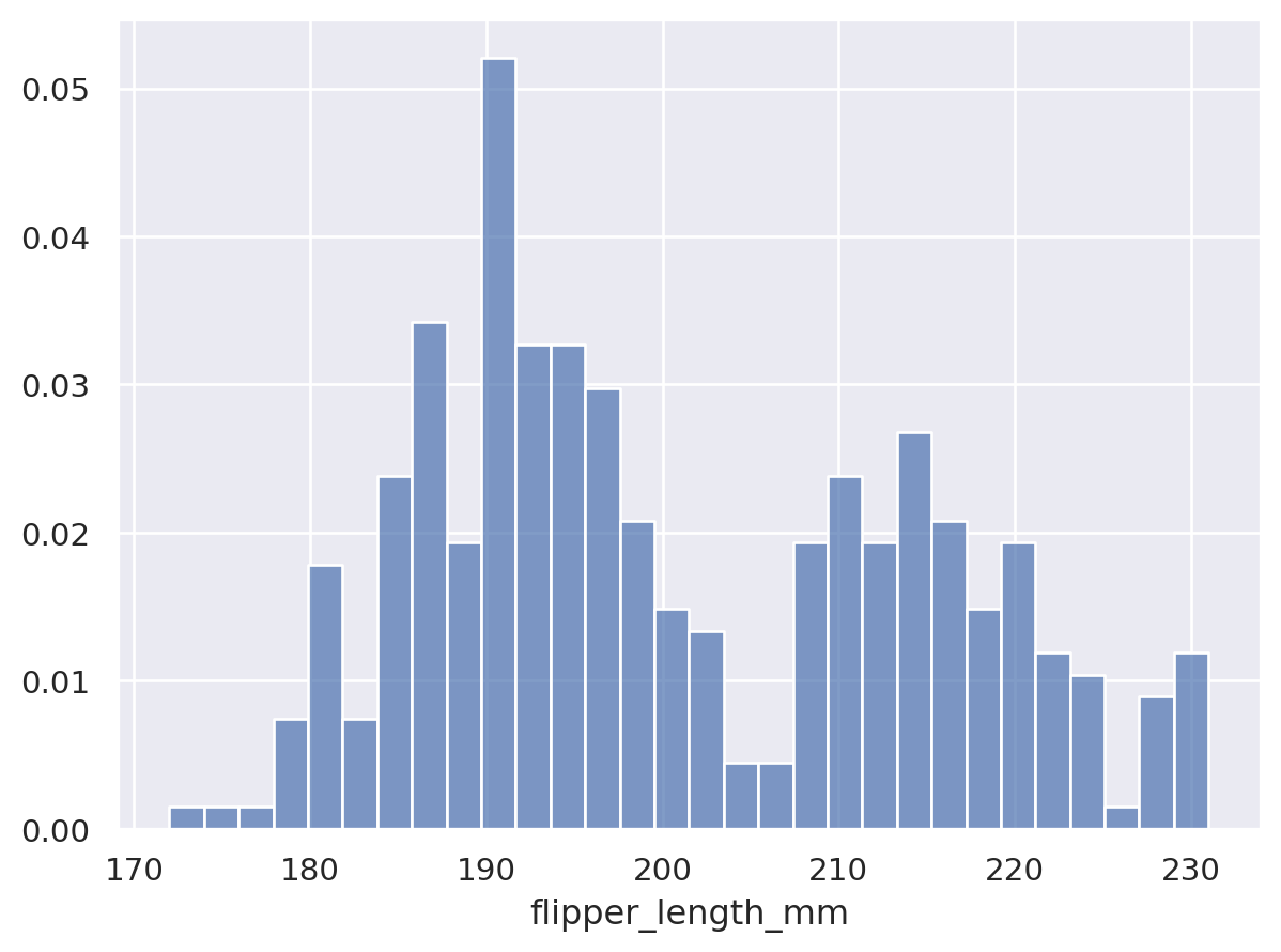
Histogram or probability density function#
For this, let’s go back to the penguins dataset.
penguins = sns.load_dataset("penguins")
penguins.head()
| species | island | bill_length_mm | bill_depth_mm | flipper_length_mm | body_mass_g | sex | |
|---|---|---|---|---|---|---|---|
| 0 | Adelie | Torgersen | 39.1 | 18.7 | 181.0 | 3750.0 | Male |
| 1 | Adelie | Torgersen | 39.5 | 17.4 | 186.0 | 3800.0 | Female |
| 2 | Adelie | Torgersen | 40.3 | 18.0 | 195.0 | 3250.0 | Female |
| 3 | Adelie | Torgersen | NaN | NaN | NaN | NaN | NaN |
| 4 | Adelie | Torgersen | 36.7 | 19.3 | 193.0 | 3450.0 | Female |
Matplotlib#
The density= keyword parameter decides whether to create counts or a probability density function.
fig, ax = plt.subplots()
ax.hist(penguins["flipper_length_mm"], bins=30, density=True, edgecolor="k")
ax.set_xlabel("Flipper length (mm)")
ax.set_ylabel("Probability density")
fig.tight_layout()
plt.show()

Seaborn#
(
so.Plot(penguins, x="flipper_length_mm").add(
so.Bars(), so.Hist(bins=30, stat="density")
)
)
Lets-Plot#
(
ggplot(penguins, aes(x="flipper_length_mm"))
+ geom_histogram(bins=30) # specify the binwidth
)
Altair#
alt.Chart(penguins).mark_bar().encode(
alt.X("flipper_length_mm:Q", bin=True),
y="count()",
)
Plotly#
fig = px.histogram(penguins, x="flipper_length_mm", nbins=30)
fig.show()
Marginal histograms#
Maplotlib#
Jaker Vanderplas’s excellent notes have a great example of this, but now there’s an easier way to do it with Matplotlib’s new constrained_layout options.
fig = plt.figure(constrained_layout=True)
# Create a layout with 3 panels in the given ratios
axes_dict = fig.subplot_mosaic(
[[".", "histx"], ["histy", "scat"]],
gridspec_kw={"width_ratios": [1, 7], "height_ratios": [2, 7]},
)
# Glue all the relevant axes together
axes_dict["histy"].invert_xaxis()
axes_dict["histx"].sharex(axes_dict["scat"])
axes_dict["histy"].sharey(axes_dict["scat"])
# Plot the data
axes_dict["scat"].scatter(penguins["bill_length_mm"], penguins["bill_depth_mm"])
axes_dict["histx"].hist(penguins["bill_length_mm"])
axes_dict["histy"].hist(penguins["bill_depth_mm"], orientation="horizontal");

Seaborn#
sns.jointplot(data=penguins, x="bill_length_mm", y="bill_depth_mm");

Lets-Plot#
from lets_plot.bistro.joint import *
(
joint_plot(penguins, x="bill_length_mm", y="bill_depth_mm", reg_line=False)
+ labs(x="Bill length (mm)", y="Bill depth (mm)")
)
Altair#
This is a bit fiddly.
base = alt.Chart(penguins)
xscale = alt.Scale(domain=(20, 60))
yscale = alt.Scale(domain=(10, 30))
area_args = {"opacity": 0.5, "interpolate": "step"}
points = base.mark_circle().encode(
alt.X("bill_length_mm", scale=xscale), alt.Y("bill_depth_mm", scale=yscale)
)
top_hist = (
base.mark_area(**area_args)
.encode(
alt.X(
"bill_length_mm:Q",
# when using bins, the axis scale is set through
# the bin extent, so we do not specify the scale here
# (which would be ignored anyway)
bin=alt.Bin(maxbins=30, extent=xscale.domain),
stack=None,
title="",
),
alt.Y("count()", stack=None, title=""),
)
.properties(height=60)
)
right_hist = (
base.mark_area(**area_args)
.encode(
alt.Y(
"bill_depth_mm:Q",
bin=alt.Bin(maxbins=30, extent=yscale.domain),
stack=None,
title="",
),
alt.X("count()", stack=None, title=""),
)
.properties(width=60)
)
top_hist & (points | right_hist)
Plotly#
fig = px.scatter(
penguins,
x="bill_length_mm",
y="bill_depth_mm",
marginal_x="histogram",
marginal_y="histogram",
)
fig.show()
Heatmap#
Heatmaps, or sometimes known as correlation maps, represent data in 3 dimensions by having two axes that forms a grid showing colour that corresponds to (usually) continuous values.
We’ll use the flights data to show the number of passengers by month-year:
flights = sns.load_dataset("flights")
flights = flights.pivot(index="month", columns="year", values="passengers").T
flights.head()
| month | Jan | Feb | Mar | Apr | May | Jun | Jul | Aug | Sep | Oct | Nov | Dec |
|---|---|---|---|---|---|---|---|---|---|---|---|---|
| year | ||||||||||||
| 1949 | 112 | 118 | 132 | 129 | 121 | 135 | 148 | 148 | 136 | 119 | 104 | 118 |
| 1950 | 115 | 126 | 141 | 135 | 125 | 149 | 170 | 170 | 158 | 133 | 114 | 140 |
| 1951 | 145 | 150 | 178 | 163 | 172 | 178 | 199 | 199 | 184 | 162 | 146 | 166 |
| 1952 | 171 | 180 | 193 | 181 | 183 | 218 | 230 | 242 | 209 | 191 | 172 | 194 |
| 1953 | 196 | 196 | 236 | 235 | 229 | 243 | 264 | 272 | 237 | 211 | 180 | 201 |
Matplotlib#
fig, ax = plt.subplots()
im = ax.imshow(flights.values, cmap="inferno")
cbar = ax.figure.colorbar(im, ax=ax)
ax.set_xticks(np.arange(len(flights.columns)))
ax.set_yticks(np.arange(len(flights.index)))
# Labels
ax.set_xticklabels(flights.columns, rotation=90)
ax.set_yticklabels(flights.index)
plt.show()

Seaborn#
sns.heatmap(flights);

Lets-Plot#
Lets-Plot uses tidy data, rather than the wide data preferred by matplotlib, so we need to first get the original format of the flights data back:
flights = sns.load_dataset("flights")
(
ggplot(flights, aes("month", as_discrete("year"), fill="passengers"))
+ geom_tile()
+ scale_y_reverse()
)
Altair#
alt.Chart(flights).mark_rect().encode(
x=alt.X("month", type="nominal", sort=None), y="year:O", color="passengers:Q"
)
Boxplot#
Let’s use the tips dataset:
tips = sns.load_dataset("tips")
tips.head()
| total_bill | tip | sex | smoker | day | time | size | |
|---|---|---|---|---|---|---|---|
| 0 | 16.99 | 1.01 | Female | No | Sun | Dinner | 2 |
| 1 | 10.34 | 1.66 | Male | No | Sun | Dinner | 3 |
| 2 | 21.01 | 3.50 | Male | No | Sun | Dinner | 3 |
| 3 | 23.68 | 3.31 | Male | No | Sun | Dinner | 2 |
| 4 | 24.59 | 3.61 | Female | No | Sun | Dinner | 4 |
Matplotlib#
There isn’t a very direct way to create multiple box plots of different data in matplotlib in the case where the groups are unbalanced, so we create several different boxplot objects.
colormap = plt.cm.Set1
colorst = [colormap(i) for i in np.linspace(0, 0.9, len(tips["time"].unique()))]
fig, ax = plt.subplots()
for i, grp in enumerate(tips["time"].unique()):
bplot = ax.boxplot(
tips.loc[tips["time"] == grp, "tip"],
positions=[i],
vert=True, # vertical box alignment
patch_artist=True, # fill with color
labels=[grp],
) # X label
for patch in bplot["boxes"]:
patch.set_facecolor(colorst[i])
ax.set_ylabel("Tip")
plt.show()

Seaborn#
sns.boxplot(data=tips, x="time", y="tip");

Lets-Plot#
(ggplot(tips) + geom_boxplot(aes(y="tip", x="time", fill="time")))
Altair#
alt.Chart(tips).mark_boxplot(size=50).encode(
x="time:N", y="tip:Q", color="time:N"
).properties(width=300)
Plotly#
fig = px.box(tips, x="time", y="tip", color="time")
fig.show()
Violin plot#
We’ll use the same data as before, the tips dataset.
Matplotlib#
colormap = plt.cm.Set1
colorst = [colormap(i) for i in np.linspace(0, 0.9, len(tips["time"].unique()))]
fig, ax = plt.subplots()
for i, grp in enumerate(tips["time"].unique()):
vplot = ax.violinplot(
tips.loc[tips["time"] == grp, "tip"], positions=[i], vert=True
)
labels = list(tips["time"].unique())
ax.set_xticks(np.arange(len(labels)))
ax.set_xticklabels(labels)
ax.set_ylabel("Tip")
plt.show()

Seaborn#
sns.violinplot(data=tips, x="time", y="tip");

Lets-Plot#
(ggplot(tips, aes(x="time", y="tip", fill="time")) + geom_violin())
Altair#
alt.Chart(tips).transform_density(
"tip", as_=["tip", "density"], groupby=["time"]
).mark_area(orient="horizontal").encode(
y="tip:Q",
color="time:N",
x=alt.X(
"density:Q",
stack="center",
impute=None,
title=None,
axis=alt.Axis(labels=False, values=[0], grid=False, ticks=True),
),
column=alt.Column(
"time:N",
header=alt.Header(
titleOrient="bottom",
labelOrient="bottom",
labelPadding=0,
),
),
).properties(width=100).configure_facet(spacing=0).configure_view(stroke=None)
Plotly#
fig = px.violin(
tips,
y="tip",
x="time",
color="time",
box=True,
points="all",
hover_data=tips.columns,
)
fig.show()
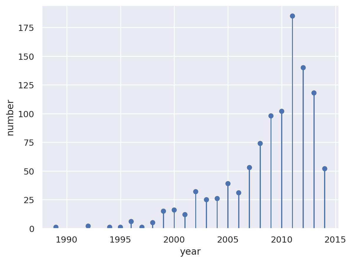
Lollipop#
planets = sns.load_dataset("planets").groupby("year")["number"].count()
planets.head()
year
1989 1
1992 2
1994 1
1995 1
1996 6
Name: number, dtype: int64
Matplotlib#
fig, ax = plt.subplots()
ax.stem(planets.index, planets)
ax.yaxis.tick_right()
ax.spines["left"].set_visible(False)
ax.set_ylim(0, 200)
ax.set_title("Number of exoplanets discovered per year")
plt.show()

Seaborn#
(
so.Plot(planets.reset_index(), x="year", y="number")
.add(so.Dot(), so.Agg("sum"))
.add(so.Bar(width=0.1), so.Agg("sum"))
)
Lets-Plot#
(
ggplot(planets.reset_index(), aes(x="year", y="number"))
+ geom_lollipop()
+ ggtitle("Number of exoplanets discovered per year")
+ scale_x_continuous(format="d")
)
Plotly#
import plotly.graph_objects as go
px_df = planets.reset_index()
fig1 = go.Figure()
# Draw points
fig1.add_trace(
go.Scatter(
x=px_df["year"],
y=px_df["number"],
mode="markers",
marker_color="darkblue",
marker_size=10,
)
)
# Draw lines
for index, row in px_df.iterrows():
fig1.add_shape(type="line", x0=row["year"], y0=0, x1=row["year"], y1=row["number"])
fig1.show()
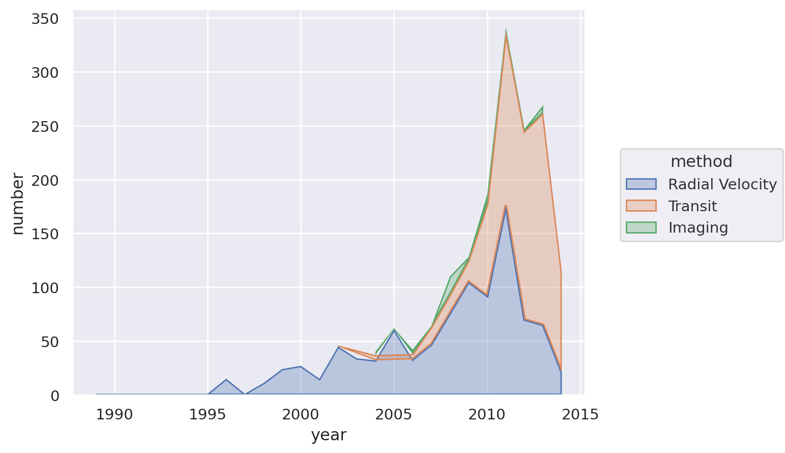
Overlapping Area plot#
For this, let’s look at the dominance of the three most used methods for detecting exoplanets.
planets = sns.load_dataset("planets")
most_pop_methods = (
planets.groupby(["method"])["number"]
.sum()
.sort_values(ascending=False)
.index[:3]
.values
)
planets = planets[planets["method"].isin(most_pop_methods)]
planets.head()
| method | number | orbital_period | mass | distance | year | |
|---|---|---|---|---|---|---|
| 0 | Radial Velocity | 1 | 269.300 | 7.10 | 77.40 | 2006 |
| 1 | Radial Velocity | 1 | 874.774 | 2.21 | 56.95 | 2008 |
| 2 | Radial Velocity | 1 | 763.000 | 2.60 | 19.84 | 2011 |
| 3 | Radial Velocity | 1 | 326.030 | 19.40 | 110.62 | 2007 |
| 4 | Radial Velocity | 1 | 516.220 | 10.50 | 119.47 | 2009 |
Matplotlib#
The easiest way to do this in matplotlib is to adjust the data a bit first and then use the built-in pandas plot function. (This is true in other cases too, but in this case it’s much more complex otherwise).
(
planets.groupby(["year", "method"])["number"]
.sum()
.unstack()
.plot.area(alpha=0.6, ylim=(0, None))
.set_title("Planets dicovered by top 3 methods", loc="left")
);

Seaborn#
(
so.Plot(
planets.groupby(["year", "method"])["number"].sum().reset_index(),
x="year",
y="number",
color="method",
).add(so.Area(alpha=0.3), so.Agg(), so.Stack())
)
Lets-Plot#
(
ggplot(
planets.groupby(["year", "method"])["number"].sum().reset_index(),
aes(x="year", y="number", fill="method", group="method", color="method"),
)
+ geom_area(stat="identity", alpha=0.5)
+ scale_x_continuous(format="d")
)
Altair#
alt.Chart(
planets.groupby(["year", "method"])["number"]
.sum()
.reset_index()
.assign(
year=lambda x: pd.to_datetime(x["year"], format="%Y")
+ pd.tseries.offsets.YearEnd()
)
).mark_area().encode(x="year:T", y="number:Q", color="method:N")
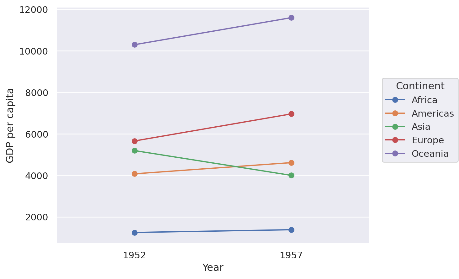
Slope chart#
A slope chart has two points connected by a line and is good for indicating how relationships between variables have changed over time.
df = pd.read_csv(
"https://raw.githubusercontent.com/selva86/datasets/master/gdppercap.csv"
)
df = pd.melt(
df,
id_vars=["continent"],
value_vars=df.columns[1:],
value_name="GDP per capita",
var_name="Year",
).rename(columns={"continent": "Continent"})
df.head()
| Continent | Year | GDP per capita | |
|---|---|---|---|
| 0 | Africa | 1952 | 1252.572466 |
| 1 | Americas | 1952 | 4079.062552 |
| 2 | Asia | 1952 | 5195.484004 |
| 3 | Europe | 1952 | 5661.057435 |
| 4 | Oceania | 1952 | 10298.085650 |
Matplotlib#
There isn’t an off-the-shelf way to do this in matplotlib but the example below shows that, with matplotlib, where there’s a will there’s a way! It’s where the ‘build-what-you-want’ comes into its own. Note that the functino that’s defined returns an Axes object so that you can do further processing and tweaking as you like.
from matplotlib import lines as mlines
def slope_plot(data, x, y, group, before_txt="Before", after_txt="After"):
if len(data[x].unique()) != 2:
raise ValueError("Slope plot must have two unique periods.")
wide_data = data[[x, y, group]].pivot(index=group, columns=x, values=y)
x_names = list(wide_data.columns)
fig, ax = plt.subplots()
def newline(p1, p2, color="black"):
ax = plt.gca()
line = mlines.Line2D(
[p1[0], p2[0]],
[p1[1], p2[1]],
color="red" if p1[1] - p2[1] > 0 else "green",
marker="o",
markersize=6,
)
ax.add_line(line)
return line
# Vertical Lines
y_min = data[y].min()
y_max = data[y].max()
ax.vlines(
x=1,
ymin=y_min,
ymax=y_max,
color="black",
alpha=0.7,
linewidth=1,
linestyles="dotted",
)
ax.vlines(
x=3,
ymin=y_min,
ymax=y_max,
color="black",
alpha=0.7,
linewidth=1,
linestyles="dotted",
)
# Points
ax.scatter(
y=wide_data[x_names[0]],
x=np.repeat(1, wide_data.shape[0]),
s=15,
color="black",
alpha=0.7,
)
ax.scatter(
y=wide_data[x_names[1]],
x=np.repeat(3, wide_data.shape[0]),
s=15,
color="black",
alpha=0.7,
)
# Line Segmentsand Annotation
for p1, p2, c in zip(wide_data[x_names[0]], wide_data[x_names[1]], wide_data.index):
newline([1, p1], [3, p2])
ax.text(
1 - 0.05,
p1,
c,
horizontalalignment="right",
verticalalignment="center",
fontdict={"size": 14},
)
ax.text(
3 + 0.05,
p2,
c,
horizontalalignment="left",
verticalalignment="center",
fontdict={"size": 14},
)
# 'Before' and 'After' Annotations
ax.text(
1 - 0.05,
y_max + abs(y_max) * 0.1,
before_txt,
horizontalalignment="right",
verticalalignment="center",
fontdict={"size": 16, "weight": 700},
)
ax.text(
3 + 0.05,
y_max + abs(y_max) * 0.1,
after_txt,
horizontalalignment="left",
verticalalignment="center",
fontdict={"size": 16, "weight": 700},
)
# Decoration
ax.set(
xlim=(0, 4), ylabel=y, ylim=(y_min - 0.1 * abs(y_min), y_max + abs(y_max) * 0.1)
)
ax.set_xticks([1, 3])
ax.set_xticklabels(x_names)
# Lighten borders
for ax_pos in ["top", "bottom", "right", "left"]:
ax.spines[ax_pos].set_visible(False)
return ax
slope_plot(df, x="Year", y="GDP per capita", group="Continent");

Seaborn#
(
so.Plot(df, x="Year", y="GDP per capita", color="Continent")
.add(so.Line(marker="o"), so.Agg())
.add(so.Range())
)
Lets-Plot#
(
ggplot(df, aes(x="Year", y="GDP per capita", group="Continent"))
+ geom_line(aes(color="Continent"), size=1)
+ geom_point(aes(color="Continent"), size=4)
)
Altair#
alt.Chart(df).mark_line().encode(x="Year:O", y="GDP per capita", color="Continent")
Plotly#
import plotly.graph_objects as go
yr_names = [int(x) for x in df["Year"].unique()]
px_df = (
df.pivot(index="Continent", columns="Year", values="GDP per capita")
.reset_index()
.rename(columns=dict(zip(df["Year"].unique(), range(len(df["Year"].unique())))))
)
x_offset = 5
fig1 = go.Figure()
# Draw lines
for index, row in px_df.iterrows():
fig1.add_shape(
type="line",
x0=yr_names[0],
y0=row[0],
x1=yr_names[1],
y1=row[1],
name=row["Continent"],
line=dict(color=px.colors.qualitative.Plotly[index]),
)
fig1.add_trace(
go.Scatter(
x=[yr_names[0]],
y=[row[0]],
text=row["Continent"],
mode="text",
name=None,
)
)
fig1.update_xaxes(range=[yr_names[0] - x_offset, yr_names[1] + x_offset])
fig1.update_yaxes(
range=[px_df[[0, 1]].min().min() * 0.8, px_df[[0, 1]].max().max() * 1.2]
)
fig1.update_layout(showlegend=False)
fig1.show()
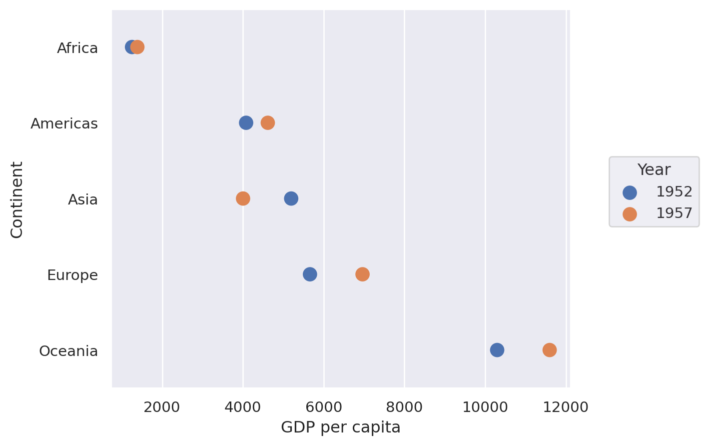
Dumbbell Plot#
These are excellent for showing a change in time with a large number of categories, as we will do here with continents and mean GDP per capita.
df = pd.read_csv(
"https://raw.githubusercontent.com/selva86/datasets/master/gdppercap.csv"
)
df = pd.melt(
df,
id_vars=["continent"],
value_vars=df.columns[1:],
value_name="GDP per capita",
var_name="Year",
).rename(columns={"continent": "Continent"})
df.head()
| Continent | Year | GDP per capita | |
|---|---|---|---|
| 0 | Africa | 1952 | 1252.572466 |
| 1 | Americas | 1952 | 4079.062552 |
| 2 | Asia | 1952 | 5195.484004 |
| 3 | Europe | 1952 | 5661.057435 |
| 4 | Oceania | 1952 | 10298.085650 |
Matplotlib#
Again, no off-the-shelf method–but that’s no problem when you can build it yourself.
def dumbbell_plot(data, x, y, change):
if len(data[x].unique()) != 2:
raise ValueError("Dumbbell plot must have two unique periods.")
if not isinstance(data[y].iloc[0], str):
raise ValueError("Dumbbell plot y variable only works with category values.")
wide_data = data[[x, y, change]].pivot(index=y, columns=x, values=change)
x_names = list(wide_data.columns)
y_names = list(wide_data.index)
def newline(p1, p2, color="black"):
ax = plt.gca()
line = mlines.Line2D([p1[0], p2[0]], [p1[1], p2[1]], color="skyblue", zorder=0)
ax.add_line(line)
return line
fig, ax = plt.subplots()
# Points
ax.scatter(
y=range(len(y_names)),
x=wide_data[x_names[1]],
s=50,
color="#0e668b",
alpha=0.9,
zorder=2,
label=x_names[1],
)
ax.scatter(
y=range(len(y_names)),
x=wide_data[x_names[0]],
s=50,
color="#a3c4dc",
alpha=0.9,
zorder=1,
label=x_names[0],
)
# Line segments
for i, p1, p2 in zip(
range(len(y_names)), wide_data[x_names[0]], wide_data[x_names[1]]
):
newline([p1, i], [p2, i])
ax.set_yticks(range(len(y_names)))
ax.set_yticklabels(y_names)
# Decoration
# Lighten borders
for ax_pos in ["top", "right", "left"]:
ax.spines[ax_pos].set_visible(False)
ax.set_xlabel(change)
ax.legend(frameon=False, loc="lower right")
plt.show()
dumbbell_plot(df, x="Year", y="Continent", change="GDP per capita")

Seaborn#
(
so.Plot(df, y="Continent", x="GDP per capita", color="Year").add(
so.Dots(pointsize=10, fillalpha=1)
)
)
Lets-Plot#
(
ggplot(df, aes(y="Continent", x="GDP per capita", group="Continent"))
+ geom_line(color="black", size=2)
+ geom_point(aes(color="Year"), size=5)
+ ggsize(400, 500)
)
Plotly#
import plotly.graph_objects as go
fig1 = go.Figure()
yr_names = df["Year"].unique()
# Draw lines
for i, cont in enumerate(df["Continent"].unique()):
cdf = df[df["Continent"] == cont]
fig1.add_shape(
type="line",
x0=cdf.loc[cdf["Year"] == yr_names[0], "GDP per capita"].values[0],
y0=cont,
x1=cdf.loc[cdf["Year"] == yr_names[1], "GDP per capita"].values[0],
y1=cont,
line=dict(color=px.colors.qualitative.Plotly[0], width=2),
)
# Draw points
for i, year in enumerate(yr_names):
yrdf = df[df["Year"] == year]
fig1.add_trace(
go.Scatter(
y=yrdf["Continent"],
x=yrdf["GDP per capita"],
mode="markers",
name=year,
marker_color=px.colors.qualitative.Plotly[i],
marker_size=10,
),
)
fig1.show()
Polar#
I’m not sure I’ve ever seen a polar plots in economics, but you never know.
Let’s generate some polar data first:
r = np.arange(0, 2, 0.01)
theta = 2 * np.pi * r
polar_data = pd.DataFrame({"r": r, "theta": theta})
polar_data.head()
| r | theta | |
|---|---|---|
| 0 | 0.00 | 0.000000 |
| 1 | 0.01 | 0.062832 |
| 2 | 0.02 | 0.125664 |
| 3 | 0.03 | 0.188496 |
| 4 | 0.04 | 0.251327 |
Matplotlib#
ax = plt.subplot(111, projection="polar")
ax.plot(polar_data["theta"], polar_data["r"])
ax.set_rmax(2)
ax.set_rticks([0.5, 1, 1.5, 2]) # Fewer radial ticks
ax.set_rlabel_position(-22.5) # Move radial labels away from plotted line
ax.grid(True)
plt.show()

Plotly#
fig = go.Figure(
data=go.Scatterpolar(
r=polar_data["r"].values,
theta=polar_data["theta"].values * 180 / (np.pi),
mode="lines",
)
)
fig.update_layout(showlegend=False)
fig.show()
Radar (or spider) chart#
Let’s generate some synthetic data for this one. Assumes that result to be shown is the sum of observations.
df = pd.DataFrame(
dict(
zip(
["var" + str(i) for i in range(1, 6)],
[np.random.randint(30, size=(4)) for i in range(1, 6)],
)
)
)
df.head()
| var1 | var2 | var3 | var4 | var5 | |
|---|---|---|---|---|---|
| 0 | 23 | 9 | 8 | 20 | 14 |
| 1 | 7 | 19 | 7 | 18 | 8 |
| 2 | 22 | 4 | 19 | 24 | 8 |
| 3 | 6 | 6 | 6 | 15 | 14 |
from math import pi
def radar_plot(data, variables):
n_vars = len(variables)
# Plot the first line of the data frame.
# Repeat the first value to close the circular graph:
values = data.loc[data.index[0], variables].values.flatten().tolist()
values += values[:1]
# What will be the angle of each axis in the plot? (we divide / number of variable)
angles = [n / float(n_vars) * 2 * pi for n in range(n_vars)]
angles += angles[:1]
# Initialise the spider plot
ax = plt.subplot(111, polar=True)
# Draw one axe per variable + add labels
plt.xticks(angles[:-1], variables)
# Draw ylabels
ax.set_rlabel_position(0)
# Plot data
ax.plot(angles, values, linewidth=1, linestyle="solid")
# Fill area
ax.fill(angles, values, "b", alpha=0.1)
return ax
radar_plot(df, df.columns);

Plotly#
df = px.data.wind()
print(df.head())
fig = px.line_polar(
df,
r="frequency",
theta="direction",
color="strength",
line_close=True,
color_discrete_sequence=px.colors.sequential.Plasma_r,
template="plotly_dark",
)
fig.show()
direction strength frequency
0 N 0-1 0.5
1 NNE 0-1 0.6
2 NE 0-1 0.5
3 ENE 0-1 0.4
4 E 0-1 0.4
Wordcloud#
These should be used sparingly. Let’s grab part of a famous text from Project Gutenberg:
# To run this example, download smith_won.txt from
# https://github.com/aeturrell/coding-for-economists/blob/main/data/smith_won.txt
# and put it in a sub-folder called 'data
book_text = open(Path("data", "smith_won.txt"), "r", encoding="utf-8").read()
# Print some lines
print("\n".join(book_text.split("\n")[107:117]))
anywhere directed, or applied, seem to have been the effects of the
division of labour. The effects of the division of labour, in the general
business of society, will be more easily understood, by considering in
what manner it operates in some particular manufactures. It is commonly
supposed to be carried furthest in some very trifling ones; not perhaps
that it really is carried further in them than in others of more
importance: but in those trifling manufactures which are destined to
supply the small wants of but a small number of people, the whole number
of workmen must necessarily be small; and those employed in every
different branch of the work can often be collected into the same
from wordcloud import WordCloud
wordcloud = WordCloud(width=700, height=400).generate(book_text)
fig, ax = plt.subplots(facecolor="k")
ax.imshow(wordcloud, interpolation="bilinear")
plt.axis("off")
plt.tight_layout();

We can also create a ‘mask’ for the wordcloud to shape it how we like, here in the shape of a book.
# To run this example, download book_mask.png from
# https://github.com/aeturrell/coding-for-economists/raw/main/data/book_mask.png
# and put it in a sub-folder called 'data
from PIL import Image
mask = np.array(Image.open(Path("data", "book_mask.png")))
wc = WordCloud(width=700, height=400, mask=mask, background_color="white")
wordcloud = wc.generate(book_text)
fig, ax = plt.subplots(facecolor="white")
ax.imshow(wordcloud, interpolation="bilinear")
plt.axis("off")
plt.tight_layout();

Network diagrams#
networkx#
The most well-established network visualisation package is networkx, which does a lot more than just visualisation. It has many different positioning options for rendering any given network, for instance in circular, spectral, spring, Fruchterman-Reingold, or other styles. In the below example, we use a pandas dataframe to specify the edges in two columns but there are various other ways to specify the network too, including ones that do not rely on pandas.
The underlying plot is rendered with matplotlib, meaning that you can customise it further should you need to. You can pass an Axes object ax to nx.draw() using nx.draw(..., ax=ax).
import networkx as nx
df = pd.DataFrame(
{
"source": ["A", "B", "C", "A", "E", "F", "E", "G", "G", "D", "F"],
"target": ["D", "A", "E", "C", "A", "F", "G", "D", "B", "G", "C"],
}
)
G = nx.from_pandas_edgelist(df)
nx.draw(G, with_labels=True, node_size=500, node_color="skyblue")

Ridge, or ‘joy’, plots#
These are famous from the front cover of “Unkown Pleasures” by Joy Division. Let’s look at an example showing the global increase in temperature.
We’ll use a summary of the daily land-surface average temperature anomaly produced by the Berkeley Earth averaging method. Temperatures are in Celsius and reported as anomalies relative to the Jan 1951-Dec 1980 average (the estimated Jan 1951-Dec 1980 land-average temperature is 8.63 +/- 0.06 C).
# To run this example, download the pickle file from
# https://github.com/aeturrell/coding-for-economists/blob/main/data/berkeley_data.pkl
# and put it in a sub-folder called 'data'
df = pd.read_pickle(Path("data/berkeley_data.pkl"))
df.head()
| Date Number | Year | Month | Day | Day of Year | Anomaly | |
|---|---|---|---|---|---|---|
| 0 | 1880.001 | 1880 | 1 | 1 | 1 | -0.786 |
| 1 | 1880.004 | 1880 | 1 | 2 | 2 | -0.695 |
| 2 | 1880.007 | 1880 | 1 | 3 | 3 | -0.783 |
| 3 | 1880.01 | 1880 | 1 | 4 | 4 | -0.725 |
| 4 | 1880.012 | 1880 | 1 | 5 | 5 | -0.802 |
Lets-Plot#
final_year = df["Year"].max()
first_year = df["Year"].min()
breaks = [y for y in list(df.Year.unique()) if y % 10 == 0]
(
ggplot(df, aes("Anomaly", "Year", fill="Year"))
+ geom_area_ridges(scale=20, alpha=1, size=0.2, trim=True, show_legend=False)
+ scale_y_continuous(breaks=breaks, trans="reverse")
+ scale_fill_viridis(option="inferno")
+ ggtitle(
"Global daily temperature anomaly {0}-{1} \n(°C above 1951-80 average)".format(
first_year, final_year
)
)
)
Contour Plot#
Contour plots can help you show how a third variable, Z, varies with both X and Y (ie Z is a surface). The way that Z is depicted could be via the density of lines drawn in the X-Y plane (use ax.contour() for this) or via colour, as in the example below (using ax.contourf()).
The heatmap (or contour plot) below, which has a colour bar legend and a title that’s rendered with latex, uses a perceptually uniform distribution that makes equal changes look equal; matplotlib has a few of these. If you need more colours, check out the packages colorcet and palettable.
Matplotlib#
Note that, in the below, Z is returned by a function that accepts a grid of X and Y values.
def f(x, y):
return np.sin(x) ** 10 + np.cos(10 + y * x) * np.cos(x)
x = np.linspace(0, 5, 100)
y = np.linspace(0, 5, 100)
X, Y = np.meshgrid(x, y)
Z = f(X, Y)
fig, ax = plt.subplots()
cf = ax.contourf(X, Y, Z, cmap="plasma")
ax.set_title(r"$f(x,y) = \sin^{10}(x) + \cos(x)\cos\left(10 + y\cdot x\right)$")
cbar = fig.colorbar(cf);

Lets-Plot#
contour_data = {"x": X.flatten(), "y": Y.flatten(), "z": Z.flatten()}
(
ggplot(contour_data)
+ geom_contourf(aes(x="x", y="y", z="z", fill="..level.."))
+ scale_fill_viridis(option="plasma")
+ ggtitle("Maths equations don't currently work")
)
Plotly#
import plotly.graph_objects as go
grid_fig = go.Figure(data=go.Contour(z=Z, x=x, y=y))
grid_fig.show()
Waterfall chart#
Waterfall charts are good for showing how different contributions combine to net out at a certain value. There’s a package dedicated to them called waterfallcharts. It builds on matplotlib. First, let’s create some data:
a = ["sales", "returns", "credit fees", "rebates", "late charges", "shipping"]
b = [10, -30, -7.5, -25, 95, -7]
Now let’s plot this data. Because the defaults of waterfallcharts don’t play that nicely with the plot style used for this book, we’ll temporarily switch back to the matplotlib default plot style using a context and with statement:
import waterfall_chart
with plt.style.context("default"):
plot = waterfall_chart.plot(a, b, sorted_value=True, rotation_value=0)

Plotly#
import plotly.graph_objects as go
px_b = b + [sum(b)]
fig = go.Figure(
go.Waterfall(
name="20",
orientation="v",
measure=["relative"] * len(a) + ["total"],
x=a + ["net"],
textposition="outside",
text=[str(x) for x in b] + ["net"],
y=px_b,
connector={"line": {"color": "rgb(63, 63, 63)"}},
)
)
fig.show()
Venn#
Venn diagrams show the overlap between groups. As with some of these other, more unsual chart types, there’s a special package that produces these and which builds on matplotlib.
from matplotlib_venn import venn2
venn2(subsets=(10, 5, 2), set_labels=("Group A", "Group B"), alpha=0.5)
plt.show()

Priestley Timeline#
This displays a timeline of start and end events in time, and their overlap.
df = pd.read_csv(
"https://github.com/aeturrell/coding-for-economists/raw/main/data/priestley-timeline.csv",
parse_dates=["Born", "Died"],
dayfirst=True,
)
df = df.sort_values("Born")
# Create the plot
fig, ax = plt.subplots(figsize=(12, 6))
for i, (index, row) in enumerate(df.iterrows()):
lifespan = (row["Died"] - row["Born"]).days
bar = ax.barh(len(df) - 1 - i, lifespan, left=row["Born"], height=0.5)
text_x = row["Born"] + pd.Timedelta(days=lifespan / 2)
# Add text inside the bar
ax.text(
text_x,
len(df) - 1 - i,
row["Name"],
va="center",
ha="center",
color="k",
fontweight="bold",
fontsize=8,
)
ax.set_yticks([])
plt.xlabel("Year")
plt.show()

Waffle, isotype, or pictogram charts#
These are great for showing easily-understandable magnitudes.
Matplotlib#
There is a package called pywaffle that provides a convenient way of doing this. It expects a dictionary of values. Note that the icon can be changed and, because it builds on matplotlib, you can tweak to your heart’s content.
from pywaffle import Waffle
data = {"Democratic": 48, "Republican": 46, "Libertarian": 3}
fig = plt.figure(
FigureClass=Waffle,
rows=5,
values=data,
colors=["#232066", "#983D3D", "#DCB732"],
legend={"loc": "upper left", "bbox_to_anchor": (1, 1)},
icons="child",
font_size=12,
icon_legend=True,
)
plt.show()

Lets-Plot#
As ever, Lets-Plot prefers tidy format data. We’ll create a mini dataset just to demonstrate its use:
import itertools
df = pd.DataFrame(list(itertools.product(range(10), range(10))), columns=["x", "y"])
df["filled"] = 0
df.iloc[:32, 2] = 1
df.head()
| x | y | filled | |
|---|---|---|---|
| 0 | 0 | 0 | 1 |
| 1 | 0 | 1 | 1 |
| 2 | 0 | 2 | 1 |
| 3 | 0 | 3 | 1 |
| 4 | 0 | 4 | 1 |
g = (
ggplot(df, aes(x="x", y="y", fill=as_discrete("filled")))
+ geom_tile(alpha=0.5, color="black")
+ scale_fill_manual(["green", "blue"])
+ coord_flip()
+ geom_text(x=5, y=5, label=f"{int(100*df.filled.mean())}%", size=30, color="white")
+ theme(
axis=element_blank(),
panel_grid_major=element_blank(),
panel_grid_minor=element_blank(),
)
+ xlab("")
+ ylab("")
)
g
Pyramid#
df = pd.read_csv(
"https://raw.githubusercontent.com/selva86/datasets/master/email_campaign_funnel.csv"
)
df.head()
| Stage | Gender | Users | |
|---|---|---|---|
| 0 | Stage 01: Browsers | Male | -1.492762e+07 |
| 1 | Stage 02: Unbounced Users | Male | -1.286266e+07 |
| 2 | Stage 03: Email Signups | Male | -1.136190e+07 |
| 3 | Stage 04: Email Confirmed | Male | -9.411708e+06 |
| 4 | Stage 05: Campaign-Email Opens | Male | -8.074317e+06 |
Matplotlib/Seaborn#
fig, ax = plt.subplots()
group_col = "Gender"
order_of_bars = df.Stage.unique()[::-1]
colors = [
plt.cm.Spectral(i / float(len(df[group_col].unique()) - 1))
for i in range(len(df[group_col].unique()))
]
for c, group in zip(colors, df[group_col].unique()):
sns.barplot(
x="Users",
y="Stage",
data=df.loc[df[group_col] == group, :],
order=order_of_bars,
color=c,
label=group,
ax=ax,
lw=0,
)
divisor = 1e6
ax.set_xticklabels([str(abs(x) / divisor) for x in ax.get_xticks()])
plt.xlabel("Users (millions)")
plt.ylabel("Stage of Purchase")
plt.yticks(fontsize=12)
plt.title("Population Pyramid of the Marketing Funnel", fontsize=22)
plt.legend(frameon=False)
plt.show()

Lets-Plot#
Unfortunately, the 20 character limit is hardcoded, so y labels are cut off. But the full text can be seen in the axial tooltip.
g = (
ggplot(df, aes(x="Stage", y="Users", fill="Gender", weight="Users"))
+ geom_bar(width=0.8) # baseplot
+ coord_flip() # flip coordinates
+ theme_minimal()
+ ylab("Users (millions)")
)
g
Plotly#
fig = px.funnel(df, y="Stage", x="Users")
fig.show()
Sankey diagram#
Sankey diagrams show how a flow breaks into pieces.
Plotly#
import plotly.graph_objects as go
labels = ["A1", "A2", "B1", "B2", "C1", "C2"]
fig = go.Figure(
data=[
go.Sankey(
node=dict(
pad=15,
thickness=20,
line=dict(color="black", width=0.5),
label=labels,
color=px.colors.qualitative.Plotly[: len(labels)],
),
# indices correspond to labels, eg A1, A2, A1, B1, ...
link=dict(
source=[0, 1, 0, 2, 3, 3, 2],
target=[2, 3, 3, 4, 4, 5, 5],
value=[7, 3, 2, 6, 4, 2, 1],
),
)
]
)
fig.update_layout(title_text="Basic Sankey Diagram", font_size=10)
fig.show()
Dendrogram or hierarchical clustering#
Seaborn#
# Data
df = (
pd.read_csv(
"https://vincentarelbundock.github.io/Rdatasets/csv/datasets/mtcars.csv"
)
.rename(columns={"rownames": "Model"})
.set_index("Model")
)
# Plot
sns.clustermap(
df, metric="correlation", method="single", standard_scale=1, cmap="vlag"
);

Treemap#
Plotly#
import numpy as np
import plotly.express as px
df = px.data.gapminder().query("year == 2007")
fig = px.treemap(
df,
path=[px.Constant("world"), "continent", "country"],
values="pop",
color="lifeExp",
hover_data=["iso_alpha"],
color_continuous_scale="RdBu",
color_continuous_midpoint=np.average(df["lifeExp"], weights=df["pop"]),
)
fig.update_layout(margin=dict(t=50, l=25, r=25, b=25))
fig.show()