Writing Papers
This chapter provides guidance on how to structure and write a research paper, particularly what sections to have and what information to convey in them.
The advice is designed to be general good practice but it is unlikely to cover all cases and there may well be good reasons to ignore parts of it depending on the nature of any given project. Despite being phrased as “do this” or “don’t do that”, the points made are designed to be sensible starting points–not rules that must be followed.
The guidance assumes you are producing a long-form paper in economics journal style rather than a short-form paper in computer science style. However, much of the guidance applies independent of journal article length.
This chapter has shamelessly drawn on numerous sources, including Keith Head’s The Introduction Formula, Marc Bellemere’s Middle Bits Formula for applied papers and Conclusion Formula, Advice on how to structure a paper from a mysterious, but very helpful, reviewer 3 as received by Ravi Kudesia, a Checklist for before submission from Mike Kaspari, a blog post by Claudia Sahm, and How to Write the Introduction of Your Development Economics Paper by David Evans.
The subsequent sections address the major parts of a paper and give advice on each.
Before you write: The Overall Contribution
One of the most important pieces of information you are trying to convey to your reader is the marginal contribution you are making relative to pre-existing knowledge and tools. To help bring this out, before you even start writing you should ask yourself the following questions:
How does the manuscript change, challenge, or fundamentally alter knowledge with respect to the concepts, relationships, models, theories, or use of methods related to the literature on X? (X is the literature to which you want to contribute.)
How does the manuscript cause us to think about X or undertake X in a way that would not normally be anticipated from extrapolations of existing work, thereby advancing future work in an important and useful way?
In response to these questions, it can be useful to create a 3\times5 matrix. On one side list (1) change, (2) challenge, and (3) fundamentally alter. On the other side, list (1) concepts, (2) relationships, (3) models, (4) theories, and (5) use of methods.
Another way to think about the structure and contribution of a paper is to ensure that these 10 points are well-covered:
- What is the focus?
- Why it is relevant?
- What is known/not known (and why it needs attention)?
- What is the burning question?
- How is the question addressed (theoretically/empirically)?
- What was done?
- What was found?
- What does it mean?
- What has been added to the discussion?
- Why should people care/what is the news people can use? (eg new package, contribution to policy debate, fresh empirical evidence)
You need to be able to complete the sentence “our marginal contribution is…”. If you don’t know what it is, your readers won’t either!
Figures
Insofar as is possible, try to make figures self-contained. For example, don’t ask people to match panels (a), (b), (c), and so on, with the descriptions in the figure caption; use informative labels. Ensure that your figure captions stand alone in explaining the chart—even better if the figure is clear by itself.
You should have one killer chart per paper, a single plot that tells the story of your most important finding clearly. This is the chart that might get picked up by The Economist or the Financial Times. Papers in science journals, which often have quite strict length limits, are very good this (they’re also good at highly dense technical charts, though those are different).
For example, here is a figure summarising a fairly complex precipitation nowcasting paper, “Skillful Precipitation Nowcasting Using Deep Generative Models of Radar”, written by Deepmind Ravuri et al. (2021):
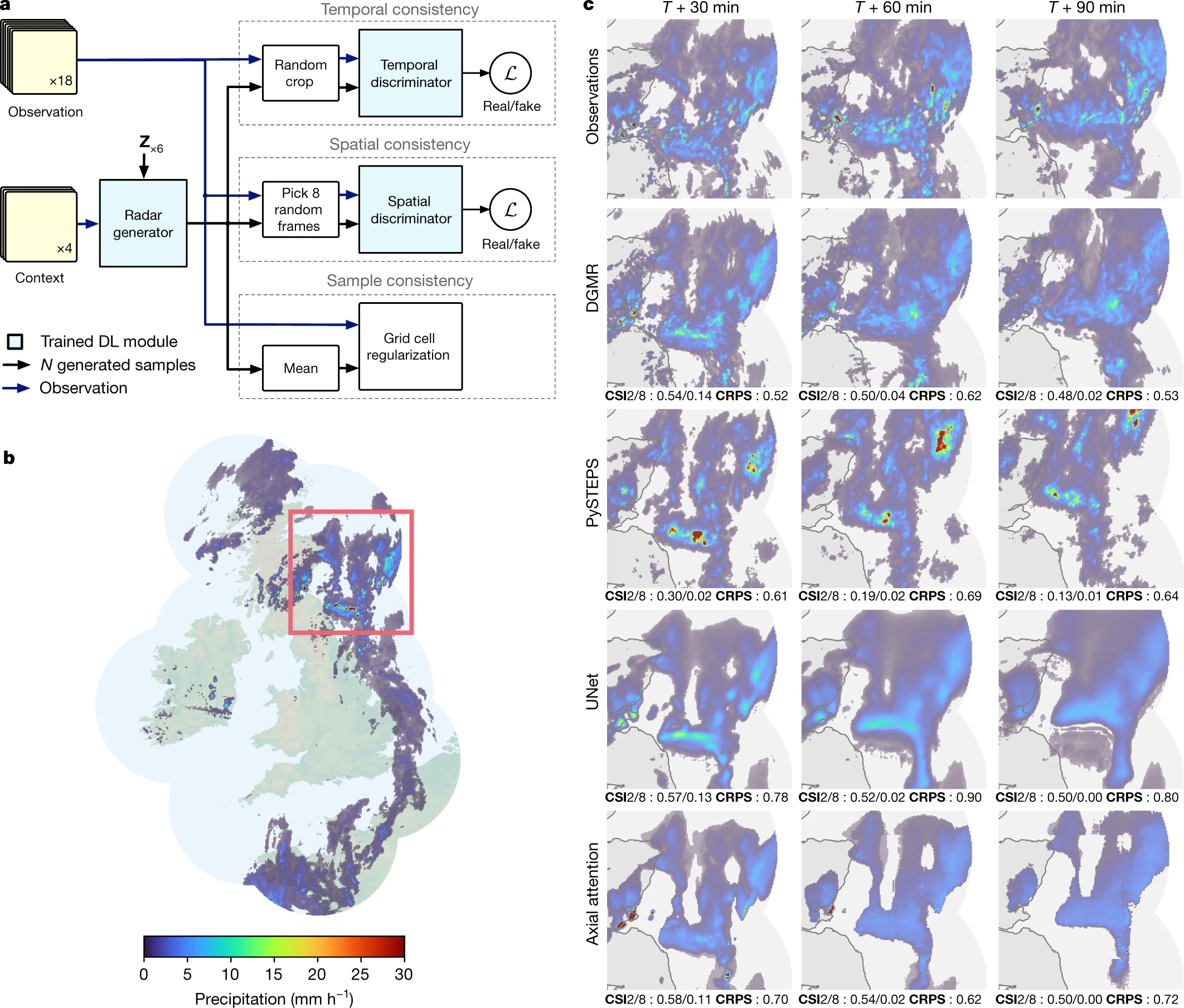
In one fell swoop, they tell us about the structure of the model, what it’s useful for (UK rain nowcasting, for which there is a strong need), and how their model, DGMR, compares against both observations and the leading alternative code, PySTEPS. (You can even find the Python code over at their Github page.)
Another good example is from “Inferring the effectiveness of government interventions against COVID-19”, (Brauner et al. 2021). This summarises the fairly complex results of a Bayesian model of non-pharmaceutical interventions into a single summary figure that policymakers can read off the results from in a second. This papers uses the Bayesian package PyMC, which you find out more about in the Bayesian Inference chapter.

Perhaps you feel that these aren’t serious or technical looking enough? Even serious, technical people have limited bandwidth: help them out with an easy to understand visual summary of your findings.
If you’re making plots, think deeply about their purpose and how clear they are. You can find more information on plotting over in the Intro to Data Visualisation pages.
To make life easier for your readers, put figures next to where they are first referenced in the text. If you have co-authors who prefer to have figures at the end, there’s a single option toggle you can use with the LaTeX package endfloat: turn it on before you compile it to send to them 😉.
Title
Choosing a title is a tricky business. In recent years, there’s been a backlash against uninformative (“Two analyses of the labour market”) or question-based (“Does X cause Y?”) paper titles and a movement that promotes ‘say what you did’ paper titles. For example, in the latter case, you might go for something along the lines of “Evidence that X causes Y in circumstance Z using method W”. There’s also a bit of a backlash against pun titles—though they do have a place when the paper itself is light-hearted. Another pitfall is to make your paper title solely about a vague but complicated-sounding method, eg “A Semiparametric Investigation of X” is not going to win you many readers.
While saying what you did can make the title quite long, and perhaps a bit less exciting and mysterious, it’s probably a good idea. Given the way that people find papers, through Google searches, you may wish to ensure that certain keywords also make it into the title.
Abstract
The abstract is a concise summary of the entire paper. Its function is to describe the rest of the paper, not to evaluate or defend it. The abstract should begin with a brief but precise statement of the problem or issue, followed by a fleeting description of the research method, design, and outputs, the major findings and marginal contribution, and the conclusions reached. The abstract should contain key words referring to method and content to help it get picked up by searches.
Ideally, your abstract should answer these key questions:
what’s the research question?
what’s the main result?
what’s the research method?
are the findings trivial or substantive?
Another way of thinking about organising your abstract is motivation, purpose, methods, findings, and policy implications.
Once you have written them, market test your title and abstract. The title and abstract are the front door. They are the most important parts of the paper. Craft them carefully and get frank feedback on them from people who know the field.
Many people find it useful to write the abstract of a paper last. By the time you have thought about the overall contribution and written the rest of the paper (particularly the introduction and conclusion), the abstract will be far easier. Abstracts are usually limited to 150—250 words, but can be as few as 100 words for some journals.
For an example of an abstract that really nails it, take a look at “The tradeoff between knowledge of mandated benefits and moral hazard” by Dr Jessica Brown (Brown 2022):
When workers are not aware of a mandated benefit, they cannot take it into account in their employment decision, leading to deadweight loss. On the other hand, lack of awareness of a benefit reduces moral hazard, decreasing deadweight loss. I incorporate these trade‐offs into a model of mandated benefits and apply the model to Temporary Disability Insurance, an employment benefit mandated in five states. First, using data collected through an original survey, I provide evidence that there is low awareness of this benefit. Second, I use the updated mandated benefits model to show that over a broad range of reasonable assumptions, the additional employee valuation of the benefit outweighs the additional program cost from moral hazard, and thus a public information campaign would increase employment.
Paper Introduction
Remember: most people who read your paper will only read the abstract, introduction, and conclusion. If your entire contribution isn’t understandable from reading these three together, you are missing a trick: and the introduction will be doing most of that work. You should spend a lot of time on your introduction. However, many people find that—like the abstract and conclusion—it’s a section that’s easier to write later rather than sooner. On the other hand, writing a good introduction can force you to really engage with what your contribution is and may save you time in the long run.
The subsections below detail the various parts that an introduction should incorporate, although they should not be labelled as such in the paper—they are all part of your Introduction section.
Note that there isn’t a separate “Literature Review” section below. You don’t need to bother with a dedicated literature review—it should be weaved into your introduction in the “Antecedent” and “Value-Add” sections, and only exist insofar as it explains how your work relates to the closest five to seven studies on the topic. This doesn’t mean that you shouldn’t have done a literature review—you almost certainly should have at some point. But this guidance is about writing a paper, not a literature review, and it’s better to keep them separate. (There are obvious exceptions to this rule, such as reviews.)
The Hook, or Motivation
In the first paragraph of the introduction, attract the reader’s interest by telling them that this paper relates to something interesting. What makes a topic Y interesting? Some combination of the following attributes makes Y something worth looking at.
Y matters: When Y rises or falls, people are hurt or helped.
Y is puzzling: it defies easy explanation.
Y is controversial: some argue one thing while others say another.
Y is big (like the service sector) or common (like traffic jams).
Y helps you do something you could not do before (ie it expands a reader’s production frontier).
You should avoid doing the following with your hook:
The bait and switch: promising an interesting topic but delivering something else, in particular, something boring.
“all my friends are doing it”: presenting no other motivation for a topic than that other people have written papers on it.
The bait and switch
The Question
Tell the reader what the paper does. Think of this as the point in a trial where, having detailed the crime, you now identify a perpetrator and promise to provide a persuasive case. The reader should have an idea of a clean research question that will have a more or less satisfactory answer by the end of the paper. The question may take around two paragraphs. At the end of the first or possibly the beginning of the second you should probably have the sentence “This paper addresses the question …”.
A slight variation on this magic sentence is required when introducing an asset such as a new dataset or a software package. In that case, the magic sentence becomes “This paper introduces thing that allows you to…”. If you have achieved the powerful union of answering an interesting question and introducing a helpful thing, you can have both!
Findings, or Main Contribution
What did you find in answer to the question you just set out? In this section, you need to spell out the key findings and messages of your research. If you want your reader to be able to remember what it is you found, there probably shouldn’t be more than 3 or 4 key findings in this section. You also need to place those findings in context; are they substantive or trivial (regardless of how precisely estimated your effects are)? It can be helpful to think of this section as ‘absolute contribution’, as opposed to the ‘relative contribution’ you’ll cover in the “Value-Add” section.
The Antecedents
Identify the prior work that is critical for understanding the contribution the paper will make. The key mistake to avoid here is discussing papers that are not essential parts of the intellectual narrative leading up to your own paper. Give credit where it is due but establish, in a non-insulting way, that the prior work has a gap in some important way that this paper (and perhaps its associated assets such as data or software) will fill.
A good rule is to look at the three to five closest papers and spend most of the time discussing them. If your paper truly crosses more than one literature, you may want to pick out one or two papers from those other topics that are also close to your work.
The Value-Add
Describe approximately 3 contributions this paper will make relative to the antecedents. This paragraph might be the most important one for convincing referees not to reject the paper, and readers not to put it down. A big difference between it and the earlier “question” and “findings” section is that the contributions should make sense only in light of prior work whereas the basic research question of the paper should be understandable simply in terms of knowing the topic (from the hook paragraph). “Antecedents” and “Value-Add” may be intertwined. These should take up around 3 paragraphs.
Do be respectful of others’ work in this section: research is hard, and you should give credit where it’s due.
If part of the value add is that you created a software package or dataset to go along with the paper, but that is not the main focus of the paper, then this is a good place to mention them.
Robustness Checks
By now, the reader may be thinking “this is too good to be true! I wonder if it’s robust?” and you must respond by sketching out (but not giving full details of) the robustness checks that you did to ensure that what you have measured, estimated, or assumed is a real finding and not a fluke.
The Road Map
This section is incredibly tedious but, unfortunately, some referees insist on it. Indeed, Deirdre McCloskey, in her book Economical Writing, says: “Still another piece of boilerplate, and one that kills the momentum of most papers on the second page, is the table-of-contents paragraph… Too many editors and referees demand it. Don’t, please … don’t.”
I’m with Deirdre on this one. Don’t bother with a road map if you can possibly help it. No-one will be surprised that your results section contains results.
If you must write a road map that outlines the organisation of the paper, avoid writing one so generic that it could apply to any paper. Instead customise the road map to the project and possibly mention pivotal “landmarks” (problems, solutions, results…) that will be seen along the way. But, if you have to put it in, keep this section as short as possible.
The Middle of the Paper
Now we come on to the content of a paper. Here are some pointers to bear in mind:
You might want to have a section titled “Background” or “Context” between the introduction and the data/theory or methods/empirical framework. This is especially so when you study, or have work related to, a new policy whose details are important or, perhaps, the features of the market or environment you are studying. For example, privacy issues surrounding some kinds of data could fit here. This can either be a substitute to, or a complement for, the theory section.
You may not need a theoretical framework/methods section.
It will sometimes make sense to switch the order between data, theory/methods, and empirical framework.
Any limitations will appear both under “Results and Discussion” and later on in the conclusion. It’s very important (particularly in pieces close to policy) not to have results that are misinterpreted.
Note that not every paper will have all of the subsections below. However, even if your paper doesn’t warrant a separate theory section, it’s a useful exercise to think about the content as being split according to assumptions (ie theory or methods), data, and the combination of the two (empirical framework) because the logic of an argument can break down in all three places.
Data (including descriptive statistics)
The data section is one of the most useful to readers (particularly other researchers), but it’s frequently not given as much love as either the theory or empirical framework sections.
You may find it useful to first remind the reader about the research question, and then connect that question to the type of data that is needed or what the ideal data would be, before moving on to describe the data you actually have.
You are likely to want to report the following about your data: when, where, why, how and by whom was it collected? What is the sample size and how does it compare to the population of interest? Did you drop any observations and, if so, why? Did you have to impute any values and, if so, how did you do it? Are any variables proxies for the real thing? What does each variable measure, exactly, and how was it constructed?
You should also ask yourself whether you have any ‘dark data’ (Hand 2020) and what limitations this might introduce to the analysis (and perhaps what mitigating steps you took). These are the types of dark data to consider:
Data we know are missing, eg a missing survey response
Data we don’t know are missing, eg people who didn’t fill out the survey at all
Selection bias, eg only being able to survey firms that haven’t failed
Self-selection, eg opting in to an online survey
Missing variables (aka confounders), eg the effect of age on coronavirus early on during the pandemic
Counter-factuals, eg how many blood clots would have happened absent the vaccine
Changes in time, eg apparent weakening of Phillips curve due to government policy
Differences in data definitions, eg deaths with coronavirus recorded as opposed to deaths within 28 days
Summaries of data, eg UK average productivity hiding wide regional variation
Measurement error and uncertainty, eg resolution limitations in satellite images
Feedback and gaming, eg effect of number of tests on apparent coronavirus prevalence
Information asymmetry, ie the effect of one party knowing more about something that another
Intentionally darkened data, ie data that have been intentionally modified in any of the other dark data ways to benefit someone
Fabricated data, eg when people are not honest on surveys
Extrapolation, ie going beyond the time, space, or group for which you have data (aka external validity)
For some internal (as opposed to external) data issues, tools such as ydata-profiling, dataprep, or skimpy can help find problems (eg variables with high numbers of missing values).
Descriptive statistics are easy to overlook but really help make something that is intangible (the full dataset you used) more tangible to readers. The most helpful way of reporting these often includes a table of basic numbers such as count, mean, median, etc. If you are imputing or dropping observations, and this is likely to be important for the results, you may want to report the numbers before and after that processing. If you choose to describe the contents of your table of descriptive statistics, tell a story about them, don’t just write up a boring enumeration of means.
It’s particularly helpful if you express descriptive statistics in units that will be familiar to the reader; this means kg per metre cubed in place of slugs per cubic foot (ie SI units), or avoiding expressing income as logs. For variables that could be real or nominal, say which they are and provide the relevant date information.
If you’re looking at categorical variables across different groups, you may want to include a balance table showing how the different sub-groups compare across different variables. For example, if you were analysing a random experiment where some people received unemployment insurance and some did not, there is the possibility that by bad luck that the two groups would end up being significantly different with respect to age: a balance table could highlight this. (This may also be suggestive of what controls will be needed in subsequent parts of the paper.)
There are some things you should actively avoid in the data section too. Do not repeat in the text what is obvious from the tables or figures, unless it directly relates to, or affects, the research question—readers will assume it has a relevance that it does not, and will be confused. Don’t use the past tense even if you’re describing data from the past (the data are still the data, after all). The present tense and active voice are easier to read and understand. Another one to avoid is presenting data with too many decimal places—readers will reasonably assume that you know the numbers to that level of accuracy if you report them. If you are measuring the mass of the electron, and the accuracy is indeed to eleven decimal places, then this is fine; otherwise, no.
Finally, take care to cite the datasets you used. If you created a new dataset, and you can share it, you should.
Theory or Methods
The theory section (for papers that include a mathematical model designed expressly for the paper) or methods section (for papers that pull together existing methods and apply them) is where you set out the assumptions you are making as clearly as possible. For a paper using machine learning, this might be the relationship between variable X and variable Y or the architecture of the neural net. For a dataset construction paper, it might be about how variable X is constructed, and if that relies on any assumptions.
You will need to consider the following:
Methods: What methods are you using and why? What limitations do they have? You should address your choice of benchmark method here.
Assumptions: What assumptions are you making? The more you can make them explicit, the better. What assumptions are you making about the choice of variables? What assumptions are you making about the parameters and/or model?
Variables: What are the theoretically endogenous variables? What are the theoretically exogenous variables? Which variables are parameters and which are measured?
Optimisation problem: What are you assuming the agents you are studying are maximising and how?
Testable prediction: state your main testable prediction. Generally, this should map one-to-one with the empirical framework.
Proof: prove your main testable prediction. Here, go for simplicity rather than elegance—why go for a proof by construction when a proof by contradiction will do just fine?
Other results and proofs: there might be some side results you can both demonstrate in theory and test empirically. (Generally, though, papers should do one thing.)
Even if your paper doesn’t warrant a separate theory or methods section, asking yourself these questions—particularly the ones addressing assumptions, methods, and variables—is a useful exercise.
Empirical framework
This section deals with how to connect the theory or methods to the data. The questions you will need to answer in this section are about i) identification and ii) estimation.
First, identification: how can you convince the reader that the problem you want to solve is the problem you’re actually solving? Identification strategy is especially relevant for causal studies. You should try and answer the following questions related to identification: what would the ideal data set look like to study your question? How close are you to that ideal, and what prevents you from getting closer? For causal studies, it is important to explicitly address how your identification strategy deals with (a) unobserved heterogeneity, (b) reverse causality or simultaneity, and (c) measurement error.
Then, estimation. Ask yourself these questions: what variables in your equations are you evaluating or estimating? How will you estimate them? How will you compute uncertainty and standard errors? What is/are the metric(s) of success? What is the hypothesis test of interest for your main testable prediction?
If your outcome variable or variable of interest needs to be constructed or estimated, this is where you’d discuss it.
Results and Discussion
Your killer chart that says it all in one fell swoop should be somewhere in this section (this will be useful for selling your work in short-form media too). It could showcase the scene-setting or core results, but it should be able to stand alone.
In this section, you will need to cover:
Scene-setting Results: These are results that don’t rely on parametric assumptions. An image is worth 1,000 words here: if you can somehow plot the relationship of interest in a two-way scatter with a regression line fit through it, or using kernel density estimates for treatment and comparison, it helps people see for themselves that there is a difference in outcomes in response to your variable of interest.
Core Results: These are your parametric results. They demonstrate the success of your main testable prediction. Here, there is no need to go into a discussion of the sign of each significant control variable, unless such a discussion is somehow germane to your core testable prediction.
Robustness Checks: These are variations on your preferred specification that show your result wasn’t just a fluke. They are as important as your core results. Do not neglect them. Slice and dice the data in as many ways as possible, sticking many of these results in an appendix, to show that the main testable prediction is supported by the data and that you haven’t cherry-picked your results.
Extensions: This is where you can explore hitherto unexamined heterogeneity, or split the sample.
Limitations: No result is perfect. How is internal validity limited? How is external validity limited? What are your results not saying, ie, what mistakes might people make in interpreting them? Every study is flawed or makes simplifying assumptions; every study has a method or result that may be misinterpreted. A caveat paragraph depicts a thoughtful author who is after the truth. Perhaps you’ve covered some of the limitations and issues along the way already in the Data, Methods, or Empirical sections. That’s okay; here you have a chance to summarise those and focus on the most pertinent of them.
If your discussion is more than 2x longer than your results, cut it down. Careful reviewers and readers want to know how your results relate to your hypotheses, the strengths and weaknesses of your results, and perhaps one or two implications of your results. Focus on these three tasks.
Regression Tables
Keith Head has some good advice on regression tables that is reproduced with some modifications here. Keith reports that some of these may be controversial—they are certainly a good baseline to start from.
Report the number of observations, the r-squared, and the root mean squared error for each regression.
Report the dependent variable and the estimation method in the table’s caption if it is common to all specifications or as a column heading if it varies across specifications.
Use self-explanatory labels for your explanatory variables. Cryptic abbreviations or symbols from the model section force the reader to page back and forth to understand your results. With five or six columns of regression results there should be enough room to use words to describe each regressor. Put the symbol used in the model in parentheses below this.
Choose sensible units for variables. The coefficients should not be very small (e.g. 0.000032) or very large (e.g. 75432.8). As a rule of thumb, coefficients should only use the first two or three places to the left or right of the decimal point. One exception is the case where variables are unit-free because you are estimating a log-log model. In that case coefficient size is inherently meaningful.
The presentation version of the table should be in large, readable type.
Put standard errors in the same column as the coefficients. Regression packages put standard errors along side coefficients as separate columns but you should put each regression as a single column in your results table.
Insert key tables inside the body of the paper, not at the end. If your paper is accepted by a journal that insists on tables at the ends, you can always move them then.
Display standard errors, not t-statistics or p-values. Unless the test that the coefficient is not equal to zero is the only conceivable test of interest, display standard errors. These give readers a direct view of the precision with which you are estimating the coefficient. They are useful information for a variety of possible tests and are still valuable even if the reader prefers not to engage in classical hypothesis testing at all.
Conclusion
Some papers title their conclusion “Summary and Concluding Remarks”, which is a good indication of how the conclusion should proceed. It should have two main parts: (i) a summary of what you have spent the several pages before the conclusion doing, and (ii) the way forward. The topics you should cover include:
Summary—“tell them what you’re going to tell them, tell them what you want to tell them, and tell them what you just told them.” This part can be tedious, but it needs to be there, and it needs to be different enough (but not new) from the abstract and the introduction. If possible, tell a story.
Limitations—the conclusion should emphasise the limitations of the approach.
Implications for policy—discuss what they are, but don’t make claims that are not supported by the results, and try to assess the cost of what is proposed in comparison to its benefits. You can do so somewhat imperfectly (this is the only place in the paper where “back-of-the-envelope” calculations are okay), since the point of the work was presumably about only one side of that equation—usually the benefits of something, sometimes its costs, but rarely both. The focus of the rest of the paper is likely to only address the problem partially; what does your result mean in the context of the bigger picture? If there are policy implications, carefully and sensitively spell them out. This will typically be the most sensitive section.
Implications for future research—if you are writing a follow-up paper, this is a good place to set the stage for it. It’s also a good place to put a call-to-action for a piece of work you can’t do but think others can and should.
After the draft is written
Once you’ve written a draft you’re happy with, there are a bunch of checks you can do to help make sure the draft is everything it can be. The first is to pop it in a drawer for a week and let it stew. When you come to read it again, you’ll find that you can redraft it to be even better. The rest of the tips are:
Write and re-write. First drafts are always bad.
Get rid of every adjective modifying a relationship. Was x larger than y? Just say so. Saying it was much larger, or especially tiny, or amazingly huge adds no information.
Replace long words with short words. Good writing maximises the content of the message per number of letters used. Replace long words with short words of equal meaning. Replace utilisation with use.
Replace every “differed” or “was different” with the actual, quantitative relationship. Compare the content per letters used for the following two sentences: “Plants fertilised with nitrogen differed in height from controls.”, and “Plants fertilized with nitrogen were 2.5x taller than controls.” Not only have you conveyed that nitrogen increased growth, you’ve given a vivid word picture as to how much.
Spell check everything.
Read it aloud. There is no better way to gauge the flow and logic of a manuscript.
Look back at your figures and tables, and be brutal. Do you need them all? Do they all convey important messages that a reader cannot get from the text? In general, you can have up to approximately 10 floats before an editor or referee may wonder if they have picked up a picture book rather than a journal article. Naturally, in some special cases—for example, if the paper is about data visualisation—you may feel warranted in having more. But a good check is whether you can tell the story in just four floats, and the most important result in just one.
Further Resources
Two extremely good general resources on writing are Zinsser (2006) and White and Strunk (1972). For a more in-depth take on writing papers (specific to applied economics papers), see Bellemare (2020).