import numpy as np
import pandas as pd
import seaborn as sns  # Just for some data

# Set seed for random numbers
seed_for_prng = 78557
prng = np.random.default_rng(
    seed_for_prng
) # prng=probabilistic random number generatorData Visualisation using the Grammar of Graphics with Plotnine
Introduction
Here you’ll see how to use declarative plotting library plotnine.
Note
We recommend you use letsplot for declarative plotting but plotnine is an excellent alternative.
plotnine is, like seaborn, a declarative library. Unlike seaborn, it adopts the ‘grammar of graphics’ approach inspired by the book ‘The Grammar of Graphics’ by Leland Wilkinson. plotnine is heavily inspired by the API of the popular ggplot2 plotting package in the statistical programming language R. The point behind the grammar of graphics approach is that users can compose plots by explicitly mapping data to the various elements that make up the plot. It is a particularly effective approach for a whole slew of standard plots created from tidy data.
As ever, we’ll start by importing some key packages:
Let’s take a look at how to do a simple scatter plot in plotnine. We’ll use the mtcars dataset.
from plotnine import aes, geom_point, ggplot
from plotnine.data import mtcars

(ggplot(mtcars, aes("wt", "mpg")) + geom_point())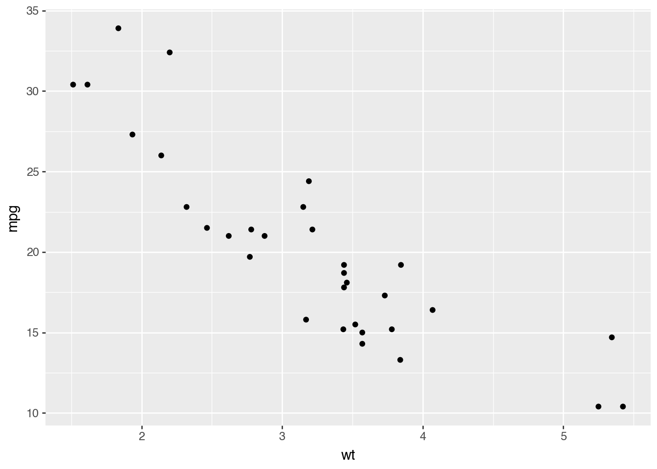
Here, ggplot is the organising framework for creating a plot and mtcars is a dataframe with the data in that we’d like to plot. aes stands for aesthetic mapping and it tells plotnine which columns of the dataframe to treat as the x and y axis (in that order). Finally, geom_point() tells plotnine to add scatter points to the plot.
If we want to add colour, we pass a colour keyword argument to aes like so (with ‘factor’ meaning treat the variable like it’s a categorical):
(ggplot(mtcars, aes("wt", "mpg", color="factor(gear)")) + geom_point())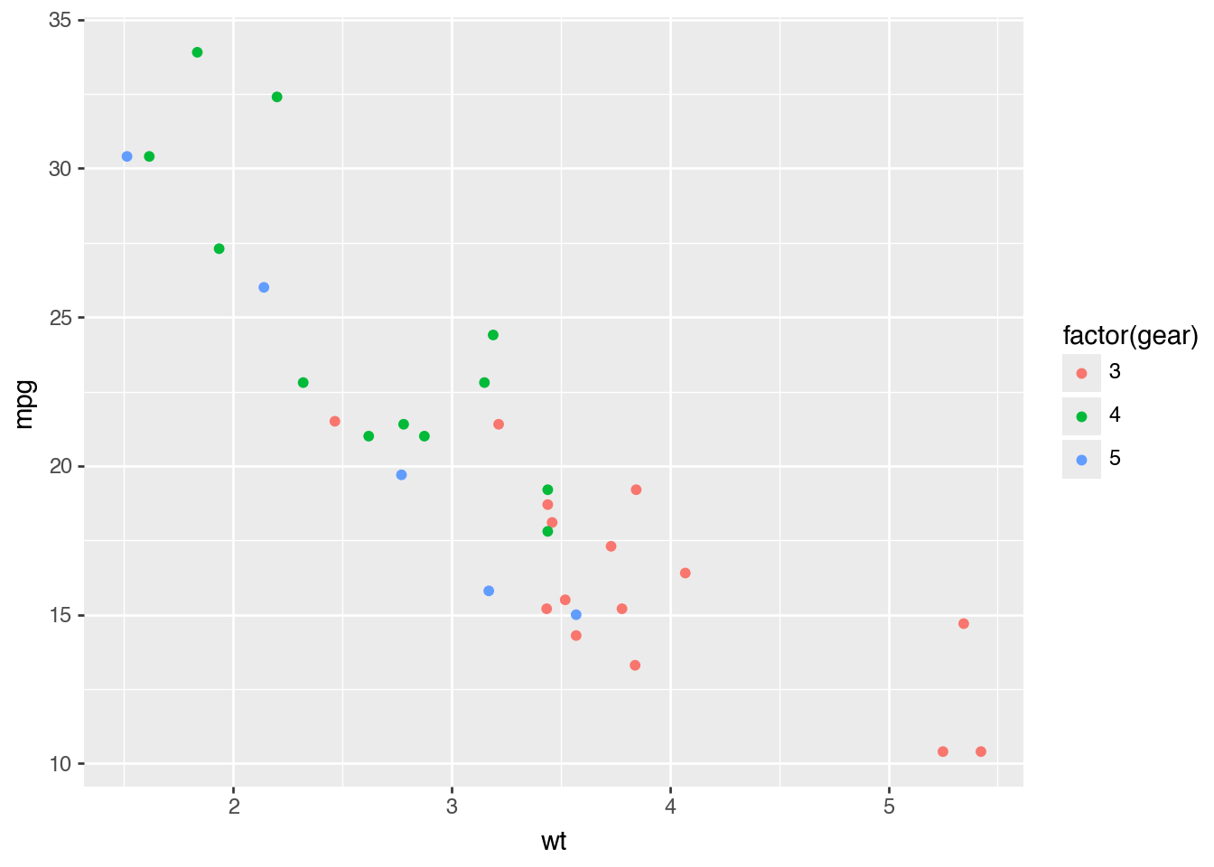
One of the nice aspects of the grammar of graphics approach, perhaps its best feature, is that switching to other types of ‘geom’ (aka chart type) is as easy as calling the same code but with a different ‘geom’ switched in. Note that, because we only imported one element at a time from plotnine we do need to explicitly import any other ‘geoms’ that we’d like to use, as in the next example below. But we could have just imported everything from plotnine instead using from plotnine import *.
The next example shows how easy it is to switch between ‘geoms’.
from plotnine import geom_smooth

(ggplot(mtcars, aes("wt", "mpg")) + geom_smooth())
/Users/aet/Documents/git_projects/coding-for-economists/.venv/lib/python3.10/site-packages/plotnine/stats/smoothers.py:342: PlotnineWarning: Confidence intervals are not yet implemented for lowess smoothings.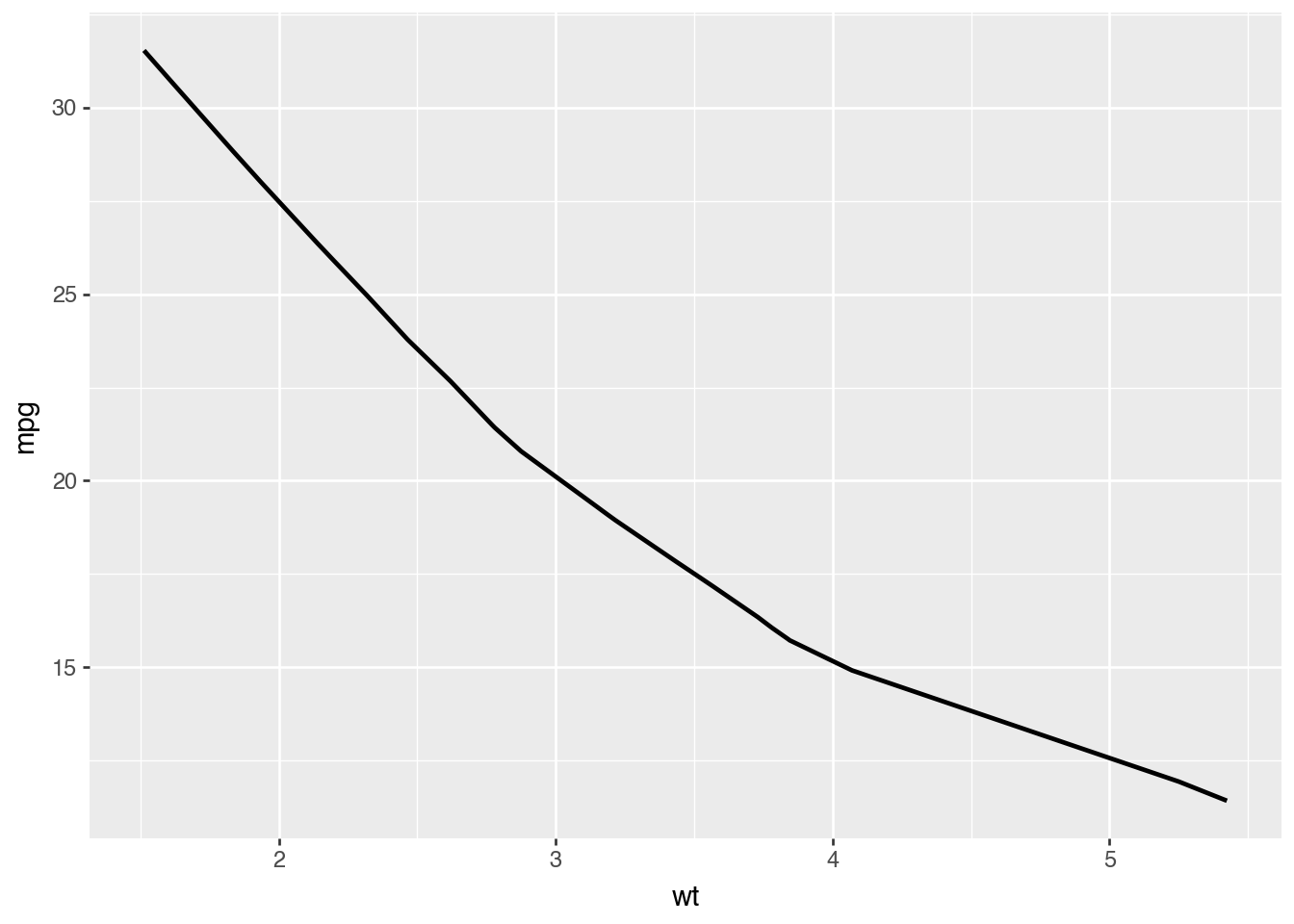
Furthermore, we can add multiple geoms to the same chart by layering them within the same call to the ggplot() function:
(ggplot(mtcars, aes("wt", "mpg")) + geom_smooth(color="blue") + geom_point())/Users/aet/Documents/git_projects/coding-for-economists/.venv/lib/python3.10/site-packages/plotnine/stats/smoothers.py:342: PlotnineWarning: Confidence intervals are not yet implemented for lowess smoothings.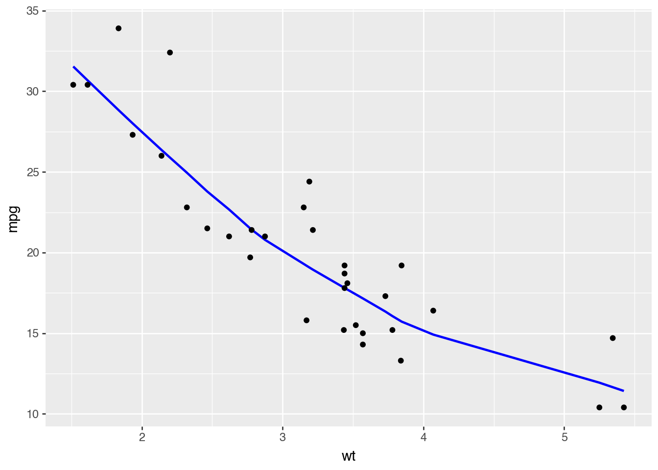
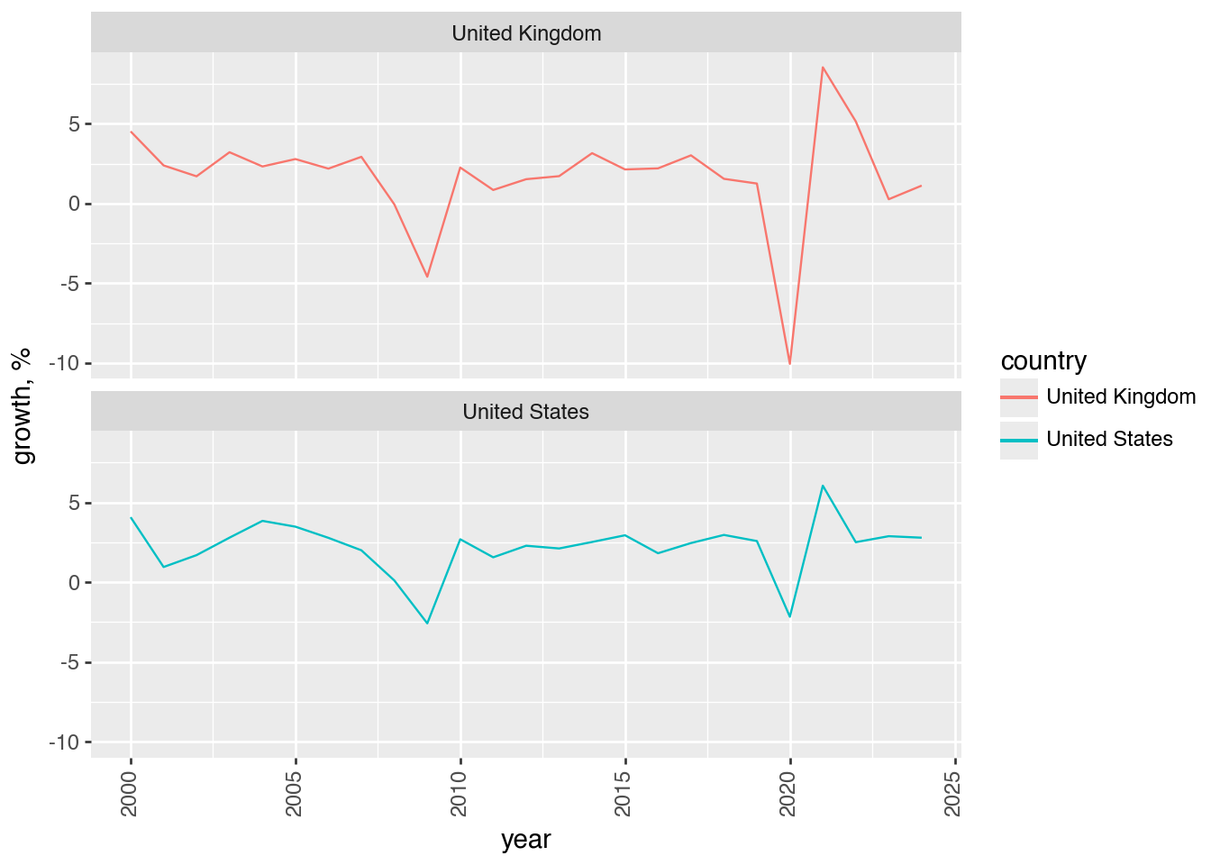
Just like seaborn and matplotlib, we can create facet plots too–but this time they’re just a variation on the same underlying call to ggplot(). Let’s see that same example of GDP by country rendered with plotnine. First, we need to grab the data:
from datetime import datetime

import wbgapi as wb

ts_start_year = 1999
ts_end_year = datetime.now().year
countries = ["GBR", "USA"]
gdf_const_2015_usd_code = "NY.GDP.MKTP.KD"
df = (
    wb.data.DataFrame(
        gdf_const_2015_usd_code,
        countries,
        time=range(ts_start_year, ts_end_year + 1),
        labels=True,
        numericTimeKeys=True,
    )
    .rename(columns={"Country": "country"})
    .reset_index(drop=True)
    .melt(id_vars="country", var_name="year", value_name=gdf_const_2015_usd_code)
    .sort_values(by=["country", "year"])
    .reset_index(drop=True)
)
df["growth, %"] = df.groupby("country")[gdf_const_2015_usd_code].transform(
    lambda x: 100 * x.pct_change(1)
)
df["year"] = df["year"].astype("float")  # needed for plotnine
df.head()
/var/folders/x6/ffnr59f116l96_y0q0bjfz7c0000gn/T/ipykernel_62679/2179686844.py:24: FutureWarning: The default fill_method='pad' in Series.pct_change is deprecated and will be removed in a future version. Either fill in any non-leading NA values prior to calling pct_change or specify 'fill_method=None' to not fill NA values.| country | year | NY.GDP.MKTP.KD | growth, % | |
|---|---|---|---|---|
| 0 | United Kingdom | 1999.0 | 2.214131e+12 | NaN |
| 1 | United Kingdom | 2000.0 | 2.314307e+12 | 4.524381 |
| 2 | United Kingdom | 2001.0 | 2.369643e+12 | 2.391022 |
| 3 | United Kingdom | 2002.0 | 2.410141e+12 | 1.709027 |
| 4 | United Kingdom | 2003.0 | 2.487711e+12 | 3.218516 |
Now we can get on with plotting it:
from plotnine import element_text, facet_wrap, geom_line, theme

(
    ggplot(df.dropna(), aes(x="year", y="growth, %", color="country"))
    + geom_line()
    + facet_wrap("country", nrow=2)
    + theme(axis_text_x=element_text(rotation=90))
)
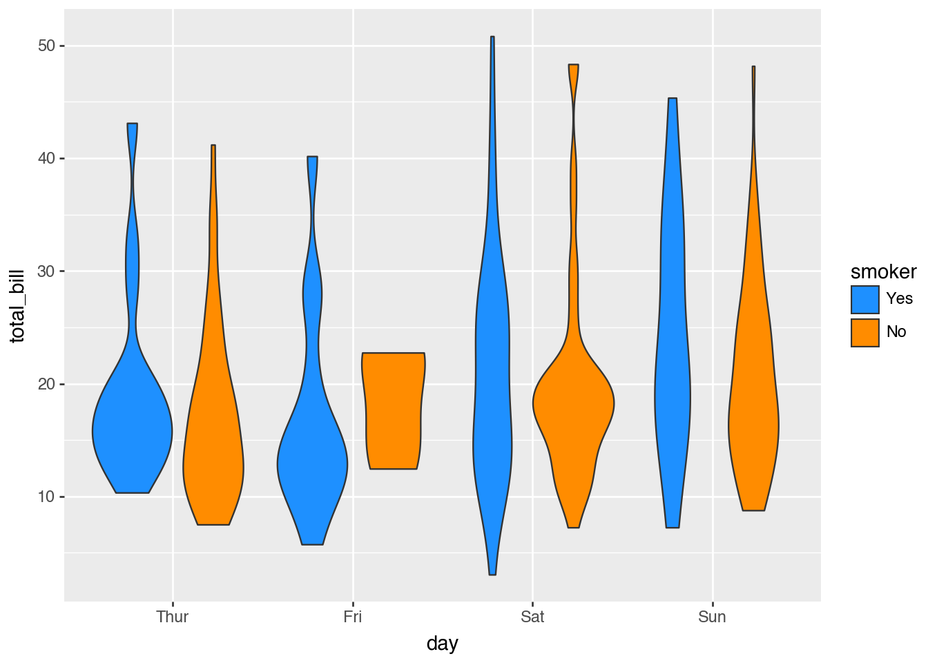
plotnine can do many of the same types of charts as seaborn; let’s see some similar examples:
from plotnine import geom_violin, scale_fill_manual

tips = sns.load_dataset("tips")

(
    ggplot(tips, aes("day", "total_bill", fill="smoker"))
    + geom_violin(tips)
    + scale_fill_manual(values=["dodgerblue", "darkorange"])
)
from plotnine import labs

penguins = sns.load_dataset("penguins")

(
    ggplot(
        penguins, aes(x="bill_length_mm", y="bill_depth_mm", color="factor(species)")
    )
    + geom_point()
    + geom_smooth(method="lm")
    + labs(x="Bill length (mm)", y="Bill depth (mm)")
)
/Users/aet/Documents/git_projects/coding-for-economists/.venv/lib/python3.10/site-packages/plotnine/layer.py:374: PlotnineWarning: geom_point : Removed 2 rows containing missing values.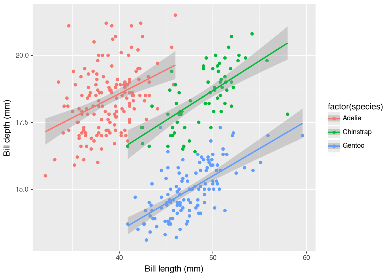
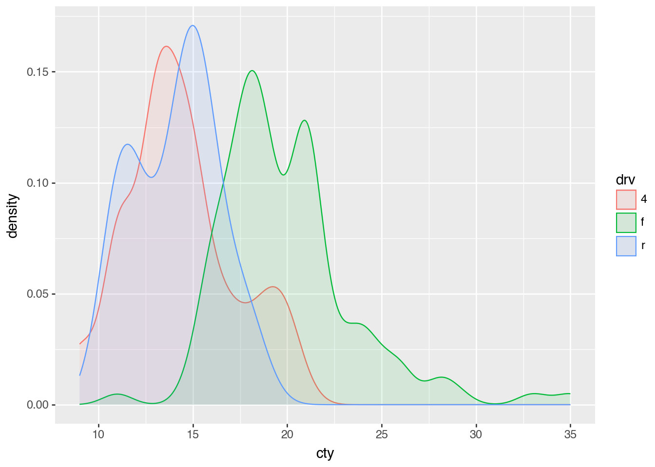
Finally, an example of great practical use during exploratory analysis, the kernel density plot:
from plotnine import geom_density
from plotnine.data import mpg

(ggplot(mpg, aes(x="cty", color="drv", fill="drv")) + geom_density(alpha=0.1))