import matplotlib as mpl
import matplotlib.pyplot as plt
import numpy as np
import pandas as pd
import seaborn as sns
import seaborn.objects as so

# Set seed for random numbers
seed_for_prng = 78557
prng = np.random.default_rng(
    seed_for_prng
) # prng=probabilistic random number generatorData Visualisation with Seaborn
Introduction
Warning
seaborn’s object API is still a work-in-progress, so check the version you’re using carefully and note that the API may change relative to what’s shown here.
Here you’ll see how to make plots quickly using the declarative plotting package seaborn. This package is good if you want to make a standard chart from so-called tidy data where you have one row per observation and one columnn per variable.
Note
We recommend you use letsplot for declarative plotting but seaborn is an excellent alternative that builds on matplotlib and so is more customisable.
seaborn is actually built on top of matplotlib so you can also mix code for the two packages.
The rest of this chapter is indebted to the excellent seaborn object notation documentation.
As ever, we start by bringing in the packages we’ll need:
Quite a few of the examples we’ll see use a range of additional datasets, so let’s grab those straight away:
tips = sns.load_dataset("tips")
penguins = sns.load_dataset("penguins").dropna()
diamonds = sns.load_dataset("diamonds")
healthexp = (
    sns.load_dataset("healthexp").sort_values(["Country", "Year"]).query("Year <= 2020")
)
Specifying a plot and mapping data
The most important command in seaborn is Plot(). You specify plots by instantiating a Plot() object and calling its methods. Let’s see a simple example:
(so.Plot(penguins, x="bill_length_mm", y="bill_depth_mm").add(so.Dot()))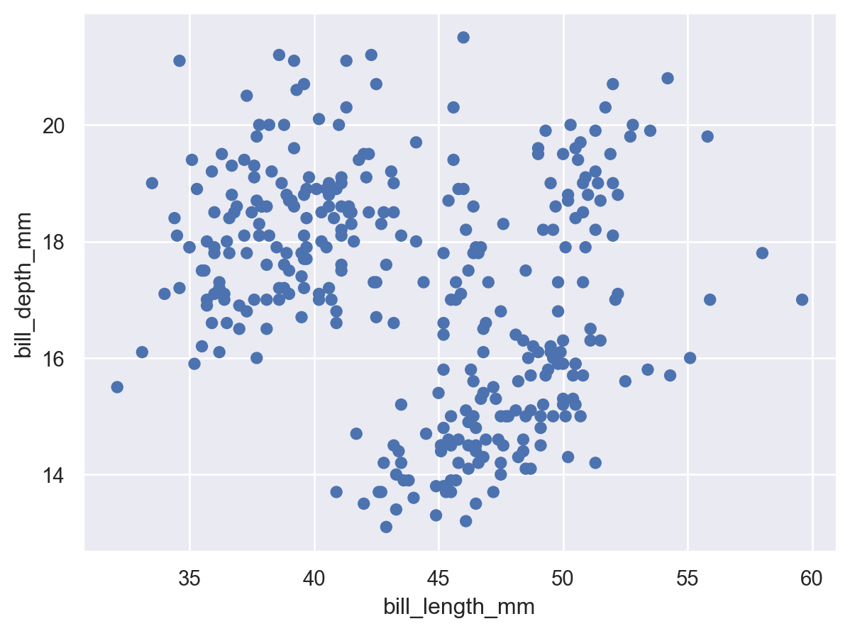
This code, which produces a scatter plot, should look reasonably familiar. Just as when using seaborn.scatterplot(), we passed a tidy dataframe (penguins) and assigned two of its columns to the x and y coordinates of the plot. But instead of starting with the type of chart and then adding some data assignments, here we started with the data assignments and then added a graphical element.
Setting properties
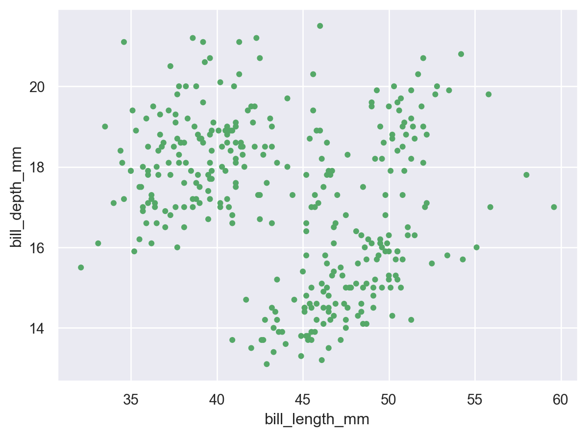
The Dot class is an example of a Mark: an object that graphically represents data values. Each mark will have a number of properties that can be set to change its appearance:
(
    so.Plot(penguins, x="bill_length_mm", y="bill_depth_mm").add(
        so.Dot(color="g", pointsize=4)
    )
)
Mapping properties
As with seaborn’s functions, it is also possible to map data values to various graphical properties:
(
so.Plot(
penguins,
x="bill_length_mm",
y="bill_depth_mm",
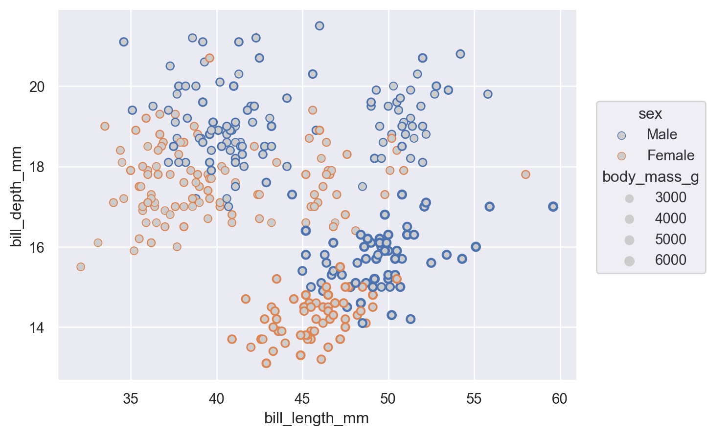
color="species",
pointsize="body_mass_g",
).add(so.Dot())
)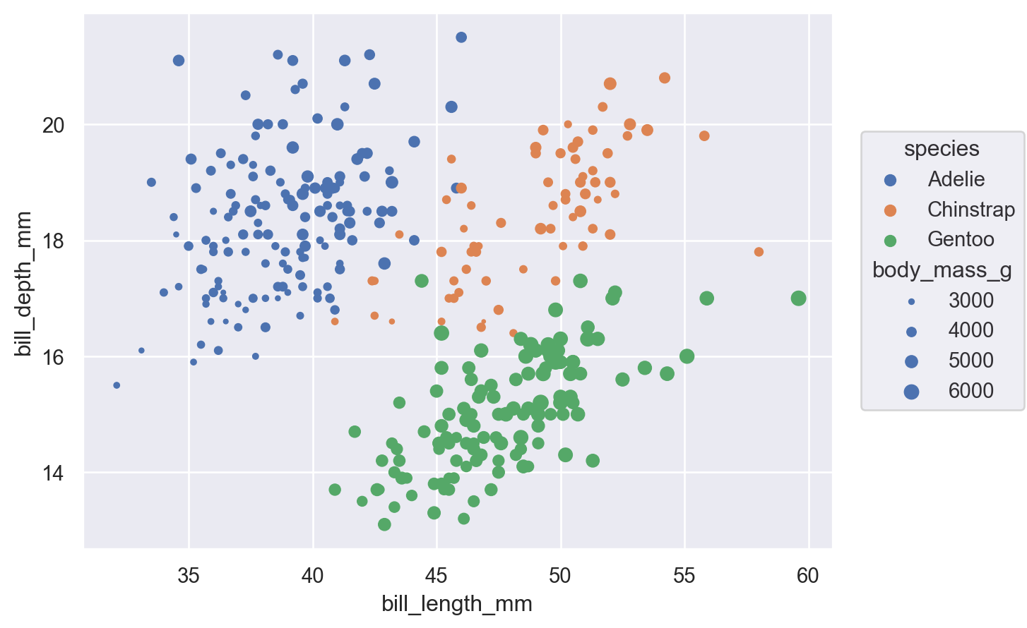
While this basic functionality is not novel, an important difference from the function API is that properties are mapped using the same parameter names that would set them directly (instead of having hue vs. color, etc.). What matters is where the property is defined: passing a value when you initialize Dot will set it directly, whereas assigning a variable when you set up the Plot() will map the corresponding data.
Beyond this difference, the objects interface also allows a much wider range of mark properties to be mapped:
(
    so.Plot(
        penguins,
        x="bill_length_mm",
        y="bill_depth_mm",
        edgecolor="sex",
        edgewidth="body_mass_g",
    ).add(so.Dot(color=".8"))
)
Defining groups
The Dot mark represents each data point independently, so the assignment of a variable to a property only has the effect of changing each dot’s appearance. For marks that group or connect observations, such as Line, it also determines the number of distinct graphical elements:
(so.Plot(healthexp, x="Year", y="Life_Expectancy", color="Country").add(so.Line()))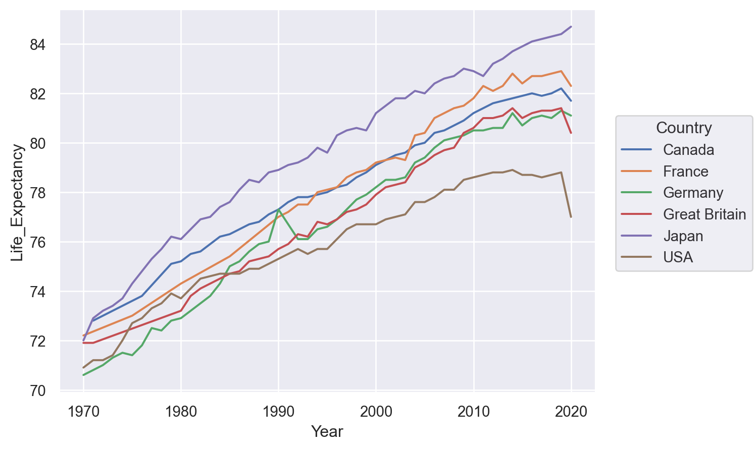
It is also possible to define a grouping without changing any visual properties, by using group:
(so.Plot(healthexp, x="Year", y="Life_Expectancy", group="Country").add(so.Line()))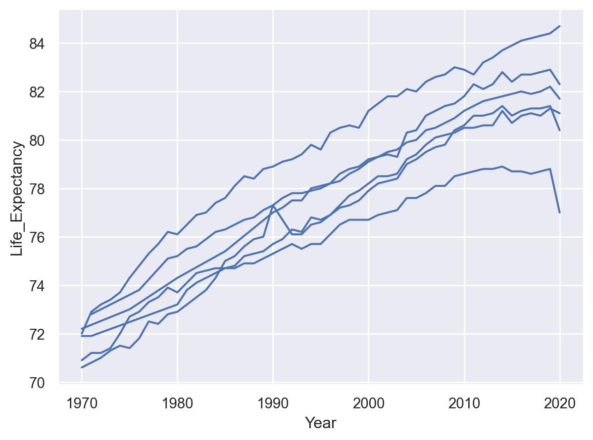
Transforming data before plotting
Statistical transformation
As with many seaborn functions, the objects interface supports statistical transformations. These are performed by Stat objects, such as Agg():
(so.Plot(penguins, x="species", y="body_mass_g").add(so.Bar(), so.Agg()))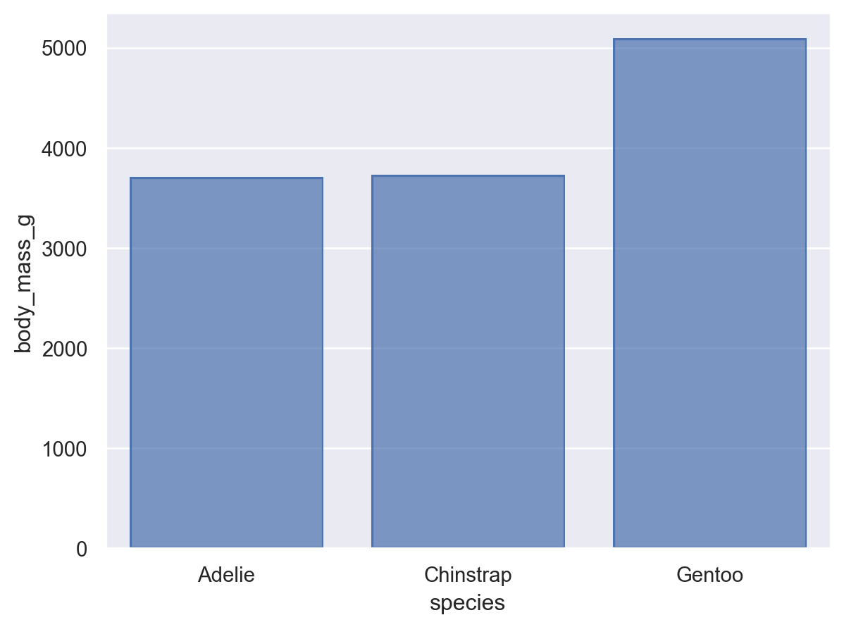
In the function interface, statistical transformations are possible with some visual representations (e.g. seaborn.barplot()) but not others (e.g. seaborn.scatterplot()). The objects interface more cleanly separates representation and transformation, allowing you to compose Mark and Stat objects:
(so.Plot(penguins, x="species", y="body_mass_g").add(so.Dot(pointsize=10), so.Agg()))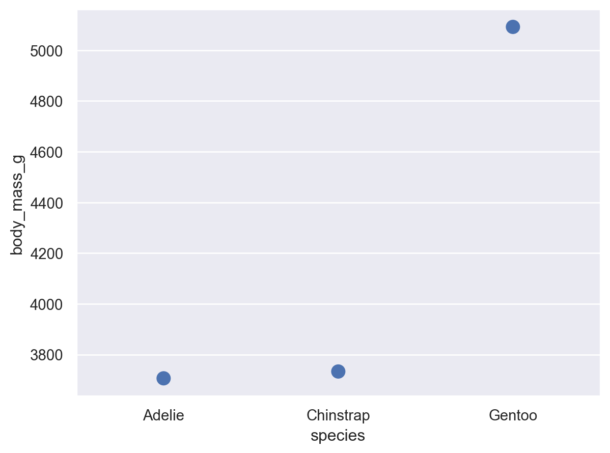
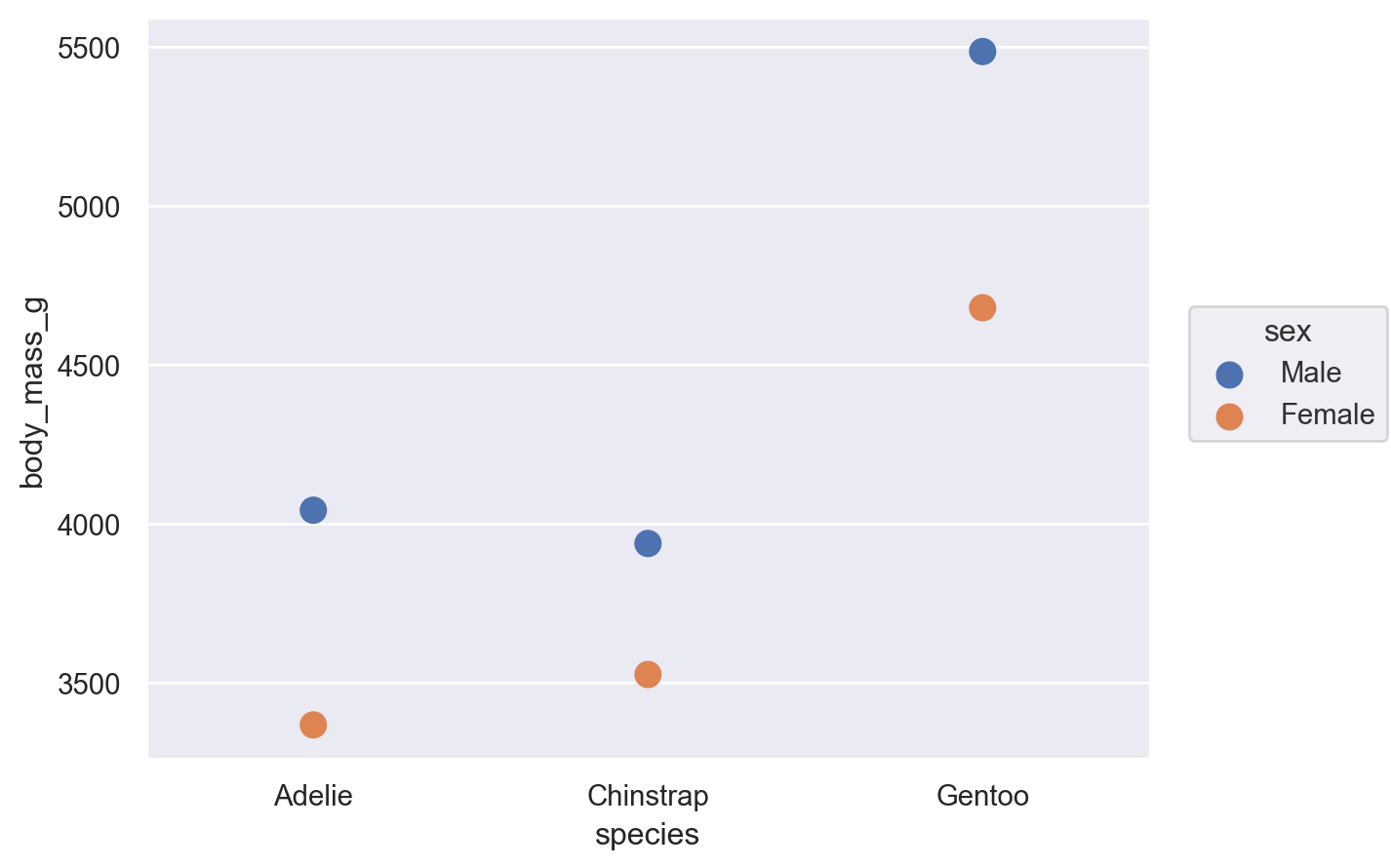
When forming groups by mapping properties, the Stat transformation is applied to each group separately:
(
    so.Plot(penguins, x="species", y="body_mass_g", color="sex").add(
        so.Dot(pointsize=10), so.Agg()
    )
)
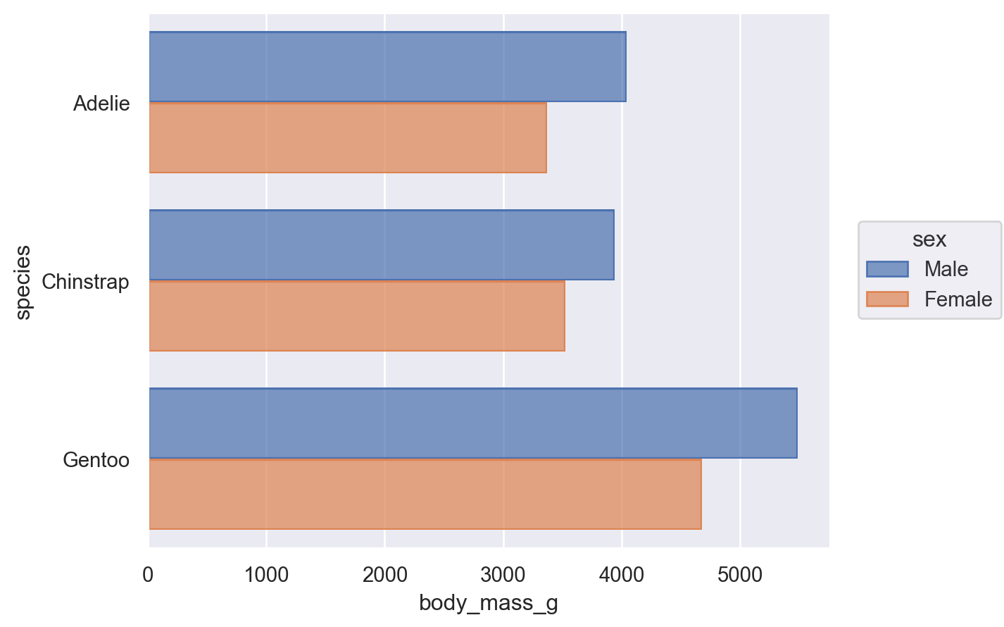
Resolving overplotting
Some seaborn functions also have mechanisms that automatically resolve overplotting, as when seaborn.barplot “dodges” bars once hue is assigned. The objects interface has less complex default behavior. Bars representing multiple groups will overlap by default:
(so.Plot(penguins, x="species", y="body_mass_g", color="sex").add(so.Bar(), so.Agg()))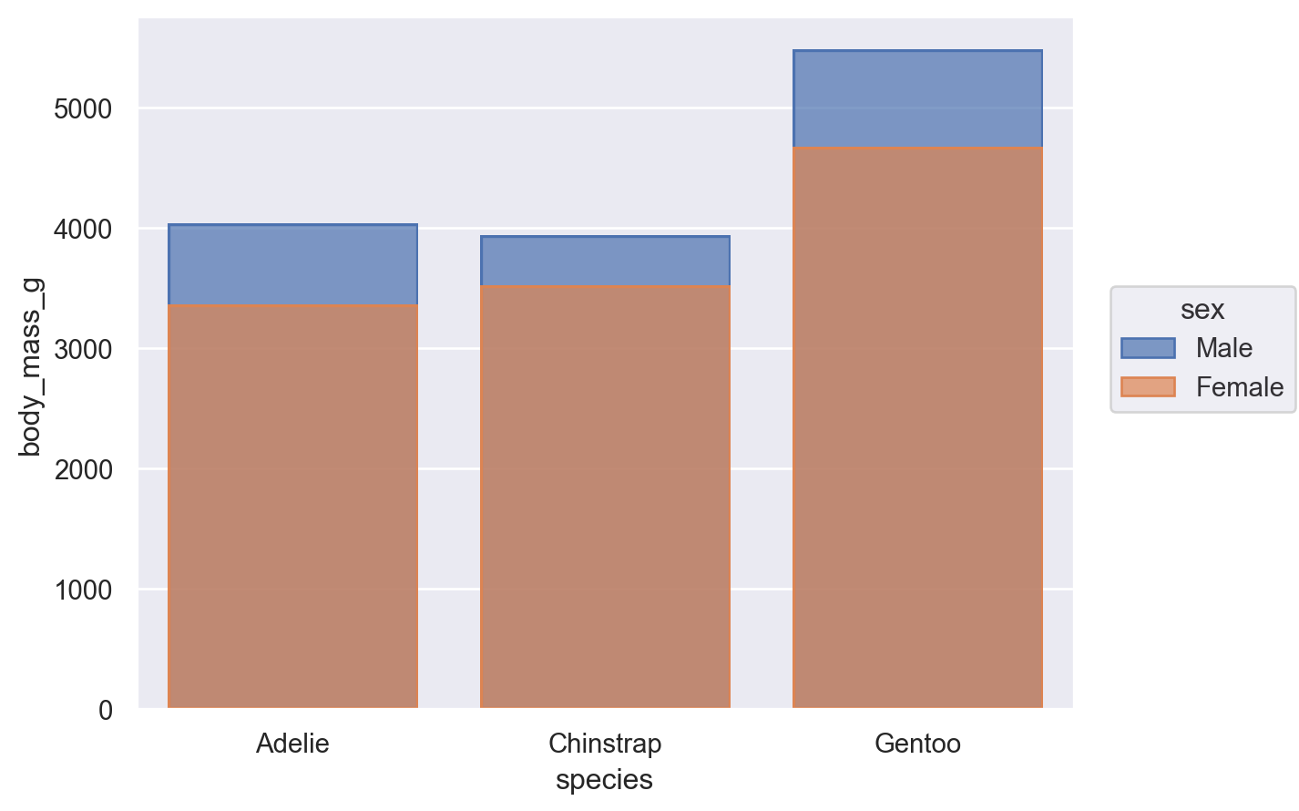
Nevertheless, it is possible to compose the Bar mark with the Agg stat and a second transformation, implemented by Dodge:
(
    so.Plot(penguins, x="species", y="body_mass_g", color="sex").add(
        so.Bar(), so.Agg(), so.Dodge()
    )
)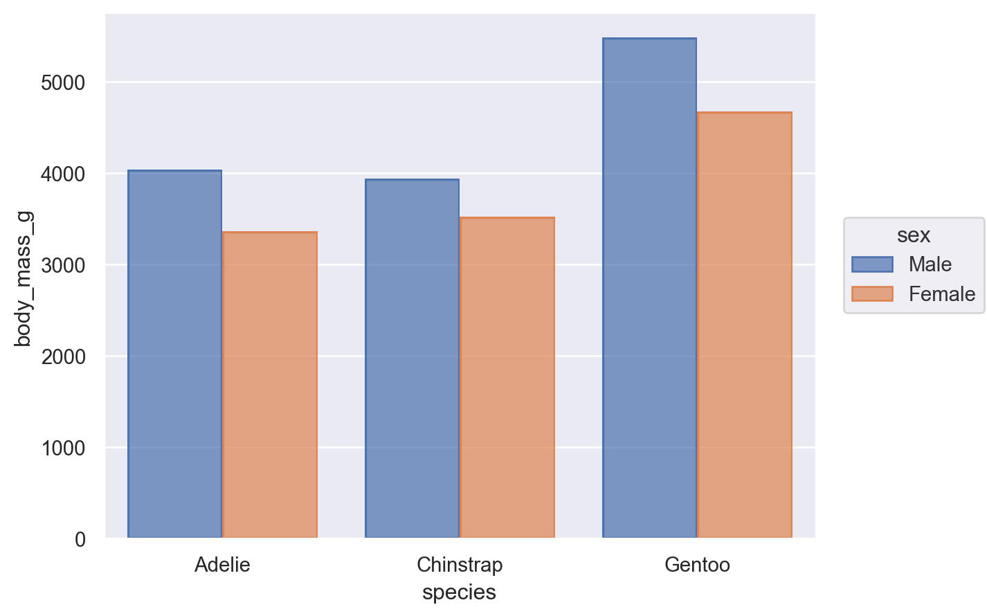
The Dodge class is an example of a Move transformation, which is like a Stat but only adjusts x and y coordinates. The Move classes can be applied with any mark, and it’s not necessary to use a Stat first:
(so.Plot(penguins, x="species", y="body_mass_g", color="sex").add(so.Dot(), so.Dodge()))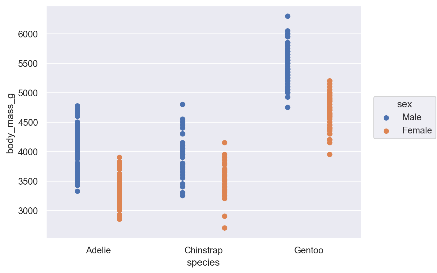
It’s also possible to apply multiple Move operations in sequence:
(
so.Plot(penguins, x="species", y="body_mass_g", color="sex").add(
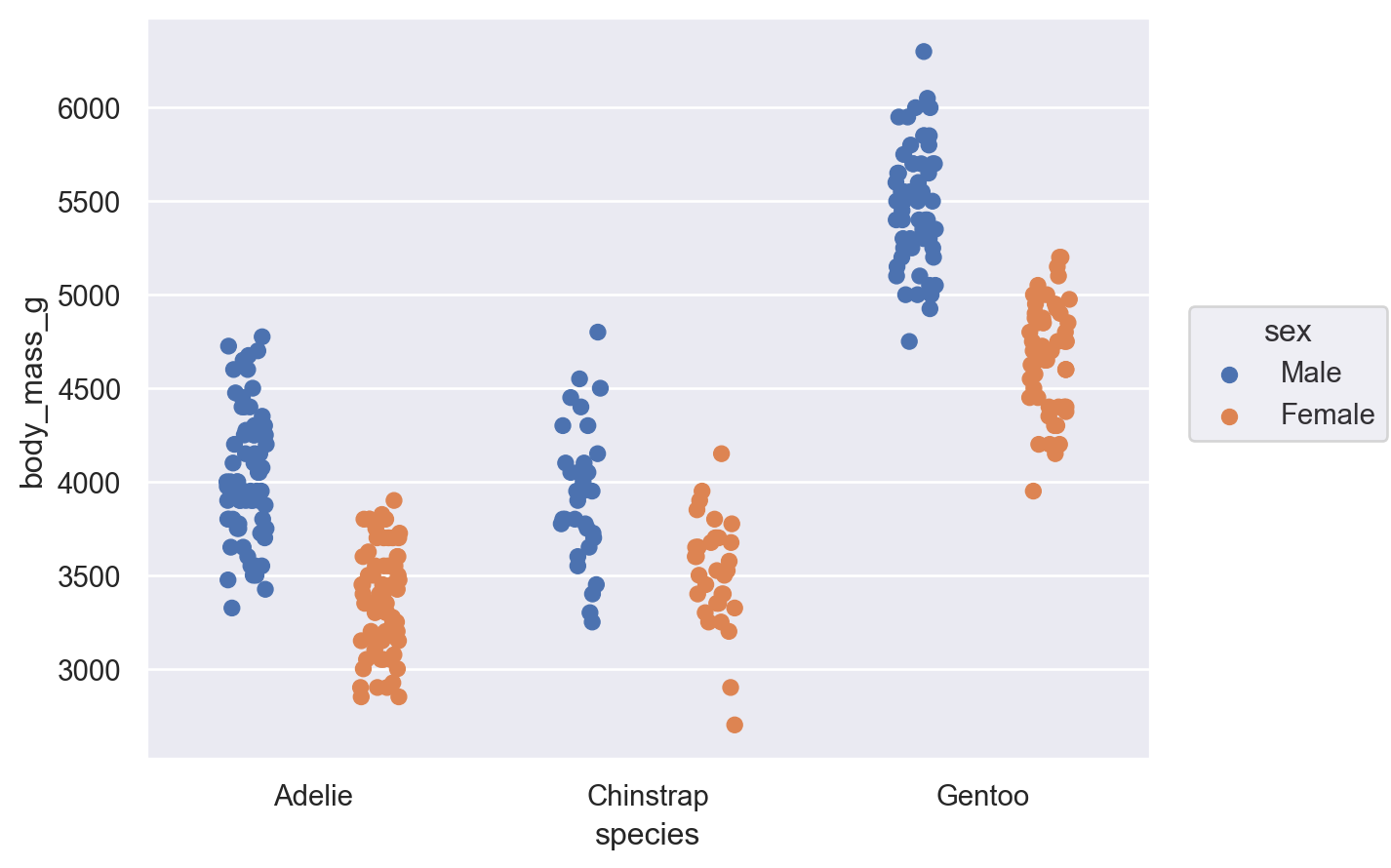
so.Dot(), so.Dodge(), so.Jitter(0.3)
)
)
Creating variables through transformation
The Agg stat requires both x and y to already be defined, but variables can also be created through statistical transformation. For example, the Hist stat requires only one of x or y to be defined, and it will create the other by counting observations:
(so.Plot(penguins, x="species").add(so.Bar(), so.Hist()))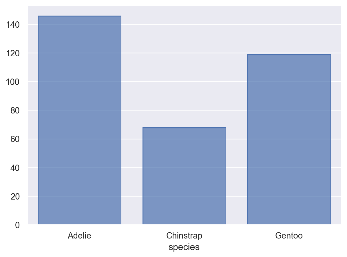
The Hist stat will also create new x values (by binning) when given numeric data:
(so.Plot(penguins, x="flipper_length_mm").add(so.Bars(), so.Hist()))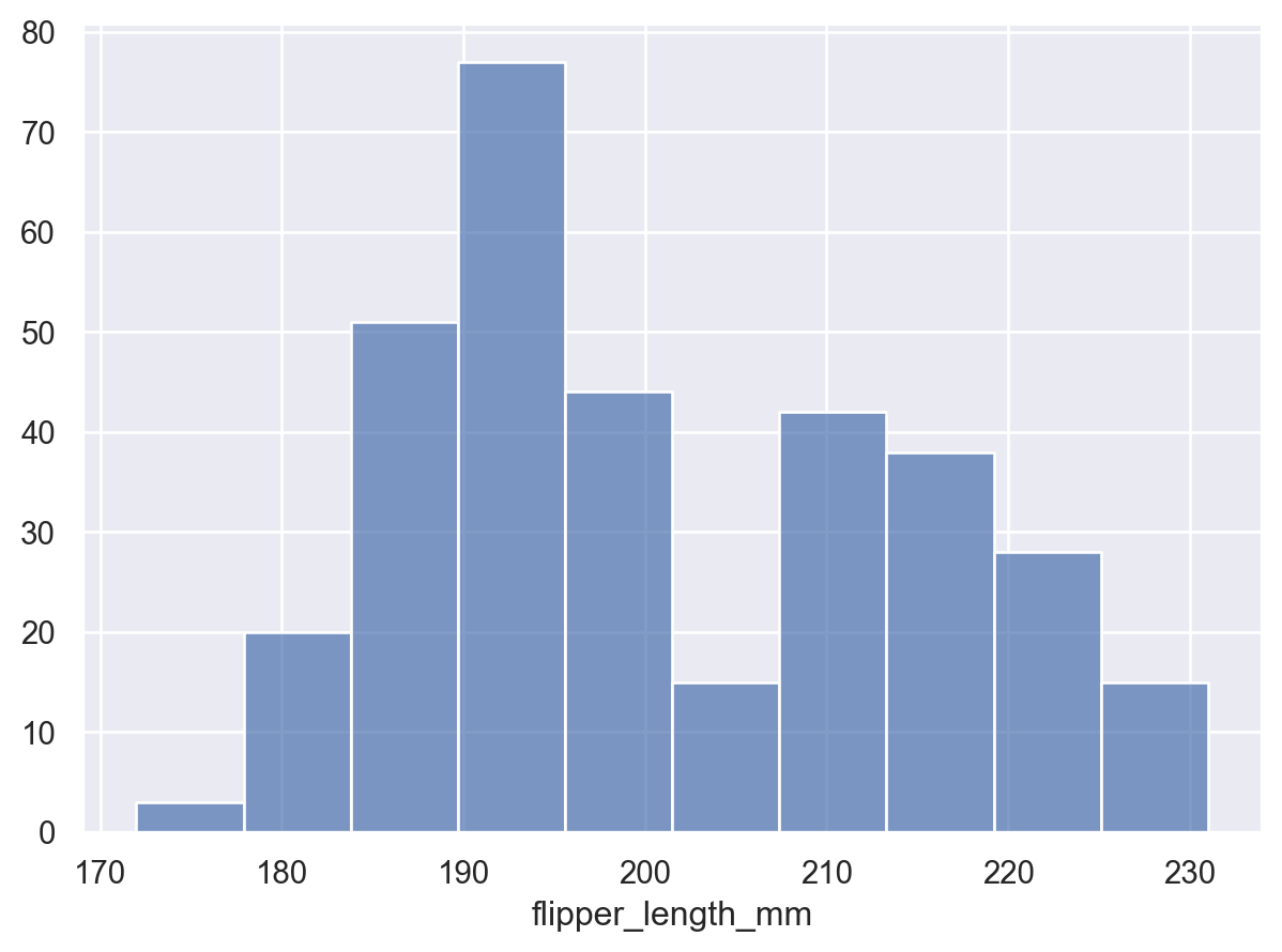
Notice how we used Bars, rather than Bar for the plot with the continuous x axis. These two marks are related, but Bars has different defaults and works better for continuous histograms. It also produces a different, more efficient matplotlib artist. You will find the pattern of singular/plural marks elsewhere. The plural version is typically optimized for cases with larger numbers of marks.
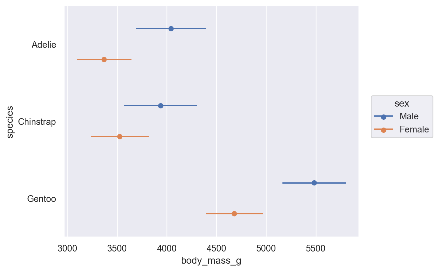
Some transforms accept both x and y, but add interval data for each coordinate. This is particularly relevant for plotting error bars after aggregating:
(
    so.Plot(penguins, x="body_mass_g", y="species", color="sex")
    .add(so.Range(), so.Est(errorbar="sd"), so.Dodge())
    .add(so.Dot(), so.Agg(), so.Dodge())
)
Orienting marks and transforms
When aggregating, dodging, and drawing a bar, the x and y variables are treated differently. Each operation has the concept of an orientation. The Plot() tries to determine the orientation automatically based on the data types of the variables. For instance, if we flip the assignment of species and body_mass_g, we’ll get the same plot, but oriented horizontally:
(
    so.Plot(penguins, x="body_mass_g", y="species", color="sex").add(
        so.Bar(), so.Agg(), so.Dodge()
    )
)
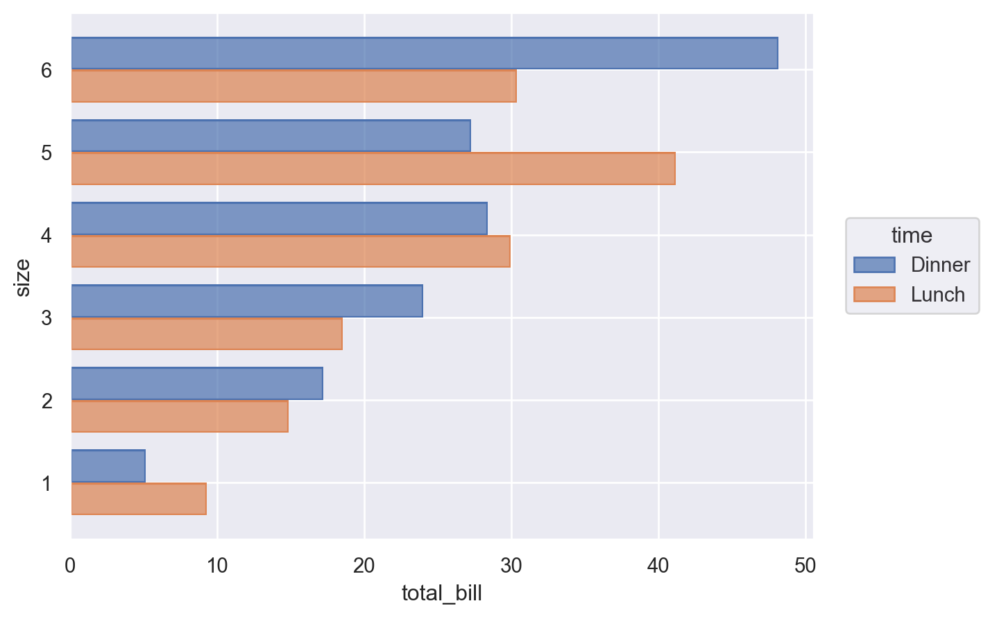
Sometimes, the correct orientation is ambiguous, as when both the x and y variables are numeric. In these cases, you can be explicit by passing the orient parameter to Plot.add():
(
    so.Plot(tips, x="total_bill", y="size", color="time").add(
        so.Bar(), so.Agg(), so.Dodge(), orient="y"
    )
)
Building and displaying the plot
Each example thus far has produced a single subplot with a single kind of mark on it. But Plot() does not limit you to this.
Adding Multiple Layers
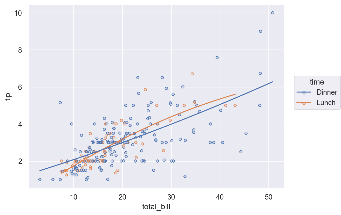
More complex single-subplot graphics can be created by calling Plot.add() repeatedly. Each time it is called, it defines a layer in the plot. For example, we may want to add a scatterplot (now using Dots) and then a regression fit:
(so.Plot(tips, x="total_bill", y="tip").add(so.Dots()).add(so.Line(), so.PolyFit()))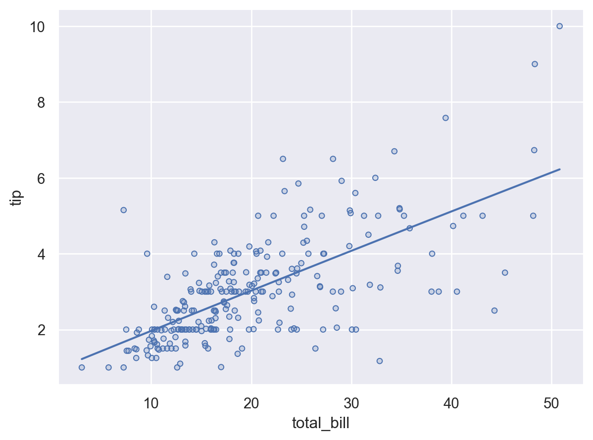
Variable mappings that are defined in the Plot() constructor will be used for all layers:
(
    so.Plot(tips, x="total_bill", y="tip", color="time")
    .add(so.Dots())
    .add(so.Line(), so.PolyFit())
)
Layer-specific mappings
You can also define a mapping such that it is used only in a specific layer. This is accomplished by defining the mapping within the call to Plot.add() for the relevant layer:
(
    so.Plot(tips, x="total_bill", y="tip")
    .add(so.Dots(), color="time")
    .add(so.Line(color=".2"), so.PolyFit())
)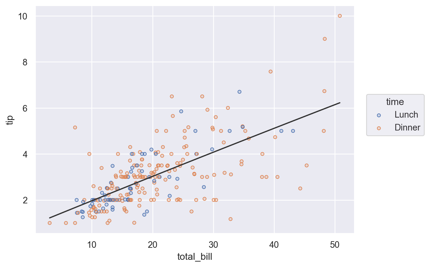
Alternatively, define the layer for the entire plot, but remove it from a specific layer by setting the variable to None:
(
    so.Plot(tips, x="total_bill", y="tip", color="time")
    .add(so.Dots())
    .add(so.Line(color=".2"), so.PolyFit(), color=None)
)
To recap, there are three ways to specify the value of a mark property: (1) by mapping a variable in all layers, (2) by mapping a variable in a specific layer, and (3) by setting the property directy:
from io import StringIO

from IPython.display import SVG

C = sns.color_palette("deep")
f = mpl.figure.Figure(figsize=(7, 3))
ax = f.subplots()
fontsize = 18
ax.add_artist(mpl.patches.Rectangle((0.13, 0.53), 0.45, 0.09, color=C[0], alpha=0.3))
ax.add_artist(mpl.patches.Rectangle((0.22, 0.43), 0.235, 0.09, color=C[1], alpha=0.3))
ax.add_artist(mpl.patches.Rectangle((0.49, 0.43), 0.26, 0.09, color=C[2], alpha=0.3))
ax.text(0.05, 0.55, "Plot(data, 'x', 'y', color='var1')", size=fontsize, color=".2")
ax.text(0.05, 0.45, ".add(Dot(pointsize=10), marker='var2')", size=fontsize, color=".2")
annots = [
    ("Mapped\nin all layers", (0.35, 0.65), (0, 45)),
    ("Set directly", (0.35, 0.4), (0, -45)),
    ("Mapped\nin this layer", (0.63, 0.4), (0, -45)),
]
for i, (text, xy, xytext) in enumerate(annots):
    ax.annotate(
        text,
        xy,
        xytext,
        textcoords="offset points",
        fontsize=14,
        ha="center",
        va="center",
        arrowprops=dict(arrowstyle="->", color=C[i]),
        color=C[i],
    )
ax.set_axis_off()
f.subplots_adjust(0, 0, 1, 1)
f.savefig(s := StringIO(), format="svg")
SVG(s.getvalue())
Faceting and pairing subplots
As with seaborn’s figure-level functions (seaborn.displot(), seaborn.catplot(), etc.), the Plot() interface can also produce figures with multiple “facets”, or subplots containing subsets of data. This is accomplished with the Plot.facet() method:
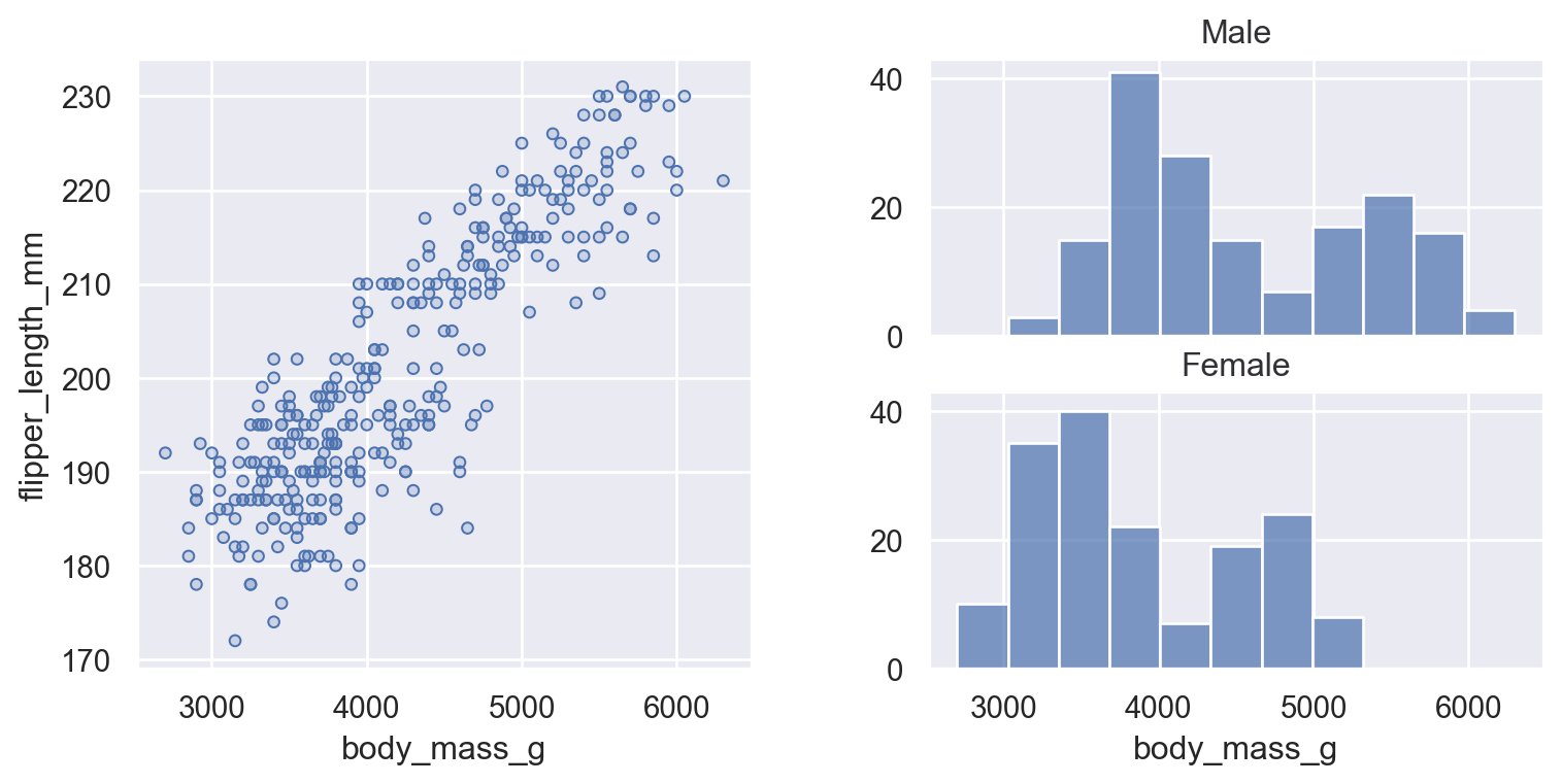
(so.Plot(penguins, x="flipper_length_mm").facet("species").add(so.Bars(), so.Hist()))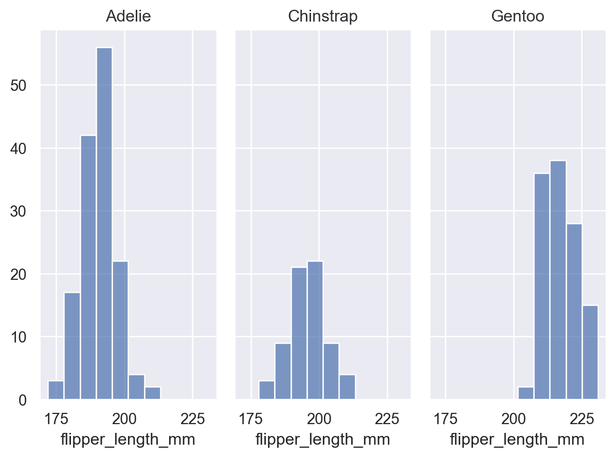
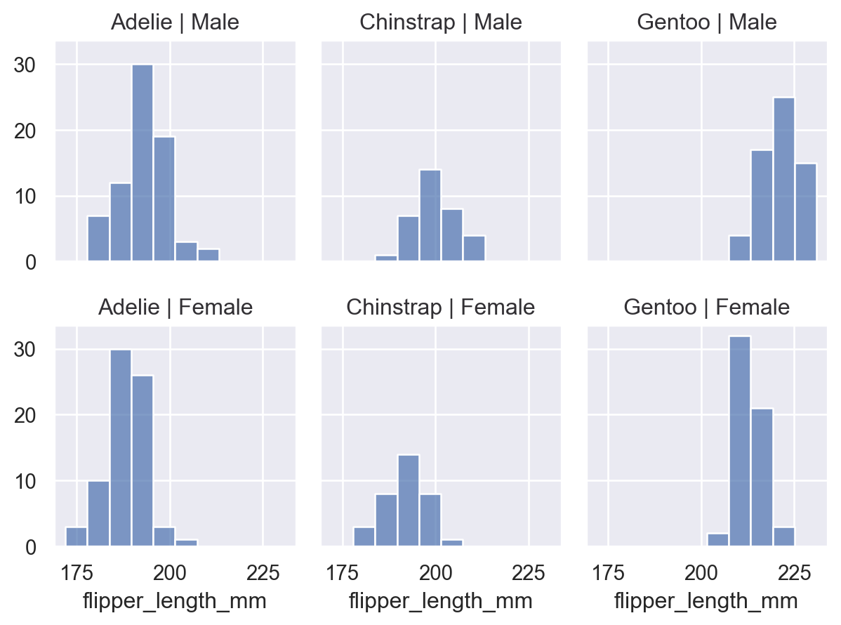
Call Plot.facet() with the variables that should be used to define the columns and/or rows of the plot:
(
    so.Plot(penguins, x="flipper_length_mm")
    .facet(col="species", row="sex")
    .add(so.Bars(), so.Hist())
)
You can facet using a variable with a larger number of levels by “wrapping” across the other dimension:
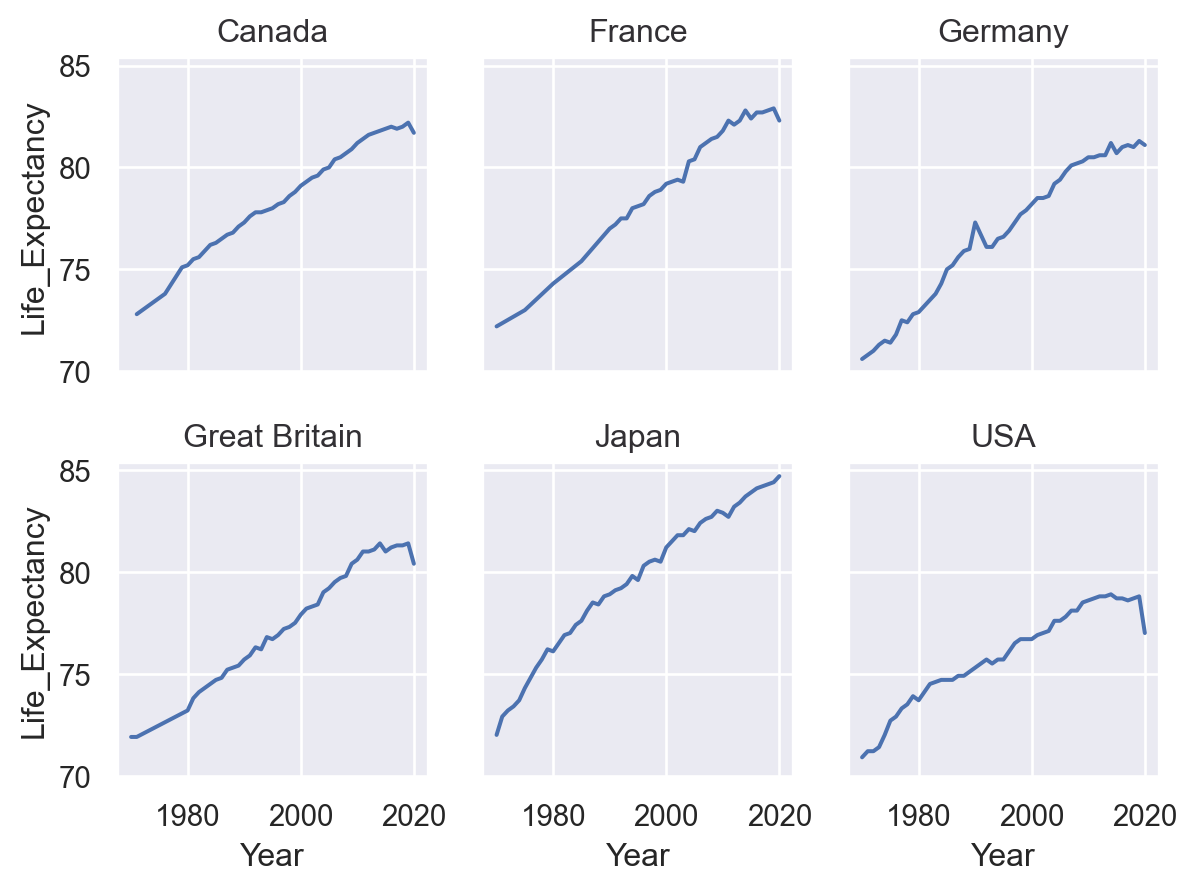
(
    so.Plot(healthexp, x="Year", y="Life_Expectancy")
    .facet(col="Country", wrap=3)
    .add(so.Line())
)
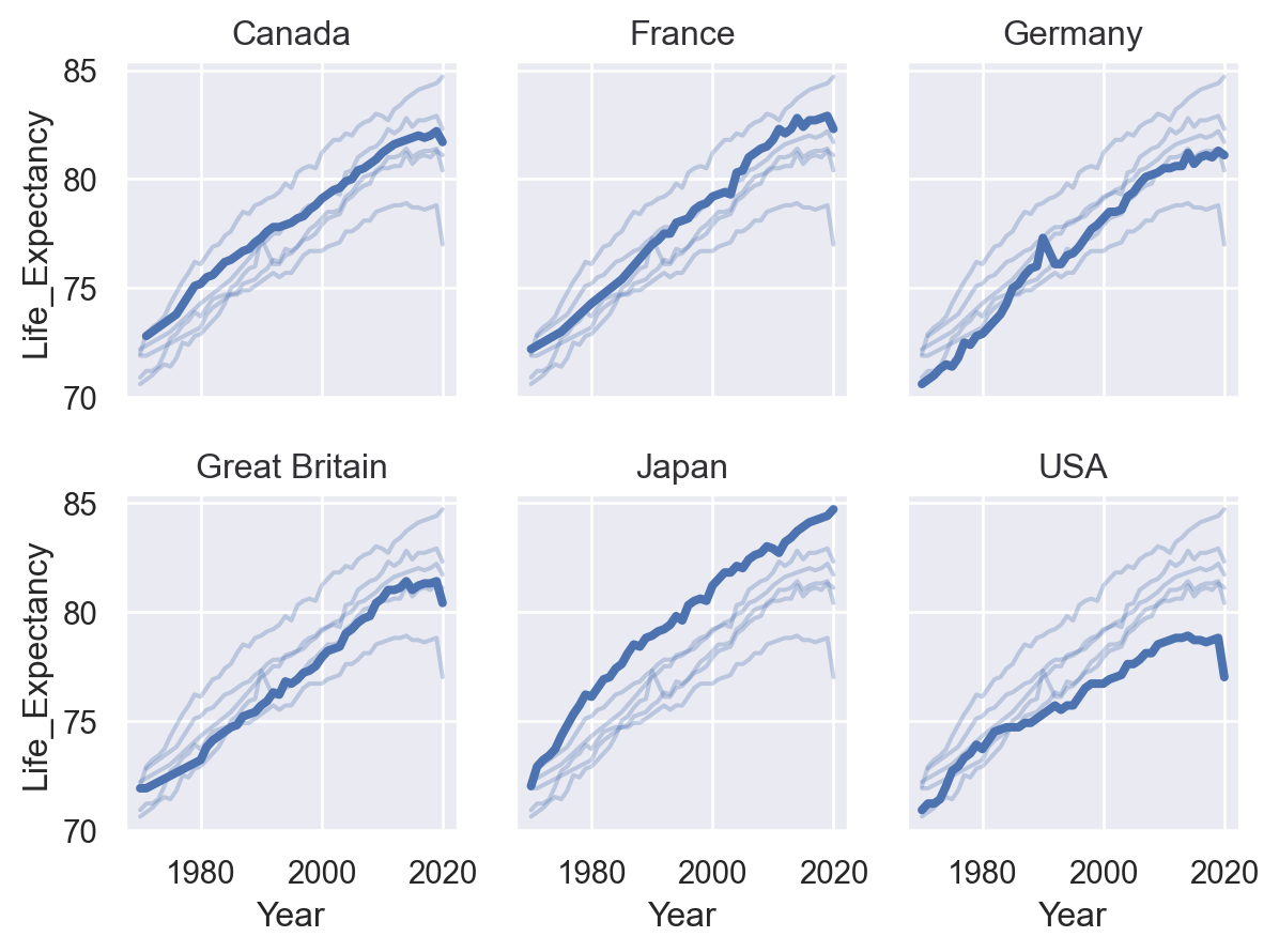
All layers will be faceted unless you explicitly exclude them, which can be useful for providing additional context on each subplot:
(
    so.Plot(healthexp, x="Year", y="Life_Expectancy")
    .facet("Country", wrap=3)
    .add(so.Line(alpha=0.3), group="Country", col=None)
    .add(so.Line(linewidth=3))
)
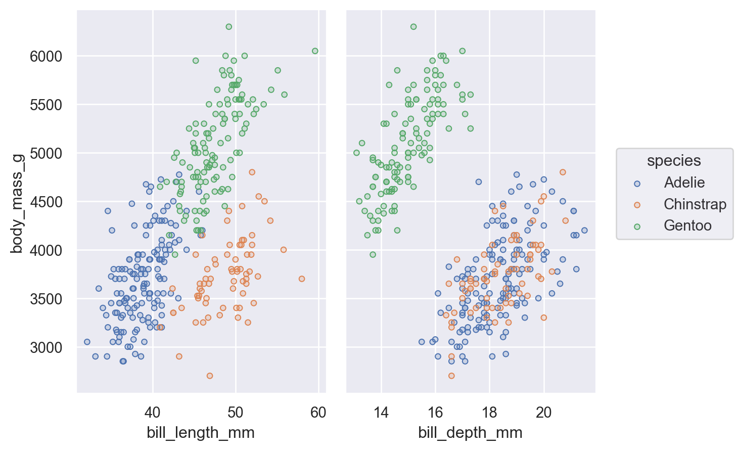
An alternate way to produce subplots is Plot.pair(). Like seaborn.PairGrid(), this draws all of the data on each subplot, using different variables for the x and/or y coordinates:
(
    so.Plot(penguins, y="body_mass_g", color="species")
    .pair(x=["bill_length_mm", "bill_depth_mm"])
    .add(so.Dots())
)
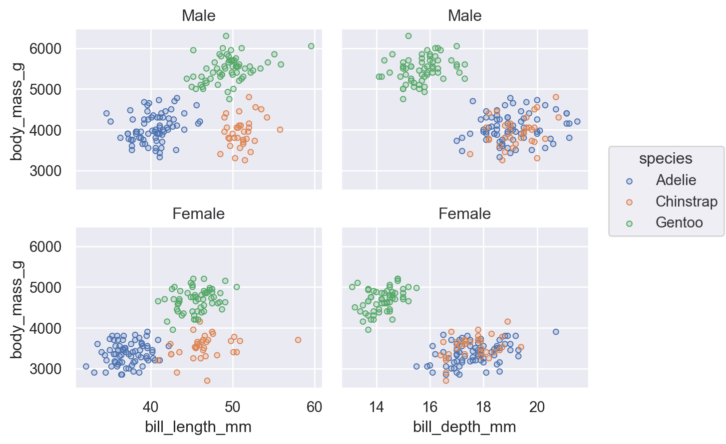
You can combine faceting and pairing so long as the operations add subplots on opposite dimensions:
(
    so.Plot(penguins, y="body_mass_g", color="species")
    .pair(x=["bill_length_mm", "bill_depth_mm"])
    .facet(row="sex")
    .add(so.Dots())
)
Integrating with matplotlib
There may be cases where you want multiple subplots to appear in a figure with a more complex structure than what Plot.facet() or Plot.pair() can provide. The current solution is to delegate figure setup to matplotlib and to supply the matplotlib object that Plot() should use with the Plot.on() method. This object can be either a matplotlib.axes.Axes, matplotlib.figure.Figure, or matplotlib.figure.SubFigure; the latter is most useful for constructing bespoke subplot layouts:
f = mpl.figure.Figure(figsize=(8, 4))
sf1, sf2 = f.subfigures(1, 2)
(
    so.Plot(penguins, x="body_mass_g", y="flipper_length_mm")
    .add(so.Dots())
    .on(sf1)
    .plot()
)
(
    so.Plot(penguins, x="body_mass_g")
    .facet(row="sex")
    .add(so.Bars(), so.Hist())
    .on(sf2)
    .plot()
)
Building and displaying the plot
An important thing to know is that Plot() methods clone the object they are called on and return that clone instead of updating the object in place. This means that you can define a common plot spec and then produce several variations on it.
So, take this basic specification:
p = so.Plot(healthexp, "Year", "Spending_USD", color="Country")We could use it to draw a line plot:
p.add(so.Line())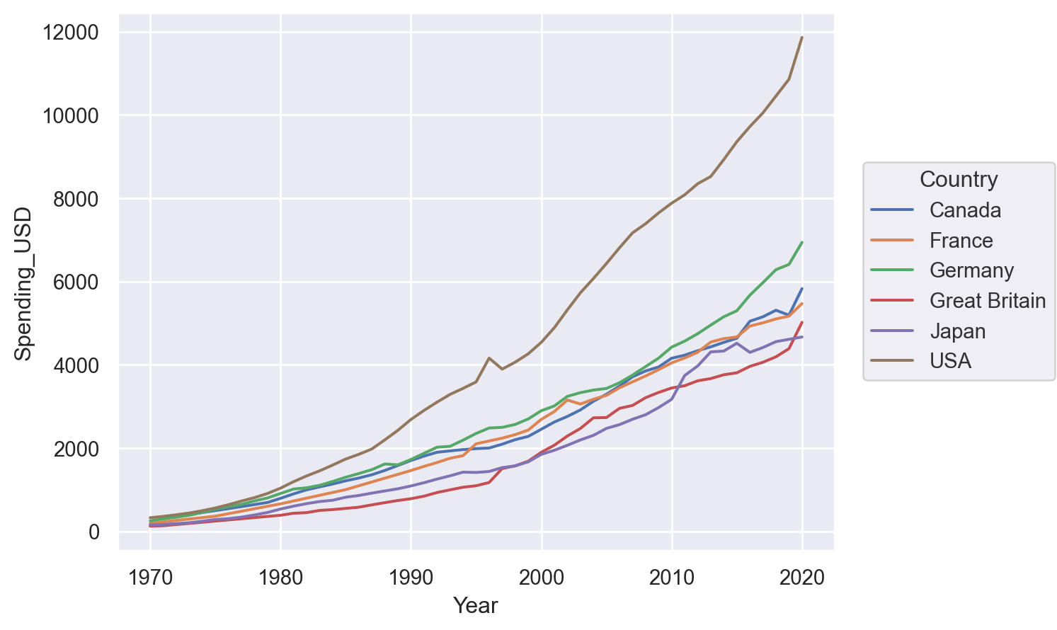
Or perhaps a stacked area plot:
p.add(so.Area(), so.Stack())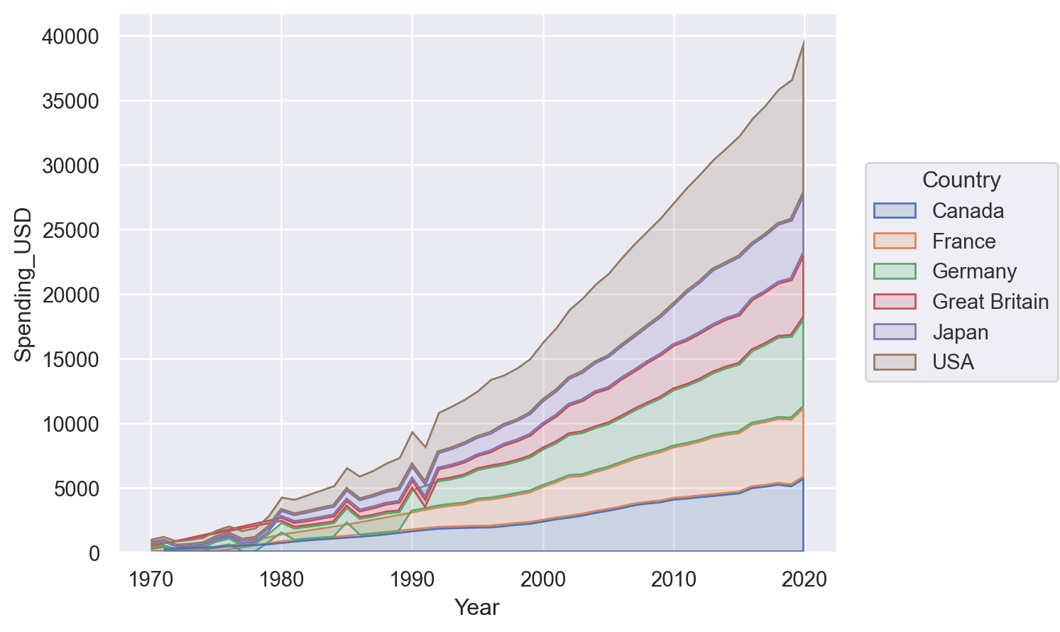
The Plot methods are fully declarative. Calling them updates the plot spec, but it doesn’t actually do any plotting. One consequence of this is that methods can be called in any order, and many of them can be called multiple times.
When does the plot actually get rendered? Plot is optimized for use in notebook environments. The rendering is automatically triggered when the Plot gets displayed in the Jupyter REPL. That’s why we didn’t see anything in the example above, where we defined a Plot but assigned it to p rather than letting it return out to the REPL.
To see a plot in a notebook, either return it from the final line of a cell or call Jupyter’s built-in display function on the object. The notebook integration bypasses :mod:matplotlib.pyplot entirely, but you can use its figure-display machinery in other contexts by calling Plot.show.
You can also save the plot to a file (or buffer) by calling Plot.save.
Customising the appearance
The new interface aims to support a deep amount of customisation through Plot, reducing the need to switch gears and use matplotlib functionality directly. (But please be patient; not all of the features needed to achieve this goal have been implemented!)
Parameterising scales
All of the data-dependent properties are controlled by the concept of a Scale and the Plot.scale() method. This method accepts several different types of arguments. One possibility, which is closest to the use of scales in matplotlib, is to pass the name of a function that transforms the coordinates:
(so.Plot(diamonds, x="carat", y="price").add(so.Dots()).scale(y="log"))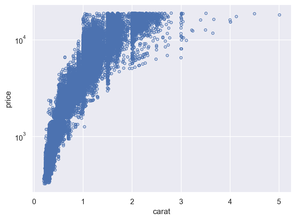
Plot.scale() can also control the mappings for semantic properties like color. You can directly pass it any argument that you would pass to the palette parameter in seaborn’s function interface:
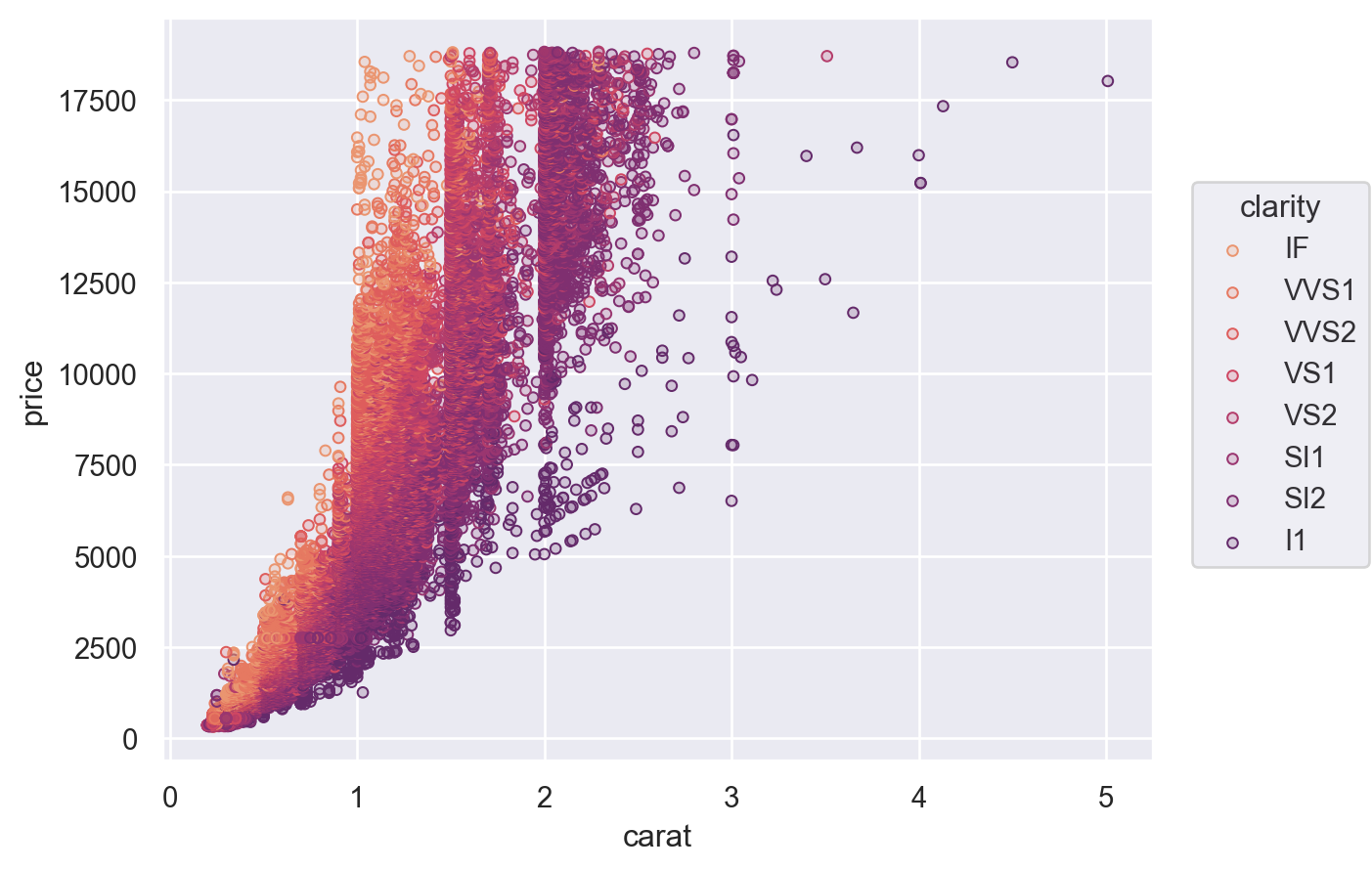
(
    so.Plot(diamonds, x="carat", y="price", color="clarity")
    .add(so.Dots())
    .scale(color="flare")
)
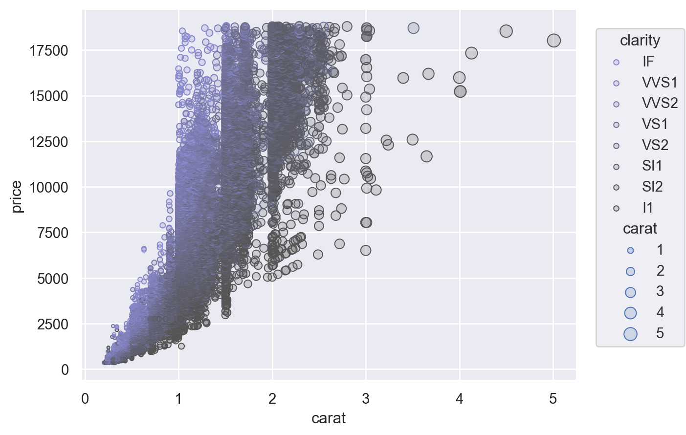
Another option is to provide a tuple of (min, max) values, controlling the range that the scale should map into. This works both for numeric properties and for colors:
(
    so.Plot(diamonds, x="carat", y="price", color="clarity", pointsize="carat")
    .add(so.Dots())
    .scale(color=("#88c", "#555"), pointsize=(2, 10))
)
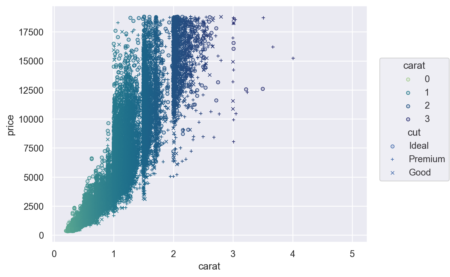
For additional control, you can pass a Scale object. There are several different types of Scale, each with appropriate parameters. For example, Continuous lets you define the input domain (norm), the output range (values), and the function that maps between them (trans), while Nominal allows you to specify an ordering:
(
    so.Plot(diamonds, x="carat", y="price", color="carat", marker="cut")
    .add(so.Dots())
    .scale(
        color=so.Continuous("crest", norm=(0, 3), trans="sqrt"),
        marker=so.Nominal(["o", "+", "x"], order=["Ideal", "Premium", "Good"]),
    )
)
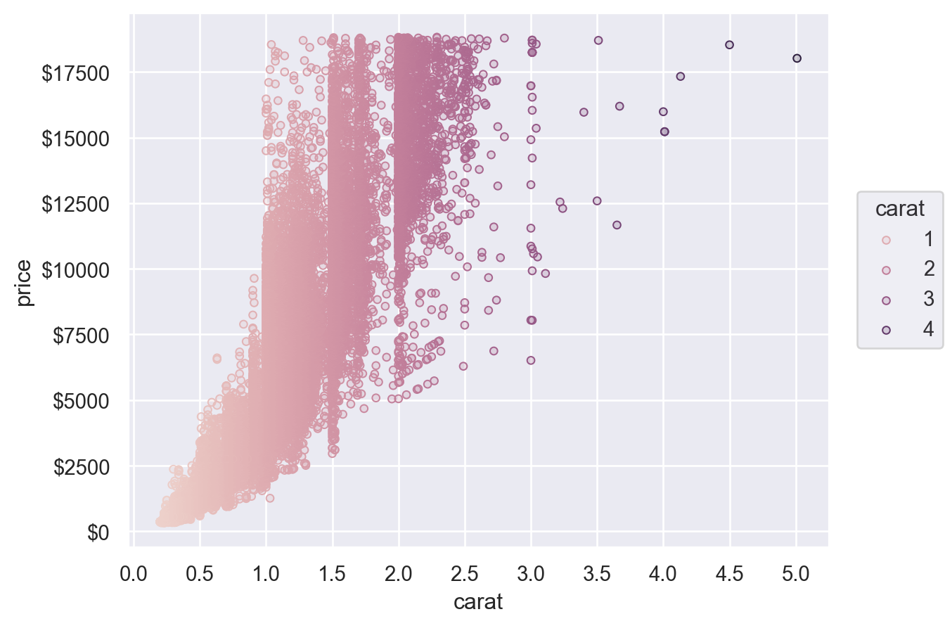
Customising legends and ticks
The Scale objects are also how you specify which values should appear as tick labels / in the legend, along with how they appear. For example, the Continuous.tick method lets you control the density or locations of the ticks, and the Continuous.label method lets you modify the format:
(
    so.Plot(diamonds, x="carat", y="price", color="carat")
    .add(so.Dots())
    .scale(
        x=so.Continuous().tick(every=0.5),
        y=so.Continuous().label(like="${x:.0f}"),
        color=so.Continuous().tick(at=[1, 2, 3, 4]),
    )
)
Customising limits, labels, and titles
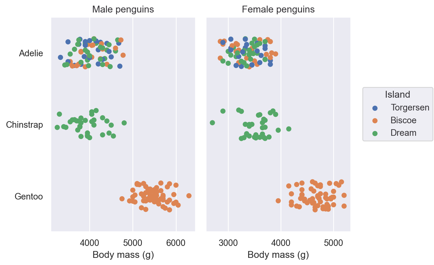
Plot() has a number of methods for simple customisation, including Plot.label(), Plot.limit(), and Plot.share():
(
    so.Plot(penguins, x="body_mass_g", y="species", color="island")
    .facet(col="sex")
    .add(so.Dot(), so.Jitter(0.5))
    .share(x=False)
    .limit(y=(2.5, -0.5))
    .label(
        x="Body mass (g)",
        y="",
        color=str.capitalize,
        title="{} penguins".format,
    )
)
Theme customisation
Finally, Plot() supports data-independent theming through the Plot.theme() method. Currently, this method accepts a dictionary of matplotlib rc parameters. You can set them directly and/or pass a package of parameters from seaborn’s theming functions:
from seaborn import axes_style

so.Plot().theme({**axes_style("whitegrid"), "grid.linestyle": ":"})