import warnings
from pathlib import Path
import altair as alt
import matplotlib.pyplot as plt
import numpy as np
import pandas as pd
import plotly.express as px
import seaborn as sns
import seaborn.objects as so
from lets_plot import *
from lets_plot.mapping import as_discrete
# Set seed for reproducibility
# Set seed for random numbers
seed_for_prng = 78557
prng = np.random.default_rng(
seed_for_prng
) # prng=probabilistic random number generator
# Turn off warnings
warnings.filterwarnings("ignore")
# Set up lets-plot charts
LetsPlot.setup_html()Common Plots II
Introduction
Carrying on from the previous chapter, we’ll look at more of the most common plots that you might want to make—and how to create them using the most popular data visualisations libraries, including matplotlib, lets-plot, seaborn, altair, and plotly.
Let’s import the libraries we’ll need.
Overlapping Area plot
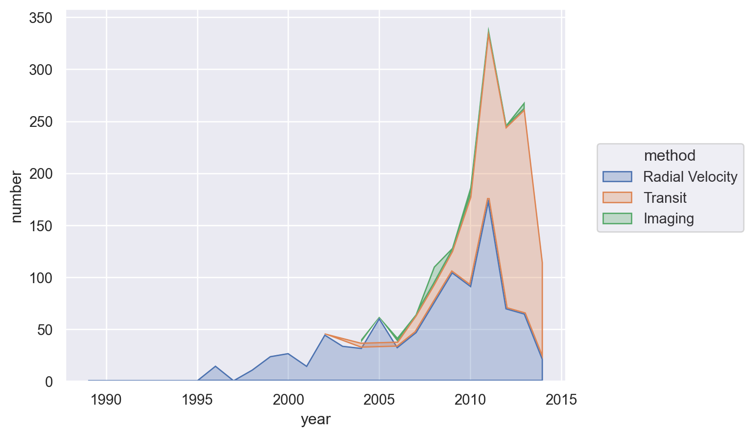
For this, let’s look at the dominance of the three most used methods for detecting exoplanets.
planets = sns.load_dataset("planets")
most_pop_methods = (
planets.groupby(["method"])["number"]
.sum()
.sort_values(ascending=False)
.index[:3]
.values
)
planets = planets[planets["method"].isin(most_pop_methods)]
planets.head()| method | number | orbital_period | mass | distance | year | |
|---|---|---|---|---|---|---|
| 0 | Radial Velocity | 1 | 269.300 | 7.10 | 77.40 | 2006 |
| 1 | Radial Velocity | 1 | 874.774 | 2.21 | 56.95 | 2008 |
| 2 | Radial Velocity | 1 | 763.000 | 2.60 | 19.84 | 2011 |
| 3 | Radial Velocity | 1 | 326.030 | 19.40 | 110.62 | 2007 |
| 4 | Radial Velocity | 1 | 516.220 | 10.50 | 119.47 | 2009 |
Matplotlib
The easiest way to do this in matplotlib is to adjust the data a bit first and then use the built-in pandas plot function. (This is true in other cases too, but in this case it’s much more complex otherwise).
(
planets.groupby(["year", "method"])["number"]
.sum()
.unstack()
.plot.area(alpha=0.6, ylim=(0, None))
.set_title("Planets dicovered by top 3 methods", loc="left")
);
Seaborn
(
so.Plot(
planets.groupby(["year", "method"])["number"].sum().reset_index(),
x="year",
y="number",
color="method",
).add(so.Area(alpha=0.3), so.Agg(), so.Stack())
)
Lets-Plot
(
ggplot(
planets.groupby(["year", "method"])["number"].sum().reset_index(),
aes(x="year", y="number", fill="method", group="method", color="method"),
)
+ geom_area(stat="identity", alpha=0.5)
+ scale_x_continuous(format="d")
)Altair
alt.Chart(
planets.groupby(["year", "method"])["number"]
.sum()
.reset_index()
.assign(
year=lambda x: pd.to_datetime(x["year"], format="%Y")
+ pd.tseries.offsets.YearEnd()
)
).mark_area().encode(x="year:T", y="number:Q", color="method:N")Slope chart
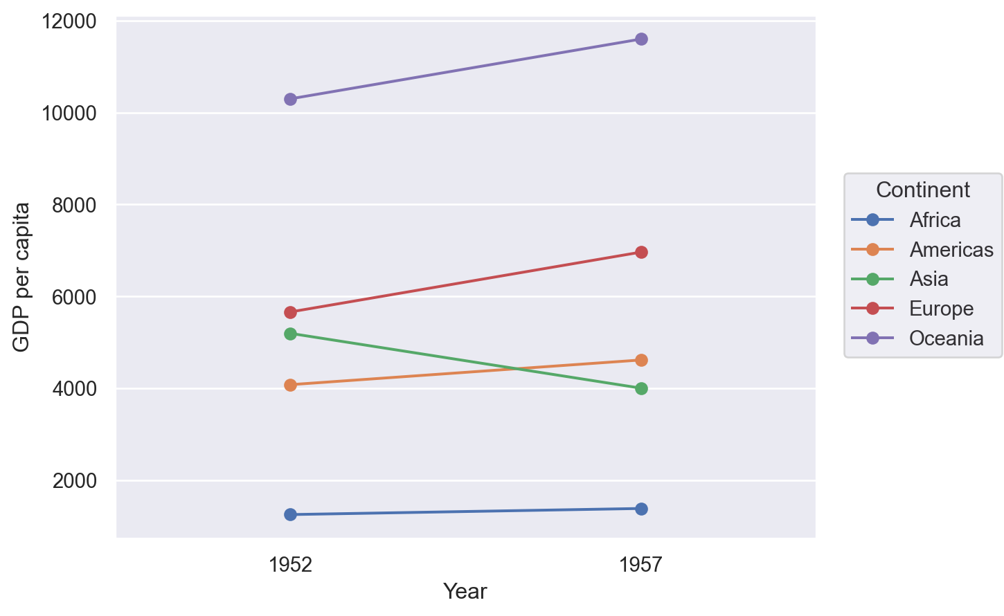
A slope chart has two points connected by a line and is good for indicating how relationships between variables have changed over time.
df = pd.read_csv(
"https://raw.githubusercontent.com/selva86/datasets/master/gdppercap.csv"
)
df = pd.melt(
df,
id_vars=["continent"],
value_vars=df.columns[1:],
value_name="GDP per capita",
var_name="Year",
).rename(columns={"continent": "Continent"})
df.head()| Continent | Year | GDP per capita | |
|---|---|---|---|
| 0 | Africa | 1952 | 1252.572466 |
| 1 | Americas | 1952 | 4079.062552 |
| 2 | Asia | 1952 | 5195.484004 |
| 3 | Europe | 1952 | 5661.057435 |
| 4 | Oceania | 1952 | 10298.085650 |
Matplotlib
There isn’t an off-the-shelf way to do this in matplotlib but the example below shows that, with matplotlib, where there’s a will there’s a way! It’s where the ‘build-what-you-want’ comes into its own. Note that the functino that’s defined returns an Axes object so that you can do further processing and tweaking as you like.
from matplotlib import lines as mlines
def slope_plot(data, x, y, group, before_txt="Before", after_txt="After"):
if len(data[x].unique()) != 2:
raise ValueError("Slope plot must have two unique periods.")
wide_data = data[[x, y, group]].pivot(index=group, columns=x, values=y)
x_names = list(wide_data.columns)
fig, ax = plt.subplots()
def newline(p1, p2, color="black"):
ax = plt.gca()
line = mlines.Line2D(
[p1[0], p2[0]],
[p1[1], p2[1]],
color="red" if p1[1] - p2[1] > 0 else "green",
marker="o",
markersize=6,
)
ax.add_line(line)
return line
# Vertical Lines
y_min = data[y].min()
y_max = data[y].max()
ax.vlines(
x=1,
ymin=y_min,
ymax=y_max,
color="black",
alpha=0.7,
linewidth=1,
linestyles="dotted",
)
ax.vlines(
x=3,
ymin=y_min,
ymax=y_max,
color="black",
alpha=0.7,
linewidth=1,
linestyles="dotted",
)
# Points
ax.scatter(
y=wide_data[x_names[0]],
x=np.repeat(1, wide_data.shape[0]),
s=15,
color="black",
alpha=0.7,
)
ax.scatter(
y=wide_data[x_names[1]],
x=np.repeat(3, wide_data.shape[0]),
s=15,
color="black",
alpha=0.7,
)
# Line Segmentsand Annotation
for p1, p2, c in zip(wide_data[x_names[0]], wide_data[x_names[1]], wide_data.index):
newline([1, p1], [3, p2])
ax.text(
1 - 0.05,
p1,
c,
horizontalalignment="right",
verticalalignment="center",
fontdict={"size": 14},
)
ax.text(
3 + 0.05,
p2,
c,
horizontalalignment="left",
verticalalignment="center",
fontdict={"size": 14},
)
# 'Before' and 'After' Annotations
ax.text(
1 - 0.05,
y_max + abs(y_max) * 0.1,
before_txt,
horizontalalignment="right",
verticalalignment="center",
fontdict={"size": 16, "weight": 700},
)
ax.text(
3 + 0.05,
y_max + abs(y_max) * 0.1,
after_txt,
horizontalalignment="left",
verticalalignment="center",
fontdict={"size": 16, "weight": 700},
)
# Decoration
ax.set(
xlim=(0, 4), ylabel=y, ylim=(y_min - 0.1 * abs(y_min), y_max + abs(y_max) * 0.1)
)
ax.set_xticks([1, 3])
ax.set_xticklabels(x_names)
# Lighten borders
for ax_pos in ["top", "bottom", "right", "left"]:
ax.spines[ax_pos].set_visible(False)
return ax
slope_plot(df, x="Year", y="GDP per capita", group="Continent");
Seaborn
(
so.Plot(df, x="Year", y="GDP per capita", color="Continent")
.add(so.Line(marker="o"), so.Agg())
.add(so.Range())
)
Lets-Plot
(
ggplot(df, aes(x="Year", y="GDP per capita", group="Continent"))
+ geom_line(aes(color="Continent"), size=1)
+ geom_point(aes(color="Continent"), size=4)
)Altair
alt.Chart(df).mark_line().encode(x="Year:O", y="GDP per capita", color="Continent")Plotly
import plotly.graph_objects as go
yr_names = [int(x) for x in df["Year"].unique()]
px_df = (
df.pivot(index="Continent", columns="Year", values="GDP per capita")
.reset_index()
.rename(columns=dict(zip(df["Year"].unique(), range(len(df["Year"].unique())))))
)
x_offset = 5
fig1 = go.Figure()
# Draw lines
for index, row in px_df.iterrows():
fig1.add_shape(
type="line",
x0=yr_names[0],
y0=row[0],
x1=yr_names[1],
y1=row[1],
name=row["Continent"],
line=dict(color=px.colors.qualitative.Plotly[index]),
)
fig1.add_trace(
go.Scatter(
x=[yr_names[0]],
y=[row[0]],
text=row["Continent"],
mode="text",
name=None,
)
)
fig1.update_xaxes(range=[yr_names[0] - x_offset, yr_names[1] + x_offset])
fig1.update_yaxes(
range=[px_df[[0, 1]].min().min() * 0.8, px_df[[0, 1]].max().max() * 1.2]
)
fig1.update_layout(showlegend=False)
fig1.show()Dumbbell Plot
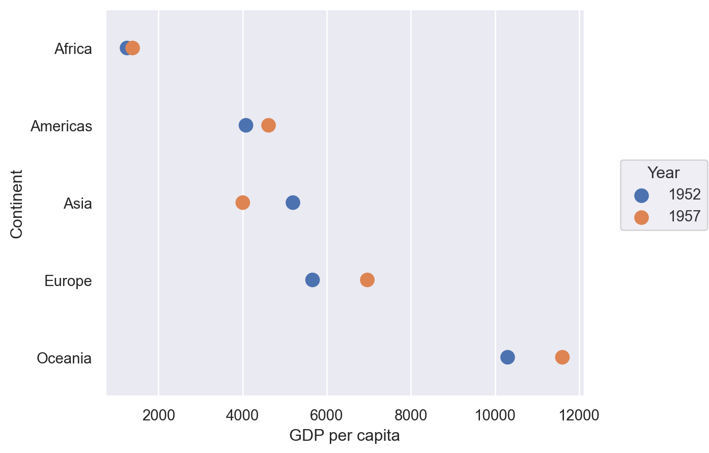
These are excellent for showing a change in time with a large number of categories, as we will do here with continents and mean GDP per capita.
df = pd.read_csv(
"https://raw.githubusercontent.com/selva86/datasets/master/gdppercap.csv"
)
df = pd.melt(
df,
id_vars=["continent"],
value_vars=df.columns[1:],
value_name="GDP per capita",
var_name="Year",
).rename(columns={"continent": "Continent"})
df.head()| Continent | Year | GDP per capita | |
|---|---|---|---|
| 0 | Africa | 1952 | 1252.572466 |
| 1 | Americas | 1952 | 4079.062552 |
| 2 | Asia | 1952 | 5195.484004 |
| 3 | Europe | 1952 | 5661.057435 |
| 4 | Oceania | 1952 | 10298.085650 |
Matplotlib
Again, no off-the-shelf method–but that’s no problem when you can build it yourself.
def dumbbell_plot(data, x, y, change):
if len(data[x].unique()) != 2:
raise ValueError("Dumbbell plot must have two unique periods.")
if not isinstance(data[y].iloc[0], str):
raise ValueError("Dumbbell plot y variable only works with category values.")
wide_data = data[[x, y, change]].pivot(index=y, columns=x, values=change)
x_names = list(wide_data.columns)
y_names = list(wide_data.index)
def newline(p1, p2, color="black"):
ax = plt.gca()
line = mlines.Line2D([p1[0], p2[0]], [p1[1], p2[1]], color="skyblue", zorder=0)
ax.add_line(line)
return line
fig, ax = plt.subplots()
# Points
ax.scatter(
y=range(len(y_names)),
x=wide_data[x_names[1]],
s=50,
color="#0e668b",
alpha=0.9,
zorder=2,
label=x_names[1],
)
ax.scatter(
y=range(len(y_names)),
x=wide_data[x_names[0]],
s=50,
color="#a3c4dc",
alpha=0.9,
zorder=1,
label=x_names[0],
)
# Line segments
for i, p1, p2 in zip(
range(len(y_names)), wide_data[x_names[0]], wide_data[x_names[1]]
):
newline([p1, i], [p2, i])
ax.set_yticks(range(len(y_names)))
ax.set_yticklabels(y_names)
# Decoration
# Lighten borders
for ax_pos in ["top", "right", "left"]:
ax.spines[ax_pos].set_visible(False)
ax.set_xlabel(change)
ax.legend(frameon=False, loc="lower right")
plt.show()
dumbbell_plot(df, x="Year", y="Continent", change="GDP per capita")
Seaborn
(
so.Plot(df, y="Continent", x="GDP per capita", color="Year").add(
so.Dots(pointsize=10, fillalpha=1)
)
)
Lets-Plot
(
ggplot(df, aes(y="Continent", x="GDP per capita", group="Continent"))
+ geom_line(color="black", size=2)
+ geom_point(aes(color="Year"), size=5)
+ ggsize(400, 500)
)Plotly
import plotly.graph_objects as go
fig1 = go.Figure()
yr_names = df["Year"].unique()
# Draw lines
for i, cont in enumerate(df["Continent"].unique()):
cdf = df[df["Continent"] == cont]
fig1.add_shape(
type="line",
x0=cdf.loc[cdf["Year"] == yr_names[0], "GDP per capita"].values[0],
y0=cont,
x1=cdf.loc[cdf["Year"] == yr_names[1], "GDP per capita"].values[0],
y1=cont,
line=dict(color=px.colors.qualitative.Plotly[0], width=2),
)
# Draw points
for i, year in enumerate(yr_names):
yrdf = df[df["Year"] == year]
fig1.add_trace(
go.Scatter(
y=yrdf["Continent"],
x=yrdf["GDP per capita"],
mode="markers",
name=year,
marker_color=px.colors.qualitative.Plotly[i],
marker_size=10,
),
)
fig1.show()Polar
I’m not sure I’ve ever seen a polar plots in economics, but you never know.
Let’s generate some polar data first:
r = np.arange(0, 2, 0.01)
theta = 2 * np.pi * r
polar_data = pd.DataFrame({"r": r, "theta": theta})
polar_data.head()| r | theta | |
|---|---|---|
| 0 | 0.00 | 0.000000 |
| 1 | 0.01 | 0.062832 |
| 2 | 0.02 | 0.125664 |
| 3 | 0.03 | 0.188496 |
| 4 | 0.04 | 0.251327 |
Matplotlib
ax = plt.subplot(111, projection="polar")
ax.plot(polar_data["theta"], polar_data["r"])
ax.set_rmax(2)
ax.set_rticks([0.5, 1, 1.5, 2]) # Fewer radial ticks
ax.set_rlabel_position(-22.5) # Move radial labels away from plotted line
ax.grid(True)
plt.show()
Plotly
fig = go.Figure(
data=go.Scatterpolar(
r=polar_data["r"].values,
theta=polar_data["theta"].values * 180 / (np.pi),
mode="lines",
)
)
fig.update_layout(showlegend=False)
fig.show()Radar (or spider) chart
Let’s generate some synthetic data for this one. Assumes that result to be shown is the sum of observations.
df = pd.DataFrame(
dict(
zip(
["var" + str(i) for i in range(1, 6)],
[np.random.randint(30, size=(4)) for i in range(1, 6)],
)
)
)
df.head()| var1 | var2 | var3 | var4 | var5 | |
|---|---|---|---|---|---|
| 0 | 10 | 26 | 0 | 28 | 20 |
| 1 | 3 | 17 | 22 | 26 | 11 |
| 2 | 1 | 2 | 7 | 9 | 3 |
| 3 | 24 | 20 | 12 | 13 | 21 |
from math import pi
def radar_plot(data, variables):
n_vars = len(variables)
# Plot the first line of the data frame.
# Repeat the first value to close the circular graph:
values = data.loc[data.index[0], variables].values.flatten().tolist()
values += values[:1]
# What will be the angle of each axis in the plot? (we divide / number of variable)
angles = [n / float(n_vars) * 2 * pi for n in range(n_vars)]
angles += angles[:1]
# Initialise the spider plot
ax = plt.subplot(111, polar=True)
# Draw one axe per variable + add labels
plt.xticks(angles[:-1], variables)
# Draw ylabels
ax.set_rlabel_position(0)
# Plot data
ax.plot(angles, values, linewidth=1, linestyle="solid")
# Fill area
ax.fill(angles, values, "b", alpha=0.1)
return ax
radar_plot(df, df.columns);
Plotly
df = px.data.wind()
print(df.head())
fig = px.line_polar(
df,
r="frequency",
theta="direction",
color="strength",
line_close=True,
color_discrete_sequence=px.colors.sequential.Plasma_r,
template="plotly_dark",
)
fig.show() direction strength frequency
0 N 0-1 0.5
1 NNE 0-1 0.6
2 NE 0-1 0.5
3 ENE 0-1 0.4
4 E 0-1 0.4Wordcloud
These should be used sparingly. Let’s grab part of a famous text from Project Gutenberg:
# To run this example, download smith_won.txt from
# https://github.com/aeturrell/coding-for-economists/blob/main/data/smith_won.txt
# and put it in a sub-folder called 'data
book_text = open(Path("data", "smith_won.txt"), "r", encoding="utf-8").read()
# Print some lines
print("\n".join(book_text.split("\n")[107:117])) anywhere directed, or applied, seem to have been the effects of the
division of labour. The effects of the division of labour, in the general
business of society, will be more easily understood, by considering in
what manner it operates in some particular manufactures. It is commonly
supposed to be carried furthest in some very trifling ones; not perhaps
that it really is carried further in them than in others of more
importance: but in those trifling manufactures which are destined to
supply the small wants of but a small number of people, the whole number
of workmen must necessarily be small; and those employed in every
different branch of the work can often be collected into the samefrom wordcloud import WordCloud
wordcloud = WordCloud(width=700, height=400).generate(book_text)
fig, ax = plt.subplots(facecolor="k")
ax.imshow(wordcloud, interpolation="bilinear")
plt.axis("off")
plt.tight_layout();
We can also create a ‘mask’ for the wordcloud to shape it how we like, here in the shape of a book.
# To run this example, download book_mask.png from
# https://github.com/aeturrell/coding-for-economists/raw/main/data/book_mask.png
# and put it in a sub-folder called 'data
from PIL import Image
mask = np.array(Image.open(Path("data", "book_mask.png")))
wc = WordCloud(width=700, height=400, mask=mask, background_color="white")
wordcloud = wc.generate(book_text)
fig, ax = plt.subplots(facecolor="white")
ax.imshow(wordcloud, interpolation="bilinear")
plt.axis("off")
plt.tight_layout();
Network diagrams
networkx
The most well-established network visualisation package is networkx, which does a lot more than just visualisation. It has many different positioning options for rendering any given network, for instance in circular, spectral, spring, Fruchterman-Reingold, or other styles. In the below example, we use a pandas dataframe to specify the edges in two columns but there are various other ways to specify the network too, including ones that do not rely on pandas.
The underlying plot is rendered with matplotlib, meaning that you can customise it further should you need to. You can pass an Axes object ax to nx.draw() using nx.draw(..., ax=ax).
import networkx as nx
df = pd.DataFrame(
{
"source": ["A", "B", "C", "A", "E", "F", "E", "G", "G", "D", "F"],
"target": ["D", "A", "E", "C", "A", "F", "G", "D", "B", "G", "C"],
}
)
G = nx.from_pandas_edgelist(df)
nx.draw(G, with_labels=True, node_size=500, node_color="skyblue")
Ridge, or ‘joy’, plots
These are famous from the front cover of “Unkown Pleasures” by Joy Division. Let’s look at an example showing the global increase in temperature.
We’ll use a summary of the daily land-surface average temperature anomaly produced by the Berkeley Earth averaging method. Temperatures are in Celsius and reported as anomalies relative to the Jan 1951-Dec 1980 average (the estimated Jan 1951-Dec 1980 land-average temperature is 8.63 +/- 0.06 C).
# To run this example, download the pickle file from
# https://github.com/aeturrell/coding-for-economists/blob/main/data/berkeley_data.pkl
# and put it in a sub-folder called 'data'
df = pd.read_pickle(Path("data/berkeley_data.pkl"))
df.head()| Date Number | Year | Month | Day | Day of Year | Anomaly | |
|---|---|---|---|---|---|---|
| 0 | 1880.001 | 1880 | 1 | 1 | 1 | -0.786 |
| 1 | 1880.004 | 1880 | 1 | 2 | 2 | -0.695 |
| 2 | 1880.007 | 1880 | 1 | 3 | 3 | -0.783 |
| 3 | 1880.01 | 1880 | 1 | 4 | 4 | -0.725 |
| 4 | 1880.012 | 1880 | 1 | 5 | 5 | -0.802 |
Lets-Plot
final_year = df["Year"].max()
first_year = df["Year"].min()
breaks = [y for y in list(df.Year.unique()) if y % 10 == 0]
(
ggplot(df, aes("Anomaly", "Year", fill="Year"))
+ geom_area_ridges(scale=20, alpha=1, size=0.2, trim=True, show_legend=False)
+ scale_y_continuous(breaks=breaks, trans="reverse")
+ scale_fill_viridis(option="inferno")
+ ggtitle(
"Global daily temperature anomaly {0}-{1} \n(°C above 1951-80 average)".format(
first_year, final_year
)
)
)Contour Plot
Contour plots can help you show how a third variable, Z, varies with both X and Y (ie Z is a surface). The way that Z is depicted could be via the density of lines drawn in the X-Y plane (use ax.contour() for this) or via colour, as in the example below (using ax.contourf()).
The heatmap (or contour plot) below, which has a colour bar legend and a title that’s rendered with latex, uses a perceptually uniform distribution that makes equal changes look equal; matplotlib has a few of these. If you need more colours, check out the packages colorcet and palettable.
Matplotlib
Note that, in the below, Z is returned by a function that accepts a grid of X and Y values.
def f(x, y):
return np.sin(x) ** 10 + np.cos(10 + y * x) * np.cos(x)
x = np.linspace(0, 5, 100)
y = np.linspace(0, 5, 100)
X, Y = np.meshgrid(x, y)
Z = f(X, Y)
fig, ax = plt.subplots()
cf = ax.contourf(X, Y, Z, cmap="plasma")
ax.set_title(r"$f(x,y) = \sin^{10}(x) + \cos(x)\cos\left(10 + y\cdot x\right)$")
cbar = fig.colorbar(cf);
Lets-Plot
contour_data = {"x": X.flatten(), "y": Y.flatten(), "z": Z.flatten()}
(
ggplot(contour_data)
+ geom_contourf(aes(x="x", y="y", z="z", fill="..level.."))
+ scale_fill_viridis(option="plasma")
+ ggtitle("Maths equations don't currently work")
)Plotly
import plotly.graph_objects as go
grid_fig = go.Figure(data=go.Contour(z=Z, x=x, y=y))
grid_fig.show()Waterfall chart
Waterfall charts are good for showing how different contributions combine to net out at a certain value. There’s a package dedicated to them called waterfallcharts. It builds on matplotlib. First, let’s create some data:
a = ["sales", "returns", "credit fees", "rebates", "late charges", "shipping"]
b = [10, -30, -7.5, -25, 95, -7]Now let’s plot this data. Because the defaults of waterfallcharts don’t play that nicely with the plot style used for this book, we’ll temporarily switch back to the matplotlib default plot style using a context and with statement:
import waterfall_chart
with plt.style.context("default"):
plot = waterfall_chart.plot(a, b, sorted_value=True, rotation_value=0)
Plotly
import plotly.graph_objects as go
px_b = b + [sum(b)]
fig = go.Figure(
go.Waterfall(
name="20",
orientation="v",
measure=["relative"] * len(a) + ["total"],
x=a + ["net"],
textposition="outside",
text=[str(x) for x in b] + ["net"],
y=px_b,
connector={"line": {"color": "rgb(63, 63, 63)"}},
)
)
fig.show()Venn
Venn diagrams show the overlap between groups. As with some of these other, more unsual chart types, there’s a special package that produces these and which builds on matplotlib.
from matplotlib_venn import venn2
venn2(subsets=(10, 5, 2), set_labels=("Group A", "Group B"), alpha=0.5)
plt.show()
Priestley Timeline
This displays a timeline of start and end events in time, and their overlap.
df = pd.read_csv(
"https://github.com/aeturrell/coding-for-economists/raw/main/data/priestley-timeline.csv",
parse_dates=["Born", "Died"],
dayfirst=True,
)
df = df.sort_values("Born")
# Create the plot
fig, ax = plt.subplots(figsize=(12, 6))
for i, (index, row) in enumerate(df.iterrows()):
lifespan = (row["Died"] - row["Born"]).days
bar = ax.barh(len(df) - 1 - i, lifespan, left=row["Born"], height=0.5)
text_x = row["Born"] + pd.Timedelta(days=lifespan / 2)
# Add text inside the bar
ax.text(
text_x,
len(df) - 1 - i,
row["Name"],
va="center",
ha="center",
color="k",
fontweight="bold",
fontsize=8,
)
ax.set_yticks([])
plt.xlabel("Year")
plt.show()
Waffle, isotype, or pictogram charts
These are great for showing easily-understandable magnitudes.
Matplotlib
There is a package called pywaffle that provides a convenient way of doing this. It expects a dictionary of values. Note that the icon can be changed and, because it builds on matplotlib, you can tweak to your heart’s content.
from pywaffle import Waffle
data = {"Democratic": 48, "Republican": 46, "Libertarian": 3}
fig = plt.figure(
FigureClass=Waffle,
rows=5,
values=data,
colors=["#232066", "#983D3D", "#DCB732"],
legend={"loc": "upper left", "bbox_to_anchor": (1, 1)},
icons="child",
font_size=12,
icon_legend=True,
)
plt.show()
Lets-Plot
As ever, Lets-Plot prefers tidy format data. We’ll create a mini dataset just to demonstrate its use:
import itertools
df = pd.DataFrame(list(itertools.product(range(10), range(10))), columns=["x", "y"])
df["filled"] = 0
df.iloc[:32, 2] = 1
df.head()| x | y | filled | |
|---|---|---|---|
| 0 | 0 | 0 | 1 |
| 1 | 0 | 1 | 1 |
| 2 | 0 | 2 | 1 |
| 3 | 0 | 3 | 1 |
| 4 | 0 | 4 | 1 |
g = (
ggplot(df, aes(x="x", y="y", fill=as_discrete("filled")))
+ geom_tile(alpha=0.5, color="black")
+ scale_fill_manual(["green", "blue"])
+ coord_flip()
+ geom_text(x=5, y=5, label=f"{int(100*df.filled.mean())}%", size=30, color="white")
+ theme(
axis=element_blank(),
panel_grid_major=element_blank(),
panel_grid_minor=element_blank(),
)
+ xlab("")
+ ylab("")
)
gPyramid
df = pd.read_csv(
"https://raw.githubusercontent.com/selva86/datasets/master/email_campaign_funnel.csv"
)
df.head()| Stage | Gender | Users | |
|---|---|---|---|
| 0 | Stage 01: Browsers | Male | -1.492762e+07 |
| 1 | Stage 02: Unbounced Users | Male | -1.286266e+07 |
| 2 | Stage 03: Email Signups | Male | -1.136190e+07 |
| 3 | Stage 04: Email Confirmed | Male | -9.411708e+06 |
| 4 | Stage 05: Campaign-Email Opens | Male | -8.074317e+06 |
Matplotlib/Seaborn
fig, ax = plt.subplots()
group_col = "Gender"
order_of_bars = df.Stage.unique()[::-1]
colors = [
plt.cm.Spectral(i / float(len(df[group_col].unique()) - 1))
for i in range(len(df[group_col].unique()))
]
for c, group in zip(colors, df[group_col].unique()):
sns.barplot(
x="Users",
y="Stage",
data=df.loc[df[group_col] == group, :],
order=order_of_bars,
color=c,
label=group,
ax=ax,
lw=0,
)
divisor = 1e6
ax.set_xticklabels([str(abs(x) / divisor) for x in ax.get_xticks()])
plt.xlabel("Users (millions)")
plt.ylabel("Stage of Purchase")
plt.yticks(fontsize=12)
plt.title("Population Pyramid of the Marketing Funnel", fontsize=22)
plt.legend(frameon=False)
plt.show()
Lets-Plot
Unfortunately, the 20 character limit is hardcoded, so y labels are cut off. But the full text can be seen in the axial tooltip.
g = (
ggplot(df, aes(x="Stage", y="Users", fill="Gender", weight="Users"))
+ geom_bar(width=0.8) # baseplot
+ coord_flip() # flip coordinates
+ theme_minimal()
+ ylab("Users (millions)")
)
gPlotly
fig = px.funnel(df, y="Stage", x="Users")
fig.show()Sankey diagram
Sankey diagrams show how a flow breaks into pieces.
Plotly
import plotly.graph_objects as go
labels = ["A1", "A2", "B1", "B2", "C1", "C2"]
fig = go.Figure(
data=[
go.Sankey(
node=dict(
pad=15,
thickness=20,
line=dict(color="black", width=0.5),
label=labels,
color=px.colors.qualitative.Plotly[: len(labels)],
),
# indices correspond to labels, eg A1, A2, A1, B1, ...
link=dict(
source=[0, 1, 0, 2, 3, 3, 2],
target=[2, 3, 3, 4, 4, 5, 5],
value=[7, 3, 2, 6, 4, 2, 1],
),
)
]
)
fig.update_layout(title_text="Basic Sankey Diagram", font_size=10)
fig.show()Dendrogram or hierarchical clustering
Seaborn
# Data
df = (
pd.read_csv(
"https://vincentarelbundock.github.io/Rdatasets/csv/datasets/mtcars.csv"
)
.rename(columns={"rownames": "Model"})
.set_index("Model")
)
# Plot
sns.clustermap(
df, metric="correlation", method="single", standard_scale=1, cmap="vlag"
);
Treemap
Plotly
import numpy as np
import plotly.express as px
df = px.data.gapminder().query("year == 2007")
fig = px.treemap(
df,
path=[px.Constant("world"), "continent", "country"],
values="pop",
color="lifeExp",
hover_data=["iso_alpha"],
color_continuous_scale="RdBu",
color_continuous_midpoint=np.average(df["lifeExp"], weights=df["pop"]),
)
fig.update_layout(margin=dict(t=50, l=25, r=25, b=25))
fig.show()