import warnings
from itertools import cycle

import altair as alt
import matplotlib.pyplot as plt
import numpy as np
import pandas as pd
import plotly.express as px
import seaborn as sns
import seaborn.objects as so
from lets_plot import *
from lets_plot.mapping import as_discrete

# Set seed for reproducibility
# Set seed for random numbers
seed_for_prng = 78557
prng = np.random.default_rng(
    seed_for_prng
)  # prng=probabilistic random number generator

# Turn off warnings
warnings.filterwarnings("ignore")
# Set up lets-plot charts
LetsPlot.setup_html()Common Plots I
Introduction
In this chapter and the next, we’ll look at some of the most common plots that you might want to make—and how to create them using the most popular data visualisations libraries, including matplotlib, lets-plot, seaborn, altair, and plotly. If you need an introduction to these libraries, check out the other data visualisation chapters.
This chapter has benefited from the phenomenal matplotlib documentation, the lets-plot documentation, viztech (a repository that aimed to recreate the entire Financial Times Visual Vocabulary using plotnine), from the seaborn documentation, from the altair documentation, from the plotly documentation, and from examples posted around the web on forums and in blog posts. You may be wondering why plotnine isn’t featured here: its functions have almost exactly the same names as those in lets-plot, and we have opted to include the latter as it is currently the more mature plotting package. However, most of the code below for lets-plot also works in plotnine, and you can read more about plotnine in Data Visualisation using the Grammar of Graphics with Plotnine.
Bear in mind that for many of the matplotlib examples, using the df.plot.* syntax can get the plot you want more quickly! To be more comprehensive, the solution for any kind of data is shown in the examples below.
Throughout, we’ll assume that the data are in a tidy format (one row per observation, one variable per column). Remember that all Altair plots can be made interactive by adding .interactive() at the end.
First, though, let’s import the libraries we’ll need.
Scatter plot
In this example, we will see a simple scatter plot with several categories using the “cars” data:
cars = pd.read_csv(
    "https://vincentarelbundock.github.io/Rdatasets/csv/ggplot2/mpg.csv", index_col=0
)
cars.head()| manufacturer | model | displ | year | cyl | trans | drv | cty | hwy | fl | class | |
|---|---|---|---|---|---|---|---|---|---|---|---|
| rownames | |||||||||||
| 1 | audi | a4 | 1.8 | 1999 | 4 | auto(l5) | f | 18 | 29 | p | compact |
| 2 | audi | a4 | 1.8 | 1999 | 4 | manual(m5) | f | 21 | 29 | p | compact |
| 3 | audi | a4 | 2.0 | 2008 | 4 | manual(m6) | f | 20 | 31 | p | compact |
| 4 | audi | a4 | 2.0 | 2008 | 4 | auto(av) | f | 21 | 30 | p | compact |
| 5 | audi | a4 | 2.8 | 1999 | 6 | auto(l5) | f | 16 | 26 | p | compact |
Matplotlib
fig, ax = plt.subplots()
for origin in cars["class"].unique():
    cars_sub = cars[cars["class"] == origin]
    ax.scatter(cars_sub["displ"], cars_sub["hwy"], label=origin)
ax.set_ylabel("Miles per Gallon")
ax.set_xlabel("Displacement (l)")
ax.legend()
plt.show()
Seaborn
Note that this uses the seaborn objects API.
(so.Plot(cars, x="displ", y="hwy", color="class").add(so.Dot()))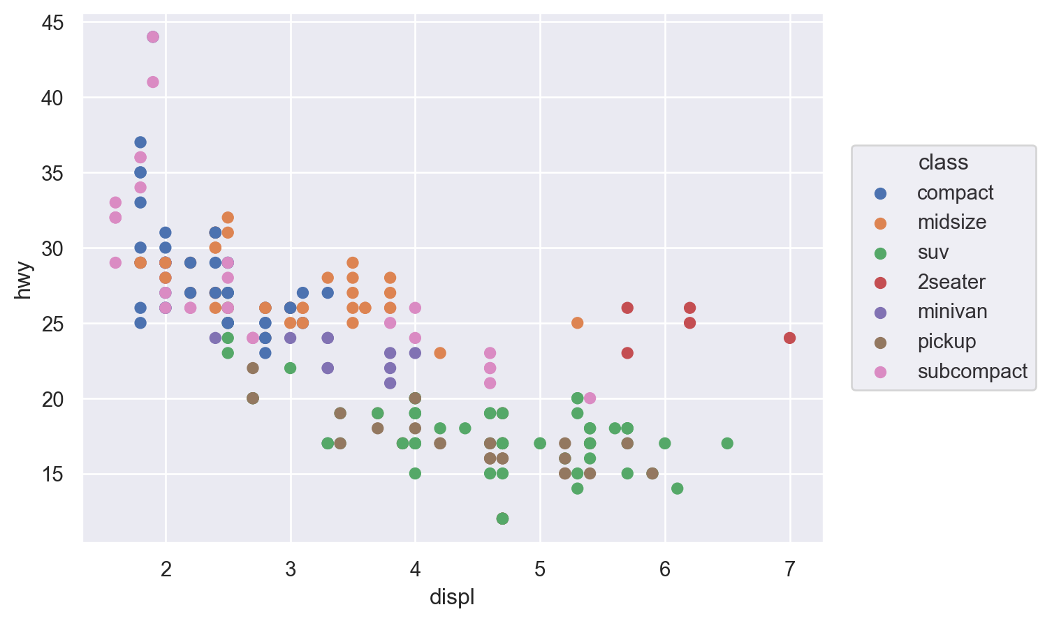
Lets-Plot
(
    ggplot(cars, aes(x="displ", y="hwy", color="class"))
    + geom_point()
    + ylab("Miles per Gallon")
)
Altair
For this first example, we’ll also show how to make the altair plot interactive with movable axes and a tooltip that reveals more info when you hover your mouse over points.
alt.Chart(cars).mark_circle(size=60).encode(
    x="displ",
    y="hwy",
    color="class",
    tooltip=["model", "class", "displ", "hwy"],
).interactive()
Plotly
Plotly is another declarative plotting library, at least sometimes (!), but one that is interactive by default.
fig = px.scatter(
    cars,
    x="displ",
    y="hwy",
    color="class",
    hover_data=["model", "class", "displ", "hwy"],
)
fig.show()
Facets
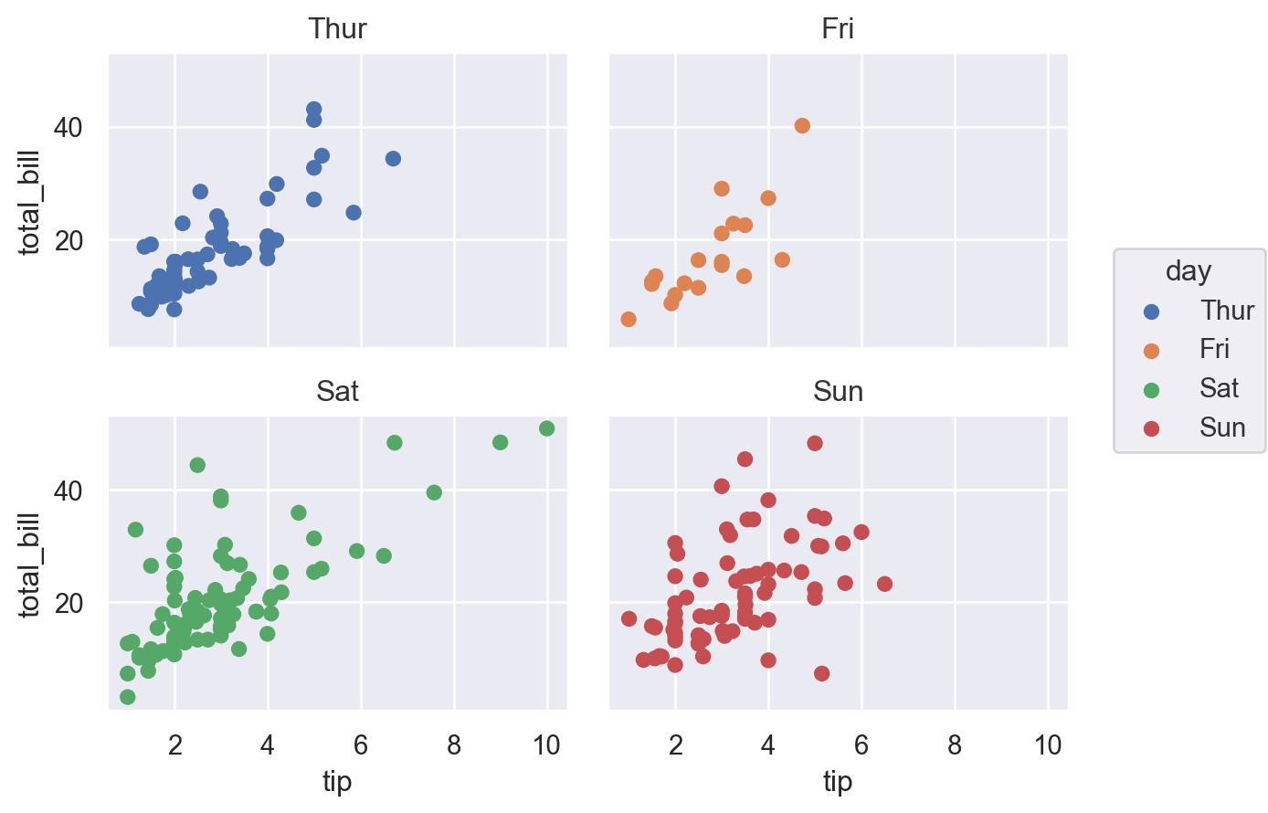
This applies to all plots, so in some sense is common! Facets, aka panels or small multiples, are ways of showing the same chart multiple times. Let’s see how to achieve them in a few of the most popular plotting libraries.
We’ll use the “tips” dataset for this.
df = sns.load_dataset("tips")
df.head()| total_bill | tip | sex | smoker | day | time | size | |
|---|---|---|---|---|---|---|---|
| 0 | 16.99 | 1.01 | Female | No | Sun | Dinner | 2 |
| 1 | 10.34 | 1.66 | Male | No | Sun | Dinner | 3 |
| 2 | 21.01 | 3.50 | Male | No | Sun | Dinner | 3 |
| 3 | 23.68 | 3.31 | Male | No | Sun | Dinner | 2 |
| 4 | 24.59 | 3.61 | Female | No | Sun | Dinner | 4 |
Matplotlib
There are many ways to create facets using Matplotlib, and you can get facets in any shape or sizes you like.
The easiest way, though, is to specify the number of rows and columns. This is achieved by specifying nrows and ncols when calling plt.subplots(). It returns an array of shape (nrows, ncols) of Axes objects. For most purposes, you’ll want to flatten these to a vector before iterating over them.
fig, axes = plt.subplots(nrows=1, ncols=4, sharex=True, sharey=True)
flat_axes = axes.flatten()  # Not needed with 1 row or 1 col, but good to be aware of

facet_grp = list(df["day"].unique())
# This part just to get some colours from the default color cycle
colour_list = plt.rcParams["axes.prop_cycle"].by_key()["color"]
iter_cycle = cycle(colour_list)

for i, ax in enumerate(flat_axes):
    sub_df = df.loc[df["day"] == facet_grp[i]]
    ax.scatter(
        sub_df["tip"],
        sub_df["total_bill"],
        s=30,
        edgecolor="k",
        color=next(iter_cycle),
    )
    ax.set_title(facet_grp[i])
fig.text(0.5, 0.01, "Tip", ha="center")
fig.text(0.0, 0.5, "Total bill", va="center", rotation="vertical")
plt.tight_layout()
plt.show()
Different facet sizes are possible in numerous ways. In practice, it’s often better to have evenly sized facets laid out in a grid–especially each facet is of the same x and y axes. But, just to show it’s possible, here’s an example that gives more space to the weekend than to weekdays using the tips dataset:
# This part just to get some colours
colormap = plt.cm.Dark2

fig = plt.figure(constrained_layout=True)
ax_dict = fig.subplot_mosaic([["Thur", "Fri", "Sat", "Sat", "Sun", "Sun"]])
facet_grp = list(ax_dict.keys())
colorst = [colormap(i) for i in np.linspace(0, 0.9, len(facet_grp))]
for i, grp in enumerate(facet_grp):
    sub_df = df.loc[df["day"] == facet_grp[i]]
    ax_dict[grp].scatter(
        sub_df["tip"],
        sub_df["total_bill"],
        s=30,
        edgecolor="k",
        color=colorst[i],
    )
    ax_dict[grp].set_title(facet_grp[i])
    if grp != "Thurs":
        ax_dict[grp].set_yticklabels([])
plt.tight_layout()
fig.text(0.5, 0, "Tip", ha="center")
fig.text(0, 0.5, "Total bill", va="center", rotation="vertical")
plt.show()
As well as using lists, you can also specify the layout using an array or using text, eg
axd = plt.figure(constrained_layout=True).subplot_mosaic(
    """
    ABD
    CCD
    CC.
    """
)
kw = dict(ha="center", va="center", fontsize=60, color="darkgrey")
for k, ax in axd.items():
    ax.text(0.5, 0.5, k, transform=ax.transAxes, **kw)
Seaborn
Seaborn makes it easy to quickly create facet plots. Note the use of col_wrap.
(
    so.Plot(df, x="tip", y="total_bill", color="day")
    .facet(col="day", wrap=2)
    .add(so.Dot())
)
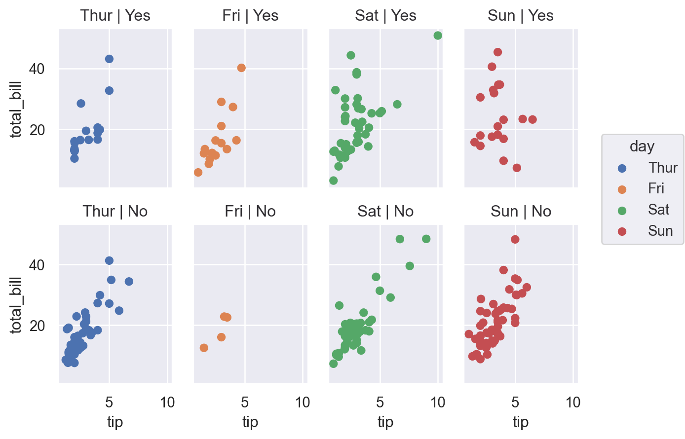
A nice feature of seaborn that is much more fiddly in (base) matplotlib is the ability to specify rows and columns separately: (smoker)
(
    so.Plot(df, x="tip", y="total_bill", color="day")
    .facet(col="day", row="smoker")
    .add(so.Dot())
)
Lets-Plot
(
    ggplot(df, aes(x="tip", y="total_bill", color="smoker"))
    + geom_point(size=3)
    + facet_wrap(["smoker", "day"])
)
Altair
alt.Chart(df).mark_point().encode(
    x="tip:Q",
    y="total_bill:Q",
    color="smoker:N",
    facet=alt.Facet("day:N", columns=2),
).properties(
    width=200,
    height=100,
)
Plotly
fig = px.scatter(
df, x="tip", y="total_bill", color="smoker", facet_row="smoker", facet_col="day"
)
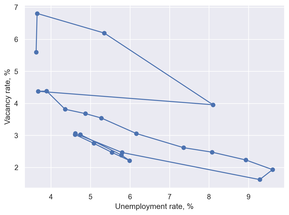
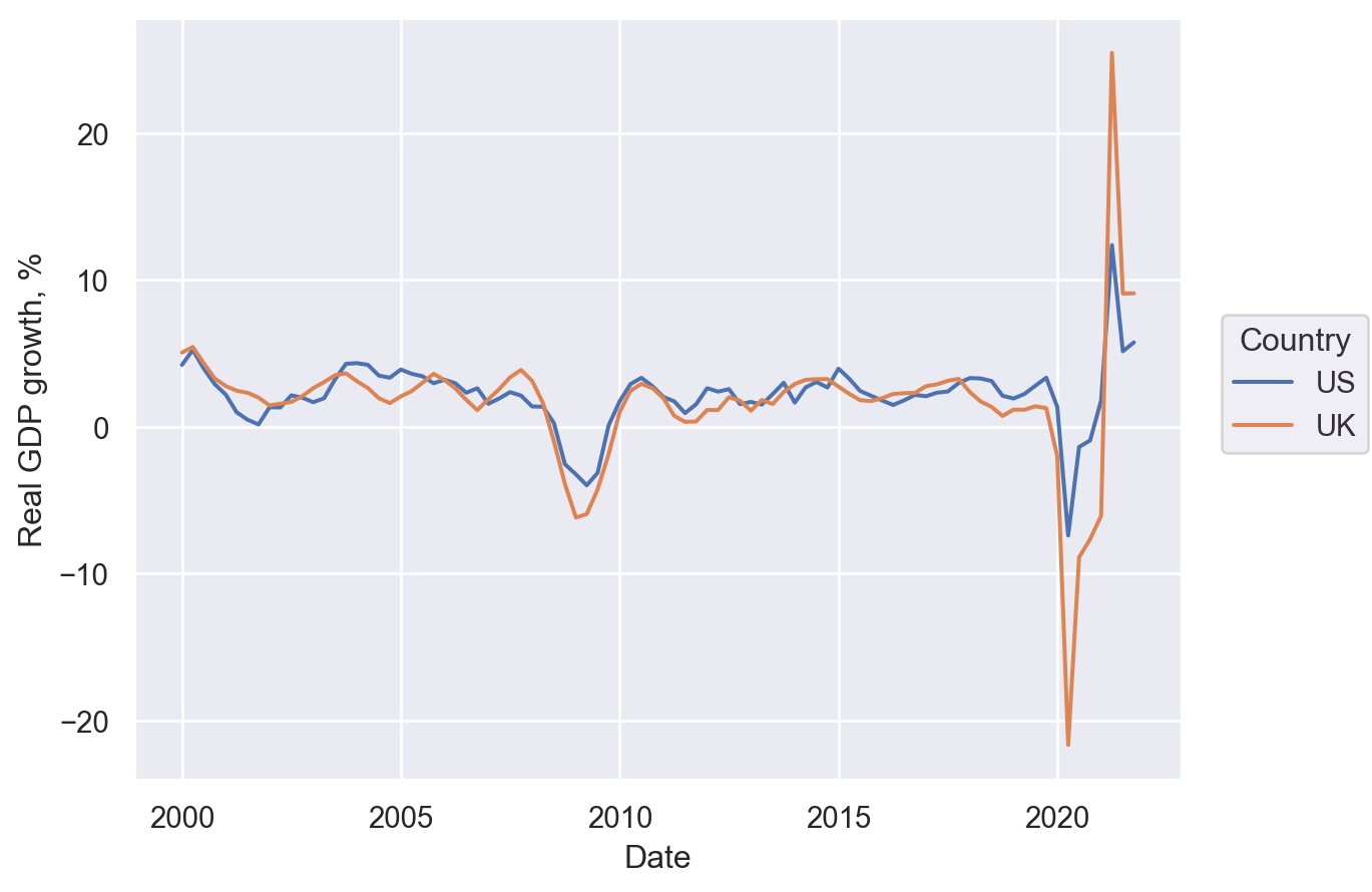
fig.show()Connected scatter plot
A simple variation on the scatter plot designed to show an ordering, usually of time. We’ll trace out a Beveridge curve based on US data.
import datetime

import pandas_datareader.data as web

start = datetime.datetime(2000, 1, 1)
end = datetime.datetime(datetime.datetime.now().year, 1, 1)
code_dict = {
    "Vacancies": "LMJVTTUVUSA647N",
    "Unemployment": "UNRATE",
    "LabourForce": "CLF16OV",
}
list_dfs = [
    web.DataReader(value, "fred", start, end)
    .rename(columns={value: key})
    .groupby(pd.Grouper(freq="AS"))
    .mean()
    for key, value in code_dict.items()
]
df = pd.concat(list_dfs, axis=1)
df = df.assign(Vacancies=100 * df["Vacancies"] / (df["LabourForce"] * 1e3)).dropna()
df["Year"] = df.index.year
df.head()| Vacancies | Unemployment | LabourForce | Year | |
|---|---|---|---|---|
| DATE | ||||
| 2001-01-01 | 3.028239 | 4.741667 | 143768.916667 | 2001 |
| 2002-01-01 | 2.387254 | 5.783333 | 144856.083333 | 2002 |
| 2003-01-01 | 2.212238 | 5.991667 | 146499.500000 | 2003 |
| 2004-01-01 | 2.470209 | 5.541667 | 147379.583333 | 2004 |
| 2005-01-01 | 2.753326 | 5.083333 | 149289.166667 | 2005 |
Matplotlib
plt.close("all")
fig, ax = plt.subplots()
quivx = -df["Unemployment"].diff(-1)
quivy = -df["Vacancies"].diff(-1)
# This connects the points
ax.quiver(
    df["Unemployment"],
    df["Vacancies"],
    quivx,
    quivy,
    scale_units="xy",
    angles="xy",
    scale=1,
    width=0.006,
    alpha=0.3,
)
ax.scatter(
    df["Unemployment"],
    df["Vacancies"],
    marker="o",
    s=35,
    edgecolor="black",
    linewidth=0.2,
    alpha=0.9,
)
for j in [0, -1]:
    ax.annotate(
        df["Year"].iloc[j],
        xy=(df[["Unemployment", "Vacancies"]].iloc[j].tolist()),
        xycoords="data",
        xytext=(-20, -40),
        textcoords="offset points",
        arrowprops=dict(arrowstyle="->", connectionstyle="angle3,angleA=0,angleB=-90"),
    )
ax.set_xlabel("Unemployment rate, %")
ax.set_ylabel("Vacancy rate, %")
plt.tight_layout()
plt.show()
Seaborn
(
    so.Plot(df, x="Unemployment", y="Vacancies")
    .add(so.Dots())
    .add(so.Path(marker="o"))
    .label(
        x="Unemployment rate, %",
        y="Vacancy rate, %",
    )
)
Lets-Plot
You can also use geom_curve() in place of geom_segment() below to get curved lines instead of straight lines.
# This is a convencience and creates a dataframe of the form
# Vacancies_from    Unemployment_from   LabourForce_from    Year_from   Vacancies_to    Unemployment_to LabourForce_to  Year_to
# 0 3.028239    4.741667    143768.916667   2001    2.387254    5.783333    144856.083333   2002
# 1  2.387254   5.783333    144856.083333   2002    2.212237    5.991667    146499.500000   2003
# so that we have both years (from and to) in each row
path_df = (
    df.iloc[:-1]
    .reset_index(drop=True)
    .join(df.iloc[1:].reset_index(drop=True), lsuffix="_from", rsuffix="_to")
)

min_yr = df["Year"].min()
max_yr = df["Year"].max()

(
    ggplot(df, aes("Unemployment", "Vacancies"))
    + geom_segment(
        aes(
            x="Unemployment_from",
            y="Vacancies_from",
            xend="Unemployment_to",
            yend="Vacancies_to",
        ),
        data=path_df,
        size=1,
        color="gray",
        arrow=arrow(type="closed", length=15, angle=15),
        spacer=5
        + 1,  # Avoids arrowheads being sunk into points (+1 as circles are size 1)
    )
    + geom_point(shape=21, color="gray", fill="#c28dc3", size=5)
    + geom_text(
        aes(label="Year"),
        data=df[df["Year"].isin([min_yr, max_yr])],
        position=position_nudge(y=0.3),
    )
    + labs(x="Unemployment rate, %", y="Vacancy rate, %")
)
Bubble plot
This is a scatter plot where the size of the point carries an extra dimension of information.
Matplotlib
fig, ax = plt.subplots()
scat = ax.scatter(cars["cty"], cars["hwy"], s=cars["displ"], alpha=0.4)
ax.set_ylabel("Miles per Gallon (highway)")
ax.set_xlabel("Miles per Gallon (city)")
ax.legend(
    *scat.legend_elements(prop="sizes", num=6),
    loc="upper right",
    title="Displacement",
    frameon=False,
)
plt.show()
Seaborn
(so.Plot(cars, x="cty", y="hwy", pointsize="displ").add(so.Dot()))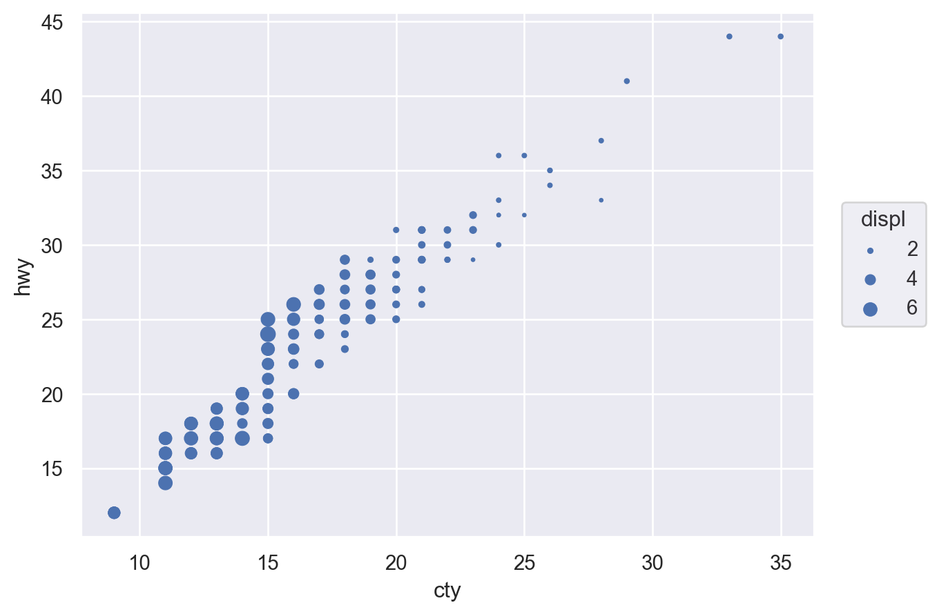
Lets-Plot
(ggplot(cars, aes(x="cty", y="hwy", size="displ")) + geom_point())Altair
alt.Chart(cars).mark_circle().encode(x="cty", y="hwy", size="displ")Plotly
# Adding a new col is easiest way to get displacement into legend with plotly:
cars["Displacement_Size"] = pd.cut(cars["displ"], bins=4)
fig = px.scatter(
    cars,
    x="cty",
    y="hwy",
    size="displ",
    color="Displacement_Size",
)
fig.show()
Line plot
First, let’s get some data on GDP growth:
todays_date = datetime.datetime.now().strftime("%Y-%m-%d")
fred_df = web.DataReader(["GDPC1", "NGDPRSAXDCGBQ"], "fred", "1999-01-01", "2021-12-31")
fred_df.columns = ["US", "UK"]
fred_df.index.name = "Date"
fred_df = 100 * fred_df.pct_change(4)
df = pd.melt(
    fred_df.reset_index(),
    id_vars=["Date"],
    value_vars=fred_df.columns,
    value_name="Real GDP growth, %",
    var_name="Country",
)
df = df.set_index("Date")
df.head()| Country | Real GDP growth, % | |
|---|---|---|
| Date | ||
| 1999-01-01 | US | NaN |
| 1999-04-01 | US | NaN |
| 1999-07-01 | US | NaN |
| 1999-10-01 | US | NaN |
| 2000-01-01 | US | 4.224745 |
Matplotlib
Note that Matplotlib prefers data to be one variable per column, in which case we could have just run
fig, ax = plt.subplots()
df.plot(ax=ax)
ax.set_title('Real GDP growth, %', loc='right')
ax.yaxis.tick_right()
but we are working with tidy data here, so we’ll do the plotting slightly differently.
fig, ax = plt.subplots()
for i, country in enumerate(df["Country"].unique()):
    df_sub = df[df["Country"] == country]
    ax.plot(df_sub.index, df_sub["Real GDP growth, %"], label=country, lw=2)
ax.set_title("Real GDP growth per capita, %", loc="right")
ax.yaxis.tick_right()
ax.spines["right"].set_visible(True)
ax.spines["left"].set_visible(False)
ax.legend(loc="lower left")
plt.show()
Seaborn
Note that only some seaborn commands currently support the use of named indexes, so we use df.reset_index() to make the ‘Date’ index into a regular column in the snippet below (although in recent versions of seaborn, lineplot() would actually work fine with data=df):
fig, ax = plt.subplots()
y_var = "Real GDP growth, %"
sns.lineplot(x="Date", y=y_var, hue="Country", data=df.reset_index(), ax=ax)
ax.yaxis.tick_right()
ax.spines["right"].set_visible(True)
ax.spines["left"].set_visible(False)
ax.set_ylabel("")
ax.set_title(y_var)
plt.show()
(
    so.Plot(df.reset_index(), x="Date", y="Real GDP growth, %", color="Country").add(
        so.Line()
    )
)
Lets-Plot
(
    ggplot(df.reset_index(), aes(x="Date", y="Real GDP growth, %", color="Country"))
    + geom_line(size=1)
)
Altair
alt.Chart(df.reset_index()).mark_line().encode(
    x="Date:T",
    y="Real GDP growth, %",
    color="Country",
    strokeDash="Country",
)
Plotly
fig = px.line(
    df.reset_index(),
    x="Date",
    y="Real GDP growth, %",
    color="Country",
    line_dash="Country",
)
fig.show()
Bar chart
Let’s see a bar chart, using the ‘barley’ dataset.
barley = pd.read_csv(
    "https://vincentarelbundock.github.io/Rdatasets/csv/agridat/fisher.barley.csv"
)
barley = pd.DataFrame(barley.groupby(["env"])["yield"].sum())
barley.head()| yield | |
|---|---|
| env | |
| Crookston | 1089.0 |
| Duluth | 828.4 |
| GrandRapids | 805.6 |
| Morris | 1053.1 |
| UniversityFarm | 928.9 |
Matplotlib
Just remove the ‘h’ in ax.barh() to get a vertical plot.
fig, ax = plt.subplots()
ax.barh(barley["yield"].index, barley["yield"], 0.35)
ax.set_xlabel("Yield")
plt.show()
Seaborn
Just switch x and y variables to get a vertical plot.
(so.Plot(barley.reset_index(), x="yield", y="env", color="env").add(so.Bar(), so.Agg()))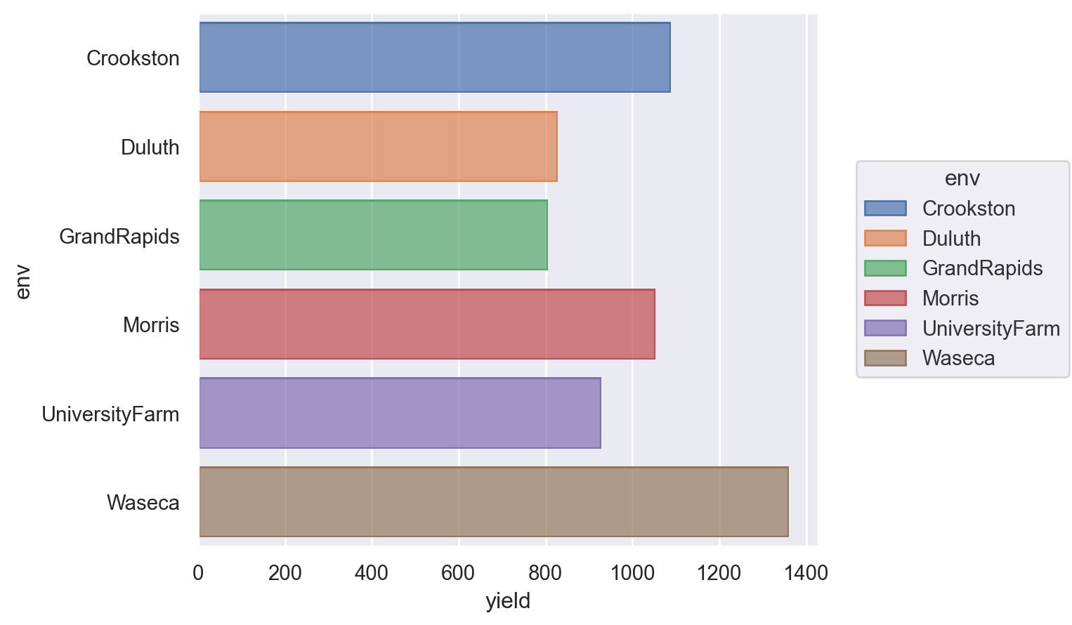
Lets-Plot
Just omit coord_flip() to get a vertical plot.
(
    ggplot(barley.reset_index(), aes(x="env", y="yield", fill="env"))
    + geom_bar(stat="identity")
    + coord_flip()
    + theme(legend_position="none")
)
Altair
Just switch x and y to get a vertical plot.
alt.Chart(barley.reset_index()).mark_bar().encode(
    y="env",
    x="yield",
).properties(
    width=alt.Step(40)  # controls width of bar.
)
Plotly
fig = px.bar(barley.reset_index(), y="env", x="yield")
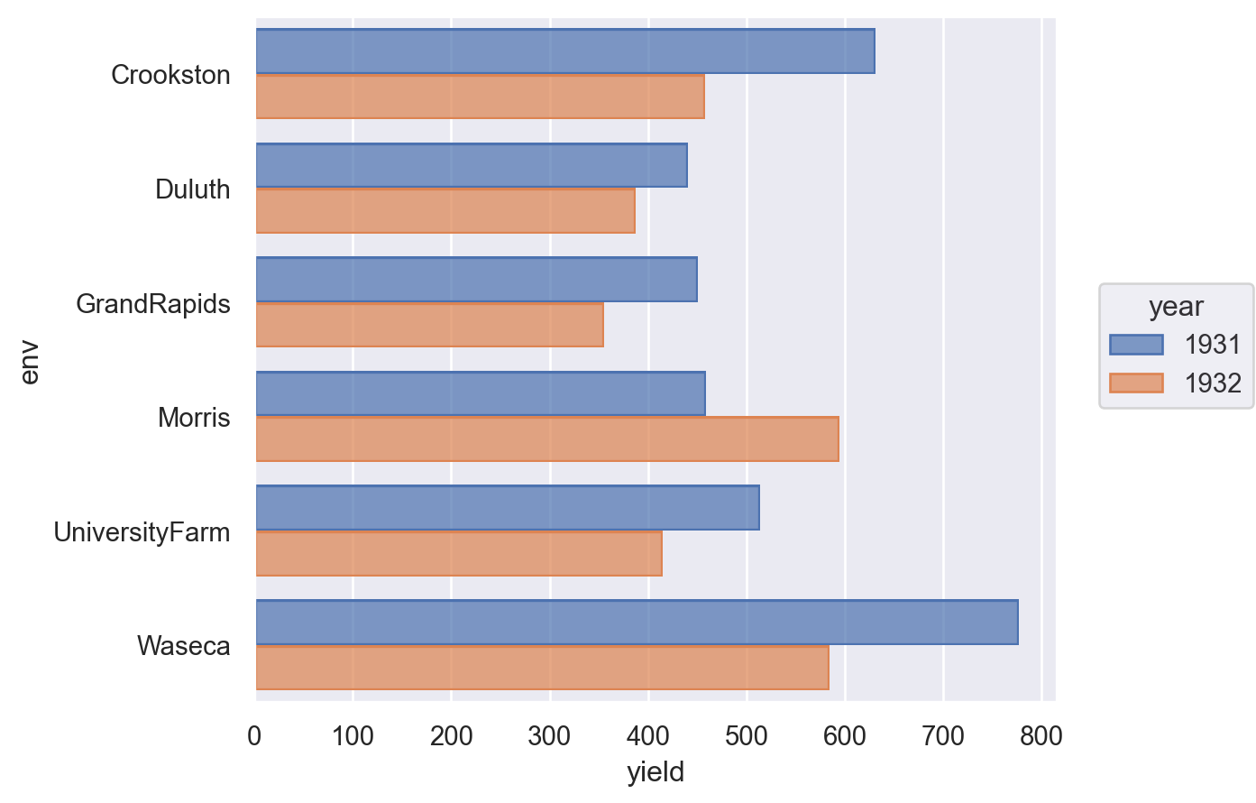
fig.show()Grouped bar chart
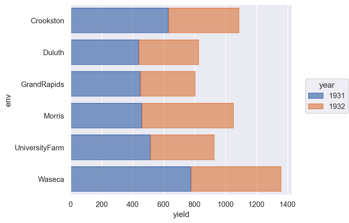
barley = pd.read_csv(
    "https://vincentarelbundock.github.io/Rdatasets/csv/agridat/fisher.barley.csv"
)
barley = pd.DataFrame(barley.groupby(["env", "year"])["yield"].sum()).reset_index()
barley.head()| env | year | yield | |
|---|---|---|---|
| 0 | Crookston | 1931 | 630.8 |
| 1 | Crookston | 1932 | 458.2 |
| 2 | Duluth | 1931 | 440.7 |
| 3 | Duluth | 1932 | 387.7 |
| 4 | GrandRapids | 1931 | 450.4 |
Matplotlib
labels = barley["env"].unique()
y = np.arange(len(labels))  # the label locations
width = 0.35  # the width of the bars

fig, ax = plt.subplots()
ax.barh(y - width / 2, barley.loc[barley["year"] == 1931, "yield"], width, label="1931")
ax.barh(y + width / 2, barley.loc[barley["year"] == 1932, "yield"], width, label="1932")

# Add some text for labels, title and custom x-axis tick labels, etc.
ax.set_xlabel("Yield")
ax.set_yticks(y)
ax.set_yticklabels(labels)
ax.legend(frameon=False)
plt.show()
Seaborn
barley["year"] = barley["year"].astype("category")  # to force category

(
    so.Plot(barley.reset_index(), x="yield", y="env", color="year").add(
        so.Bar(), so.Dodge()
    )
)
Lets-Plot
(
    ggplot(barley, aes(x="env", y="yield", group="year", fill=as_discrete("year")))
    + geom_bar(position="dodge", stat="identity")
    + coord_flip()
)
Altair
alt.Chart(barley.reset_index()).mark_bar().encode(
    y="year:O", x="yield", color="year:N", row="site:N"
).properties(
    width=alt.Step(40)  # controls width of bar.
)
Plotly
px_barley = barley.reset_index()
# This prevents plotly from using a continuous scale for year
px_barley["year"] = px_barley["year"].astype("category")
fig = px.bar(px_barley, y="env", x="yield", barmode="group", color="year")
fig.show()
Stacked bar chart
Matplotlib
labels = barley["env"].unique()
y = np.arange(len(labels))  # the label locations
width = 0.35  # the width (or height) of the bars

fig, ax = plt.subplots()
ax.barh(y, barley.loc[barley["year"] == 1931, "yield"], width, label="1931")
ax.barh(
    y,
    barley.loc[barley["year"] == 1932, "yield"],
    width,
    label="1932",
    left=barley.loc[barley["year"] == 1931, "yield"],
)

# Add some text for labels, title and custom x-axis tick labels, etc.
ax.set_xlabel("Yield")
ax.set_yticks(y)
ax.set_yticklabels(labels)
ax.legend(frameon=False)
plt.show()
Seaborn
barley["year"] = barley["year"].astype("category")  # to force category
(
    so.Plot(barley.reset_index(), x="yield", y="env", color="year").add(
        so.Bar(), so.Stack()
    )
)
Lets-Plot
(
    ggplot(barley, aes(x="env", y="yield", fill=as_discrete("year")))
    + geom_bar(stat="identity")
    + coord_flip()
)
Altair
alt.Chart(barley.reset_index()).mark_bar().encode(
    y="env",
    x="yield",
    color="year:N",
).properties(
    width=alt.Step(40)  # controls width of bar.
)
Plotly
fig = px.bar(px_barley, y="env", x="yield", barmode="relative", color="year")
fig.show()
Diverging stacked bar chart
First, let’s create some data to use in our examples.
category_names = [
    "Strongly disagree",
    "Disagree",
    "Neither agree nor disagree",
    "Agree",
    "Strongly agree",
]
results = [
    [10, 15, 17, 32, 26],
    [26, 22, 29, 10, 13],
    [35, 37, 7, 2, 19],
    [32, 11, 9, 15, 33],
    [21, 29, 5, 5, 40],
    [8, 19, 5, 30, 38],
]

likert_df = pd.DataFrame(
    results, columns=category_names, index=[f"Question {i}" for i in range(1, 7)]
)
likert_df| Strongly disagree | Disagree | Neither agree nor disagree | Agree | Strongly agree | |
|---|---|---|---|---|---|
| Question 1 | 10 | 15 | 17 | 32 | 26 |
| Question 2 | 26 | 22 | 29 | 10 | 13 |
| Question 3 | 35 | 37 | 7 | 2 | 19 |
| Question 4 | 32 | 11 | 9 | 15 | 33 |
| Question 5 | 21 | 29 | 5 | 5 | 40 |
| Question 6 | 8 | 19 | 5 | 30 | 38 |
Matplotlib
middle_index = likert_df.shape[1] // 2
offsets = (
    likert_df.iloc[:, range(middle_index)].sum(axis=1)
    + likert_df.iloc[:, middle_index] / 2
)
category_colors = plt.get_cmap("coolwarm_r")(
    np.linspace(0.15, 0.85, likert_df.shape[1])
)

fig, ax = plt.subplots(figsize=(10, 5))

# Plot Bars
for i, (colname, color) in enumerate(zip(likert_df.columns, category_colors)):
    widths = likert_df.iloc[:, i]
    starts = likert_df.cumsum(axis=1).iloc[:, i] - widths - offsets
    rects = ax.barh(
        likert_df.index, widths, left=starts, height=0.5, label=colname, color=color
    )

# Add Zero Reference Line
ax.axvline(0, linestyle="--", color="black", alpha=1, zorder=0, lw=0.3)

# X Axis
ax.set_xlim(-90, 90)
ax.set_xticks(np.arange(-90, 91, 10))
ax.xaxis.set_major_formatter(lambda x, pos: str(abs(int(x))))

# Y Axis
ax.invert_yaxis()

# Remove spines
ax.spines["right"].set_visible(False)
ax.spines["top"].set_visible(False)
ax.spines["left"].set_visible(False)

# Legend
ax.legend(
    ncol=len(category_names),
    bbox_to_anchor=(0, 1),
    loc="lower left",
    fontsize="small",
    frameon=False,
)

# Set Background Color
fig.set_facecolor("#FFFFFF")
plt.show()
Kernel density estimate
We’ll use the diamonds dataset to demonstrate this.
diamonds = sns.load_dataset("diamonds").sample(1000)
diamonds.head()| carat | cut | color | clarity | depth | table | price | x | y | z | |
|---|---|---|---|---|---|---|---|---|---|---|
| 31533 | 0.34 | Premium | G | VS2 | 62.4 | 59.0 | 765 | 4.47 | 4.41 | 2.77 |
| 21737 | 1.23 | Very Good | G | VVS2 | 62.0 | 58.0 | 9803 | 6.77 | 6.82 | 4.21 |
| 34434 | 0.30 | Ideal | G | IF | 61.0 | 57.0 | 863 | 4.31 | 4.34 | 2.64 |
| 50014 | 0.70 | Premium | F | SI1 | 60.4 | 58.0 | 2196 | 5.76 | 5.82 | 3.50 |
| 27656 | 1.49 | Ideal | F | VVS2 | 61.1 | 58.0 | 18614 | 7.36 | 7.38 | 4.50 |
Matplotlib
Technically, there is a way to do this but it’s pretty inelegant if you want a quick plot. That’s because matplotlib doesn’t do the density estimation itself. Jake Vanderplas has a nice example but as it relies on a few extra libraries, we won’t reproduce it here.
Seaborn
# Note that there isn't a clear way to do this in the seaborn objects API yet
sns.displot(diamonds, x="carat", kind="kde", hue="cut", fill=True);
Lets-Plot
(ggplot(diamonds, aes(x="carat", fill="cut", colour="cut")) + geom_density(alpha=0.5))Altair
alt.Chart(diamonds).transform_density(
    density="carat", as_=["carat", "density"], groupby=["cut"]
).mark_area(fillOpacity=0.5).encode(
    x="carat:Q",
    y="density:Q",
    color="cut:N",
)
Plotly
import plotly.figure_factory as ff

px_di = diamonds.pivot(columns="cut", values="carat")
ff.create_distplot(
    [px_di[c].dropna() for c in px_di.columns],
    group_labels=px_di.columns,
    show_rug=False,
    show_hist=False,
)
Histogram or probability density function
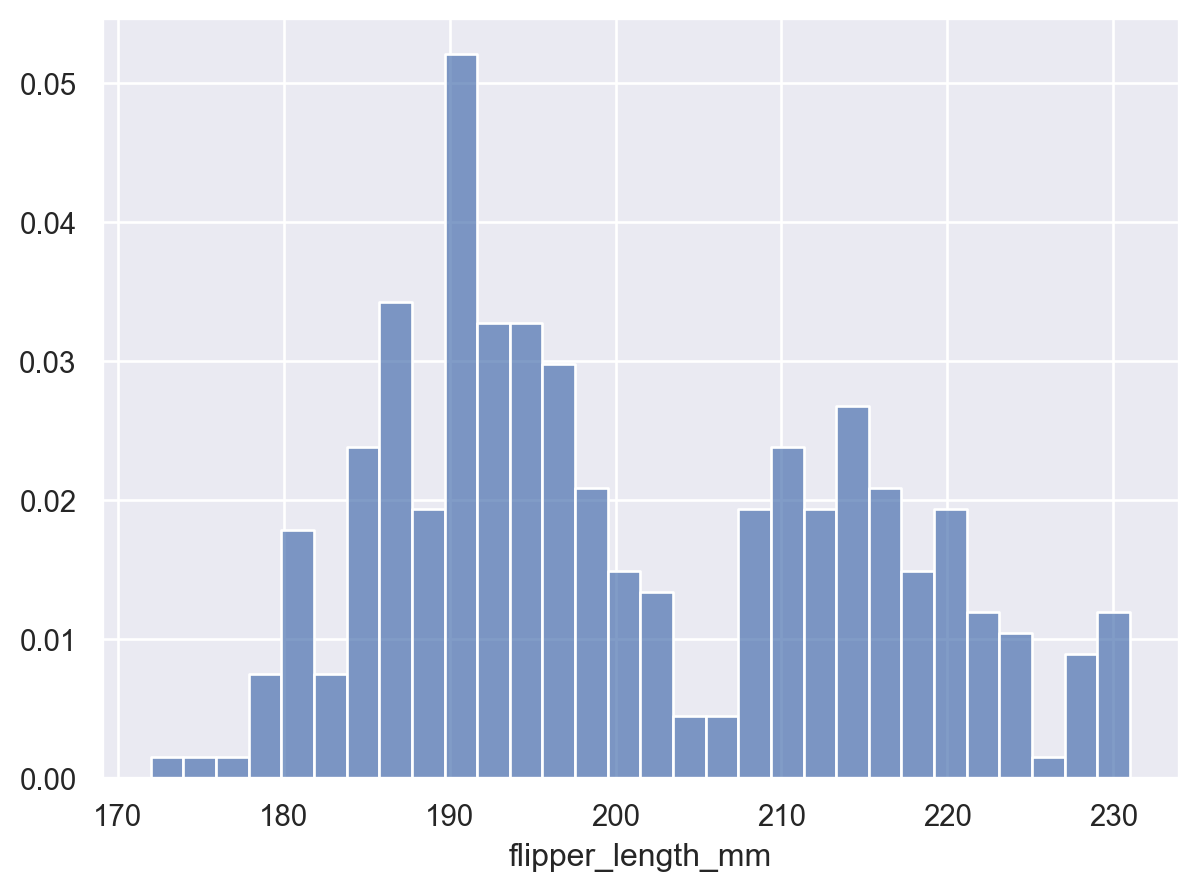
For this, let’s go back to the penguins dataset.
penguins = sns.load_dataset("penguins")
penguins.head()| species | island | bill_length_mm | bill_depth_mm | flipper_length_mm | body_mass_g | sex | |
|---|---|---|---|---|---|---|---|
| 0 | Adelie | Torgersen | 39.1 | 18.7 | 181.0 | 3750.0 | Male |
| 1 | Adelie | Torgersen | 39.5 | 17.4 | 186.0 | 3800.0 | Female |
| 2 | Adelie | Torgersen | 40.3 | 18.0 | 195.0 | 3250.0 | Female |
| 3 | Adelie | Torgersen | NaN | NaN | NaN | NaN | NaN |
| 4 | Adelie | Torgersen | 36.7 | 19.3 | 193.0 | 3450.0 | Female |
Matplotlib
The density= keyword parameter decides whether to create counts or a probability density function.
fig, ax = plt.subplots()
ax.hist(penguins["flipper_length_mm"], bins=30, density=True, edgecolor="k")
ax.set_xlabel("Flipper length (mm)")
ax.set_ylabel("Probability density")
fig.tight_layout()
plt.show()
Seaborn
(
    so.Plot(penguins, x="flipper_length_mm").add(
        so.Bars(), so.Hist(bins=30, stat="density")
    )
)
Lets-Plot
(
    ggplot(penguins, aes(x="flipper_length_mm"))
    + geom_histogram(bins=30)  # specify the binwidth
)
Altair
alt.Chart(penguins).mark_bar().encode(
    alt.X("flipper_length_mm:Q", bin=True),
    y="count()",
)
Plotly
fig = px.histogram(penguins, x="flipper_length_mm", nbins=30)
fig.show()
Marginal histograms
Maplotlib
Jaker Vanderplas’s excellent notes have a great example of this, but now there’s an easier way to do it with Matplotlib’s new constrained_layout options.
fig = plt.figure(constrained_layout=True)
# Create a layout with 3 panels in the given ratios
axes_dict = fig.subplot_mosaic(
    [[".", "histx"], ["histy", "scat"]],
    gridspec_kw={"width_ratios": [1, 7], "height_ratios": [2, 7]},
)
# Glue all the relevant axes together
axes_dict["histy"].invert_xaxis()
axes_dict["histx"].sharex(axes_dict["scat"])
axes_dict["histy"].sharey(axes_dict["scat"])
# Plot the data
axes_dict["scat"].scatter(penguins["bill_length_mm"], penguins["bill_depth_mm"])
axes_dict["histx"].hist(penguins["bill_length_mm"])
axes_dict["histy"].hist(penguins["bill_depth_mm"], orientation="horizontal");
Seaborn
sns.jointplot(data=penguins, x="bill_length_mm", y="bill_depth_mm");
Lets-Plot
from lets_plot.bistro.joint import *

(
    joint_plot(penguins, x="bill_length_mm", y="bill_depth_mm", reg_line=False)
    + labs(x="Bill length (mm)", y="Bill depth (mm)")
)
Altair
This is a bit fiddly.
base = alt.Chart(penguins)

xscale = alt.Scale(domain=(20, 60))
yscale = alt.Scale(domain=(10, 30))

area_args = {"opacity": 0.5, "interpolate": "step"}

points = base.mark_circle().encode(
    alt.X("bill_length_mm", scale=xscale), alt.Y("bill_depth_mm", scale=yscale)
)

top_hist = (
    base.mark_area(**area_args)
    .encode(
        alt.X(
            "bill_length_mm:Q",
            # when using bins, the axis scale is set through
            # the bin extent, so we do not specify the scale here
            # (which would be ignored anyway)
            bin=alt.Bin(maxbins=30, extent=xscale.domain),
            stack=None,
            title="",
        ),
        alt.Y("count()", stack=None, title=""),
    )
    .properties(height=60)
)

right_hist = (
    base.mark_area(**area_args)
    .encode(
        alt.Y(
            "bill_depth_mm:Q",
            bin=alt.Bin(maxbins=30, extent=yscale.domain),
            stack=None,
            title="",
        ),
        alt.X("count()", stack=None, title=""),
    )
    .properties(width=60)
)

top_hist & (points | right_hist)
Plotly
fig = px.scatter(
    penguins,
    x="bill_length_mm",
    y="bill_depth_mm",
    marginal_x="histogram",
    marginal_y="histogram",
)
fig.show()
Heatmap
Heatmaps, or sometimes known as correlation maps, represent data in 3 dimensions by having two axes that forms a grid showing colour that corresponds to (usually) continuous values.
We’ll use the flights data to show the number of passengers by month-year:
flights = sns.load_dataset("flights")
flights = flights.pivot(index="month", columns="year", values="passengers").T
flights.head()| month | Jan | Feb | Mar | Apr | May | Jun | Jul | Aug | Sep | Oct | Nov | Dec |
|---|---|---|---|---|---|---|---|---|---|---|---|---|
| year | ||||||||||||
| 1949 | 112 | 118 | 132 | 129 | 121 | 135 | 148 | 148 | 136 | 119 | 104 | 118 |
| 1950 | 115 | 126 | 141 | 135 | 125 | 149 | 170 | 170 | 158 | 133 | 114 | 140 |
| 1951 | 145 | 150 | 178 | 163 | 172 | 178 | 199 | 199 | 184 | 162 | 146 | 166 |
| 1952 | 171 | 180 | 193 | 181 | 183 | 218 | 230 | 242 | 209 | 191 | 172 | 194 |
| 1953 | 196 | 196 | 236 | 235 | 229 | 243 | 264 | 272 | 237 | 211 | 180 | 201 |
Matplotlib
fig, ax = plt.subplots()
im = ax.imshow(flights.values, cmap="inferno")
cbar = ax.figure.colorbar(im, ax=ax)
ax.set_xticks(np.arange(len(flights.columns)))
ax.set_yticks(np.arange(len(flights.index)))
# Labels
ax.set_xticklabels(flights.columns, rotation=90)
ax.set_yticklabels(flights.index)
plt.show()
Seaborn
sns.heatmap(flights);
Lets-Plot
Lets-Plot uses tidy data, rather than the wide data preferred by matplotlib, so we need to first get the original format of the flights data back:
flights = sns.load_dataset("flights")
(
    ggplot(flights, aes("month", as_discrete("year"), fill="passengers"))
    + geom_tile()
    + scale_y_reverse()
)
Altair
alt.Chart(flights).mark_rect().encode(
    x=alt.X("month", type="nominal", sort=None), y="year:O", color="passengers:Q"
)
Calendar heatmap
Okay the previous heatmap was technically a calendar heatmap. But there are some nifty tools for making day-of-week by month heatmaps.
Matplotlib
import dayplot as dp

df = dp.load_dataset()

fig, ax = plt.subplots(figsize=(15, 6))
dp.calendar(
    dates=df["dates"],
    values=df["values"],
    cmap="inferno",  # any matplotlib colormap
    start_date="2024-01-01",
    end_date="2024-12-31",
    ax=ax,
)
plt.show()
Boxplot
Let’s use the tips dataset:
tips = sns.load_dataset("tips")
tips.head()| total_bill | tip | sex | smoker | day | time | size | |
|---|---|---|---|---|---|---|---|
| 0 | 16.99 | 1.01 | Female | No | Sun | Dinner | 2 |
| 1 | 10.34 | 1.66 | Male | No | Sun | Dinner | 3 |
| 2 | 21.01 | 3.50 | Male | No | Sun | Dinner | 3 |
| 3 | 23.68 | 3.31 | Male | No | Sun | Dinner | 2 |
| 4 | 24.59 | 3.61 | Female | No | Sun | Dinner | 4 |
Matplotlib
There isn’t a very direct way to create multiple box plots of different data in matplotlib in the case where the groups are unbalanced, so we create several different boxplot objects.
colormap = plt.cm.Set1
colorst = [colormap(i) for i in np.linspace(0, 0.9, len(tips["time"].unique()))]

fig, ax = plt.subplots()
for i, grp in enumerate(tips["time"].unique()):
    bplot = ax.boxplot(
        tips.loc[tips["time"] == grp, "tip"],
        positions=[i],
        vert=True,  # vertical box alignment
        patch_artist=True,  # fill with color
        labels=[grp],
    )  # X label
    for patch in bplot["boxes"]:
        patch.set_facecolor(colorst[i])

ax.set_ylabel("Tip")
plt.show()
Seaborn
sns.boxplot(data=tips, x="time", y="tip");
Lets-Plot
(ggplot(tips) + geom_boxplot(aes(y="tip", x="time", fill="time")))Altair
alt.Chart(tips).mark_boxplot(size=50).encode(
    x="time:N", y="tip:Q", color="time:N"
).properties(width=300)
Plotly
fig = px.box(tips, x="time", y="tip", color="time")
fig.show()
Violin plot
We’ll use the same data as before, the tips dataset.
Matplotlib
colormap = plt.cm.Set1
colorst = [colormap(i) for i in np.linspace(0, 0.9, len(tips["time"].unique()))]

fig, ax = plt.subplots()
for i, grp in enumerate(tips["time"].unique()):
    vplot = ax.violinplot(
        tips.loc[tips["time"] == grp, "tip"], positions=[i], vert=True
    )
labels = list(tips["time"].unique())
ax.set_xticks(np.arange(len(labels)))
ax.set_xticklabels(labels)
ax.set_ylabel("Tip")
plt.show()
Seaborn
sns.violinplot(data=tips, x="time", y="tip");
Lets-Plot
(ggplot(tips, aes(x="time", y="tip", fill="time")) + geom_violin())Altair
alt.Chart(tips).transform_density(
    "tip", as_=["tip", "density"], groupby=["time"]
).mark_area(orient="horizontal").encode(
    y="tip:Q",
    color="time:N",
    x=alt.X(
        "density:Q",
        stack="center",
        impute=None,
        title=None,
        axis=alt.Axis(labels=False, values=[0], grid=False, ticks=True),
    ),
    column=alt.Column(
        "time:N",
        header=alt.Header(
            titleOrient="bottom",
            labelOrient="bottom",
            labelPadding=0,
        ),
    ),
).properties(width=100).configure_facet(spacing=0).configure_view(stroke=None)
Plotly
fig = px.violin(
tips,
y="tip",
x="time",
color="time",
box=True,
points="all",
hover_data=tips.columns,
)
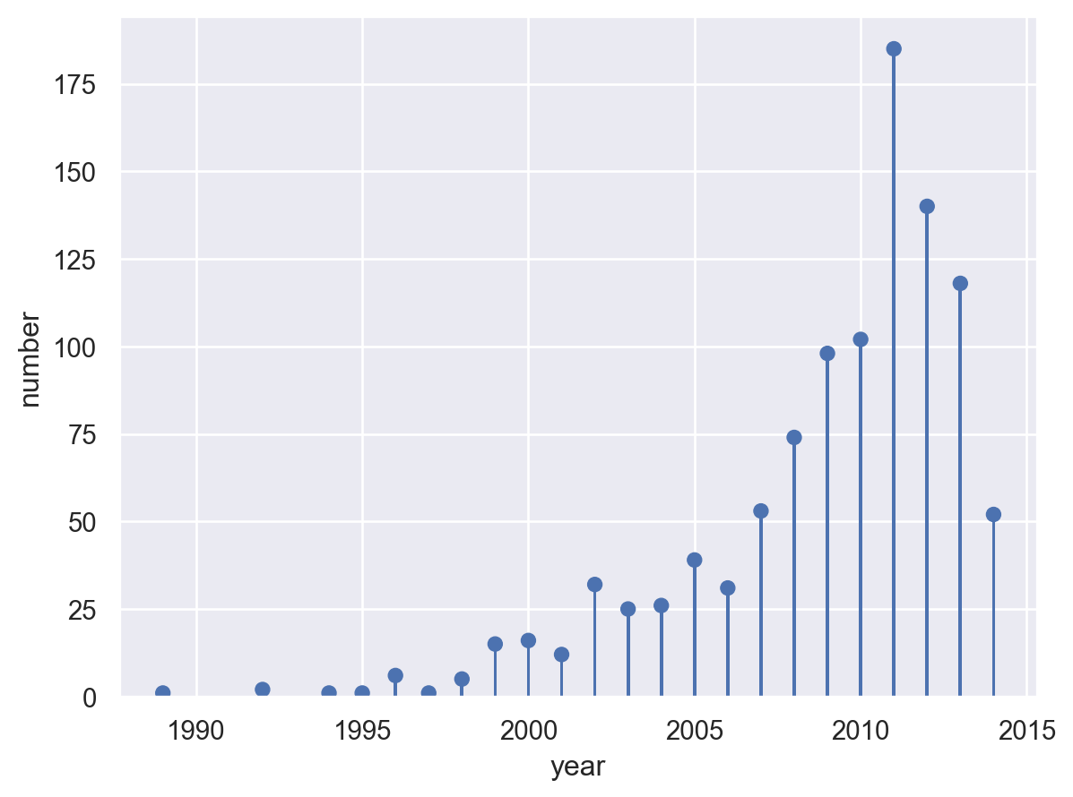
fig.show()Lollipop
planets = sns.load_dataset("planets").groupby("year")["number"].count()
planets.head()
year
1989 1
1992 2
1994 1
1995 1
1996 6
Name: number, dtype: int64Matplotlib
fig, ax = plt.subplots()
ax.stem(planets.index, planets, basefmt="")
ax.yaxis.tick_right()
ax.spines["left"].set_visible(False)
ax.set_ylim(0, 200)
ax.set_title("Number of exoplanets discovered per year")
plt.show()
Seaborn
(
    so.Plot(planets.reset_index(), x="year", y="number")
    .add(so.Dot(), so.Agg("sum"))
    .add(so.Bar(width=0.1), so.Agg("sum"))
)
Lets-Plot
(
    ggplot(planets.reset_index(), aes(x="year", y="number"))
    + geom_lollipop()
    + ggtitle("Number of exoplanets discovered per year")
    + scale_x_continuous(format="d")
)
Plotly
import plotly.graph_objects as go

px_df = planets.reset_index()

fig1 = go.Figure()
# Draw points
fig1.add_trace(
    go.Scatter(
        x=px_df["year"],
        y=px_df["number"],
        mode="markers",
        marker_color="darkblue",
        marker_size=10,
    )
)
# Draw lines
for index, row in px_df.iterrows():
    fig1.add_shape(type="line", x0=row["year"], y0=0, x1=row["year"], y1=row["number"])
fig1.show()